If you’re an entrepreneur and small business owner without professional design experience, it can be really intimidating to think about how to make a logo for yourself. Where do you start? What tools do you need? How do you make it look professional?
Even though your logo is just a small image, it has a huge impact.
If you’re just getting started or have a small budget, then learning how to design a custom logo yourself is well worth the effort.
GoDaddy offers a free logo maker for those on a budget and we will dive deeper into it in this guide. Along with GoDaddy’s user friendly tool, there are other online logo-maker tools and logo generators you might want to explore.
6 simple steps to make a logo
- Understand best practices for logo design.
- Brainstorm before starting.
- Pick the type of logo you want.
- Pick a font for your custom logo.
- Choose the colors of your logo.
- Experiment and test with your logo.
Finally, we’ll go over some final tips for making a custom logo and provide some related FAQ.
Note: With the exception of GoDaddy, the use of any other registered trademarks is for exemplary purposes only and do not reflect any affiliation whatsoever.
1. Understand best practices for DIY logo design
Before we dig into actual design best practices, it’s essential to learn some logo design best practices. Here are a few important details to keep in mind:
- Make it legible but concise: Make sure that your logo is easy to remember while still communicating your brand’s identity.
- Use a clear color palette: As a general rule, use a maximum of three colors, and make sure your logo also works in black and white.
- Use one to two fonts: To keep your logo recognizable, it’s recommended that you only use one font – two fonts max.
- Test different sizes: Your logo should look great both on a large sign and on a small business card.
- Watch your balance and alignment: Make sure you are aligning portions of your design properly. If you’re using Photoshop, turn on the smart guides and use the Align Panel to help with this. You don’t want to guess about where the center is on your design, so utilize tools to help you.
Related: GoDaddy Studio — Create eye-catching imagery for your brand
2. Brainstorm before starting

It’s important to take 20 to 30 minutes before you get started and set a really solid foundation for how you want to make your logo. Ask yourself these questions:
- What image are you trying to convey?
- How can you represent your brand image, visually?
- What parts of your name and tagline are essential?
- Where will you be displaying your logo?
What image are you trying to convey?
When you sit down to pick a symbol that represents your company, you have to be very clear on what image you’re trying to put out into the world.
What’s your brand personality?
- If you are in a more serious field like accounting or financial services, then a cartoon character doesn’t make sense.
- If you sell children’s toys, however, then a cartoon character is a perfect fit.
Creating a professional logo is like choosing how to dress. You head to the office in your business casual clothing, not a clown costume … unless you’re a clown. Take a few moments to think about how your business would dress itself.
How can you represent your brand image, visually?
Now that you’re clear on the image you want to convey, think about what kind of visual layout best represents that.
If you run a yoga studio, then a lotus flower or bubbling brook might fit the bill for the relaxing feel you’re creating. If you’re a landscaper, maybe you want to use a leaf or a lawnmower in your design.
There’s no need to get too clever with this. Obvious works. And don’t feel like you have to reinvent the wheel, either. Take a look at what other businesses in your industry are using to visually represent their brands.
Inspiration is everywhere.
What parts of your name and tagline are essential?
Look closely at your business name. Is it really long plus an accompanying tagline — or is it short? Since logos aren’t just used on websites, you need to plan for occasions when the area it fits into is constrained. Like the pocket of a T-shirt, for example, or the back of a baseball cap.
Printed promotional materials have different needs from digital ones
If your company name is long, it’s essentially becoming a wide but short rectangle. What if you need it to fit into a square space?
Consider some variations and different logo templates of your design where the wording is stacked so it fits well into these applications.
Where will you be displaying your logo?
You need to be super practical here. Is your logo going to be on a billboard? Or lapel pins? Or both?
The perfect logo is simple so it’s recognizable from a distance or up close. Big or small.
And if wording needs to be included, make sure the font is readable at all sizes. Display fonts like fancy scripts are sometimes hard to read at small sizes.
3. Pick the type of logo you want
When you decide to create a unique one-of-a-kind custom logo for yourself, but it’s simple and text-based, you’ll want to consider your font options. You can use a standard, free font, or you can use a paid font if you’re looking for a more unique option (Creative Market and Font Shop are a couple of great places to get affordable, custom fonts).
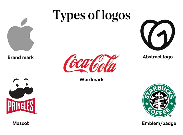
- Brand mark
- Abstract
- Wordmarks
- Mascots
- Emblems/badge
Brand mark
A brand mark is a symbol meant to represent a brand. These typically include real-world objects meant to symbolize your brand or suggest your brand values or message. Apple’s logo is an example of a brand mark.
Abstract logo
A brand mark is a symbol meant to represent a brand. These typically include real-world objects meant to symbolize your brand or suggest your brand values or message. GoDaddy is an example of an abstract mark.
Wordmarks
Wordmarks are what they sound like — text-based logos. While sounding simple, the simplicity can often be more difficult to successfully execute, and tend to perform better for established brands whose name is instantly recognizable. Coca-Cola is an example of a wordmark.
Mascots
A mascot logo features an illustrated character meant to represent a brand. Mascots can be a fun way to appeal to an audience, especially younger audiences, so think about your target audience if considering this logo. Pringles uses a mascot in their company logo.
Emblems/badge logo
Emblem logos combine both text and image in a crest-style design. These tend to be ornate and lean more traditional than modern. Starbucks uses an emblem logo.
4. Pick a font for your custom logo
When you decide to create a unique one-of-a-kind custom logo for yourself, but it’s simple and text-based, you’ll want to consider your font options. You can use a standard, free font, or you can use a paid font if you’re looking for a more unique option (Creative Market and Font Shop are a couple of great places to get affordable, custom fonts).
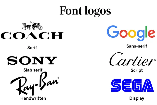
When choosing a font, whether you’re using a standard/free font or a paid font, you’ll want to first think about the type of font that fits your business. Consider what some of the below fonts convey:
- Serif: Classic, refined, traditional.
- Sans-Serif: Modern, clean, simple.
- Slab serifs: Vintage, rustic.
- Script: Refined, elegant.
- Handwritten: Bespoke, custom, casual.
- Display (includes fonts like a typewriter, novelty, etc.): Funky, unusual.
Once you’ve selected your font, it’s time to think about how you want to arrange your logo. If you put the pieces on different layers, you can move things around easily to see what looks best. Moreover, it is essential to save your logo in various file formats such as SVG, EPS, JPG, and ensure it has a transparent background for versatile usage.
Remove image backgrounds in the blink of an eye with GoDaddy Studio
Creating a high-resolution logo is vital, especially if you plan to use it on large marketing materials or signage. Vector files are the best option for maintaining quality.
You can also experiment with altering the text itself. You could try:
- Thin and thick versions of the font.
- Bold or italic versions of the font.
- Uppercase.
- Lowercase.
- Drop-shadows.
- Outlines (called “stroke”).
- Stacking words creatively.
- Overlapping letters.
- Staggering letters.
- Spacing out the letters.
- Pushing letters very close together.
- Combining items so they share a common letter or line.
Start simple, then slowly introduce a new treatment if it feels like you need it to emphasize or de-emphasize certain words in your design.
As part of your logo creation process, you can develop a brand kit, which includes your logo files, letterhead, and other marketing materials. This kit can be handed over to a graphic designer if you decide to work with one in the future.
One company that’s leveraging the “Combining items so they share a common letter or line” method (last bullet from above) is CNN.
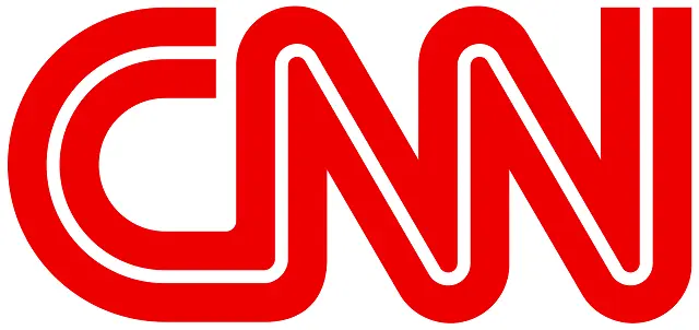
The CNN logo has combined the two “Ns” together so they share a common line. Fonts aren’t designed to do this naturally, so you know it was an intentional decision.
5. Choose the colors of your logo
Color is a powerful tool. Research has shown that people make a judgment about a product within 90 seconds and that between 62% and 90% of that assessment is based on color alone.
So, what does color tend to mean to viewers?
- Red: Confidence, youth and power
- Orange: Friendly, warm and energetic
- Yellow: Happiness, optimism and warmth
- Green: Peace, growth and health
- Blue: Trust, security and stability
- Purple: Luxurious, creative and wise
- Black: Reliable, sophisticated and experienced
- White: Simple, calm and clean
When choosing a color (or colors), keep in mind that most logos are three colors or less. There are always exceptions, but for the most part, brands tend to use fewer colors. This is even more true in recent years, with trends toward flat and minimalist design. Think about the logos you see on a regular basis — Twitter, Facebook, Instagram, TikTok, Pinterest, etc. They’re all a single color.
Playing with color in your logo is super fun, but something to factor into your choice is knowing that you’re sometimes going to be stuck with a grayscale version (typically for cost reasons — color is expensive).
You need your logo to stand on its own whether it’s in color or not.
Don’t let the color do all the heavy lifting. Make sure that you’ve nailed down your design first, then add color. The point is, you want a recognizable brand whether color is there or not.
Take the Apple logo, for example. You’ve seen it a million times I’m sure, and you never wonder what company it represents. No matter the color, this is clearly the Apple logo every time.
It’s a good practice to contact the support team of the logo maker tool you are using if you encounter any issues or have questions about pricing or features.
Related: The ultimate guide to social media image sizes
6. Experiment and test with your logo
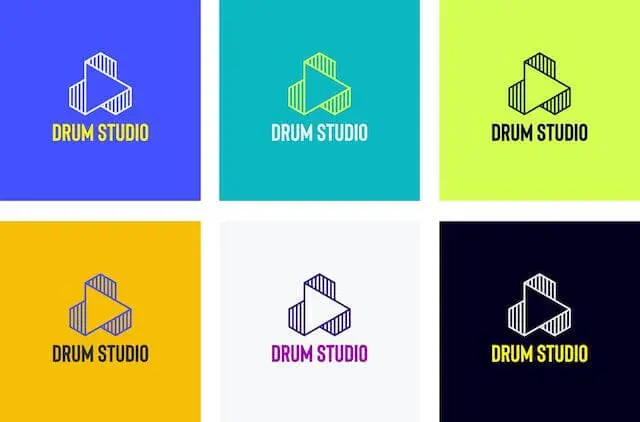
It's essential to create a few beautiful logos and experiment with them. Having logo ideas and trying different logo styles can be beneficial.
It’s time to test it out. Here are some ideas for what you’ll want to test:
- Business cards
- Stationery/invoices/receipts
- Store signs/billboards
- Favicon
- Digital display (social media, website, mobile devices, POS terminals, etc)
- T-shirts, hats, mugs, etc.
It’s important to design with multiple dimensions and sizes in mind. Using a vector-based image editing tool will help tremendously here, as it will keep your logo looking sharp at any size.
In addition to testing your logo on different product/content types, you’ll also want to test it on a variety of different colored backgrounds. Not every application for your logo will have a white background, so don’t build a logo contingent on that.
If you are a startup, creating the best logo that represents your brand well is crucial. A professional logo design represents the face of your company and is essential for branding.
Final tips for making the perfect logo
If you follow the above steps for how to create a logo, you’ll be off to a great start. But there are a few more tips that I want to share with you to ensure your success.
Be consistent
You will use your logo across many marketing channels, probably in print as well as digitally. So take the time to show off your brand in a consistent manner, using the same messaging, style of imagery, fonts, and colors.
This will inspire trust in your customers, and help with brand recognition.
If you get lax with this and start mixing in different colors or odd font treatments, it dilutes your brand and makes you look unprofessional. So keep it consistent.
Create a design that can evolve easily
Remember keeping things simple? This holds true for logo evolutions as well. If it’s too complex, it will be a pain to change later. So try to keep just a few important elements intact like the primary color and font. Then if you need to upgrade it later, it can be done with just a few small tweaks and the main identifying features remain intact.
Order some swag with your logo printed on it
There’s nothing that makes your new logo seem more real than custom-printed swag. Seeing your logo printed on bottles, notebooks, and t-shirts, makes you feel like a legitimate business.
So take a minute and order yourself some goodies.
And grab extras so you can hand them out around town. Giving clients, and potential clients a custom water bottle with your logo on it keeps it top of mind way better than yet another business card in their overstuffed wallet. I consider this the celebratory and most fun step of the logo design process.
Ready to create your custom logo?
Now that we’ve walked through the steps for designing a simple custom logo, I hope it seems more approachable and accessible. If you want to DIY your custom logo design, you can follow these steps and walk away with a well-planned logo that works beautifully for multiple platforms and uses.
Check out how easy it can be to create your own logo using GoDaddy Studio:
But if you go through the tutorial and still feel unsure, don’t be shy about hiring a designer.
FAQ for making a logo
What is a logo and why is it important to have one?
A logo is a graphic symbol that serves as the visual identity of a brand or business. A good logo should facilitate customer recognition of a brand, differentiate the brand from competitors and communicate the values of the brand. A logo serves as the foundation of your brand’s identity, making it an important aspect of your business that should not be overlooked.
What elements make a good logo?
Here’s a quick overview of what makes a good business logo:
- Memorable and unique.
- The design is balanced.
- Fits your business.
- Can be used in a variety of formats.
- The colors are appropriate.
- Your logo is future-proof for business expansion.
What is the standard size for a logo?
There isn’t a standard size for a logo; however, you will need to consider where you’ll be using your logo and base your sizing decisions appropriately. From a favicon to billboards, your logo should be flexible.
For a full breakdown on image size requirements on various platforms, check out our social media guide here:
How can I make my logo stand out?
There are a few options that you have if you need a boost to get your logo from good to great:
- Purchase premium graphics. If art isn’t your strong suit, consider buying graphics. Websites like Creative Market are excellent places to do this.
- Use a premium font. Standard fonts can feel a bit stale, so if you’re having issues finding a free font that fits your business, a premium font might be the perfect solution.
- Try creating a border. If you want your custom logo design to be more interesting and feel more contained, you can use a border, background or shape, around it.
What tools can I use to create a logo?
Your best options on the market right now for custom logo design tools are:
- Photoshop
- GoDaddy Studio
Photoshop
Photoshop is a “raster” image-editing tool. This means it uses pixels (tiny squares) to create images. This has advantages and disadvantages.
It’s great because it gives you incredible control over every aspect of your design. The disadvantage of using a pixel-based tool is the risk your design will look blurry, especially if printing it at a large size. Vector images are ideal for scaling up your logo.
Sometimes working with a large file to start with will help offset this issue. When learning how to design a logo in Photoshop, you’ll want to save it as a transparent PNG file. This ensures the custom logo stays crisp and doesn’t look blurry in the final version.
GoDaddy Studio
It’s no secret that eye-catching visual content is non-negotiable in the social media marketplace. But getting your brand to stand out from the crowd isn’t easy, and not everybody can afford a professional designer to make that happen.
GoDaddy Studio exists to solve this problem, making it quick and easy to create stunning visual content — on the web or mobile, for online or print. Think of it as your brand’s own design studio, and you’re the creative director.
The secret to GoDaddy Studio’s ease of use is an enormous, ever-growing collection of professionally designed and curated templates.
Simply pick a template best suited to your need, including logos, and customize it with your own copy, images, and colors — all at the tap of a button. Create a fresh, professional design in minutes, not hours.
The GoDaddy Studio is a logo creator and a logo editor in one tool.
Just make sure that whatever design tool you end up choosing can create crisp designs and has the ability to save transparent .png files. And if the tool also gives you the ability to use high-quality fonts you’ve purchased, that’s even better.
Create your quality logo with our free logo generator today!
