Brand identity is often the last thing on the list when starting up a business. But, let me tell you that it's worth investing brainpower in creating an awesome brand identity — before you go the whole hog and launch your business.
Wondering what I mean by brand identity? Here’s an easy-to-digest definition:
The visible elements of a business — such as colour, design and logo — that identify and distinguish the brand in the consumers' mind.

But if you dig deeper into that definition, you'll realise that brand identity is more than colours and a logo. It's where the visual elements and words come together to communicate the very essence of your business. They speak to:
- Your business values
- Your mission
- What you say, promise and deliver to customers
Let's look at a few Australian brands that I'm sure you're familiar with.
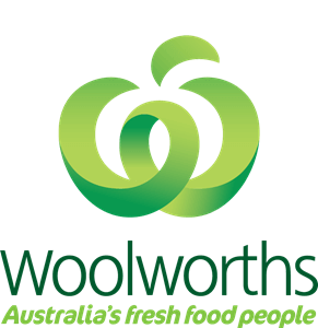
- Woolworths – The primary colours of this brand are green, and gold (very Australian, don't you think?). The logo is a stylised 'W' that looks like an apple, representing their core value of delivering fresh food.
- Commonwealth Bank – Or Commbank, as we know it today, features a yellow diamond-shaped logo (yellow being representative of wealth). But look closer, and you'll see that the shape represents the stars of the Southern Cross.
- QANTAS – Arguably one of Australia's most recognisable brand identities, QANTAS, has undertaken seven rebrands during its lifetime. Today, it's famous for being the 'flying kangaroo' in the unmissable colours of red and white.
These businesses invest significant dollars in their brand identities, helping them become the most recognisable and best-performing brands in Australia.
How do you create a brand identity when your budget isn't as big as Ben Hur? Let me walk you through it.
5 key elements of a cohesive brand identity
A strong and memorable brand identity is critical to your business's success and longevity, and that's why it's a key factor in your overall brand strategy.
When you've crafted an instantly recognisable brand identity, your business can lift off the ground by:
- Standing out
- Attracting new customers
- Keeping your existing customers coming back
Through consistent use over time, customers and prospects alike will come to recognize your brand colours and shapes.
1. Logo (or wordmark)

Seeing your logo for the first time can send happy shivers down your spine — it's a moment you'll remember forever.
Your logo must create a positive and memorable impression on your customers.
A logo can be a symbol only, a symbol with text or just text. Regardless, its purpose is to be distinct and create that 'at-a-glance recognition' of your brand.
You'll know you’ve landed on the right logo when your designer offers you one that:
- Sets you from your competition
- Appeals to your target market
- Represents your brand story and values.

It's worth investing in a professional to help design your logo if your budget permits, but if you can't, it is possible to make your own logo.
Check out The World's 20 Most Recognisable Logos & Their True Meaning to help inspire your own logo creation.
2. Colours
When it comes to creating brand recognition, consistency is the key. And, there's no better way to achieve this than by having a set colour palette for all your materials, digital and print.
In marketing, colour is an emotional cue and may influence the way people react or respond to your brand.
Marketer and blogger Neil Patel tells us that 85% of shoppers say colour is a primary reason for why they buy a particular product.
Before you start thinking you have to be an artist or graphic designer to come up with a solid colour scheme – stop. You can easily research colour theory and psychology to help inform your colour choice.
You'll also need a thorough understanding of your type of person most likely to buy from you and the message you want your brand identity to project to them.
Here are examples of colour meanings:
- Red – Red stands for energy, passion and danger
- Orange – Orange can represent creativity, youth and enthusiasm
- Yellow – Yellow means happiness, hope and spontaneity
- Green – Green stands for nature, growth and harmony
- Blue – is for calm, trust and intelligence
Tools like Colormind, Over by GoDaddy and Coolors make it easy to create a complementary colour palette to support your brand identity. Once you’ve chosen a palette, stick with it.
3. Typeface
The third element to consider when bringing your brand identity together is typeface, which is more commonly referred to as font.
Font is a set of characters of the same style and size.
It's how your words will look, wherever they appear — from your business cards and emails to your website and printed materials.

Again, it's the consistency across elements that increases the chances of viewers recognising your brand.
The perfect font for your brand is one that:
- Is unique and memorable
- Works on every platform
- Is legible
- Communicates your brand personality
Here's an excellent guide to how different typefaces can greatly impact the way your brand communicates.
4. Tagline
"Aussie kids are Weet-Bix Kids" "Lucky you're with AAMI", and "Not Happy Jan" are all examples of iconic Australian taglines.
Then there are international brands like Nike with "Just Do It", Apple with "Think Different" and Coke with "Taste the Feeling."
A tagline is a catchphrase or slogan that tells people who you are and what you stand for in a few short words. That's why you need to have a good handle on what your business does, who it does it for and what sets you apart from your competitors before you launch into tagline development.
Sumo.com provides five tips for crafting your business tagline:
- Keep it simple
- Give it meaning
- Clarity is key
- Focus on the benefits
- Tell a story
Read 7 Australian Companies with Great Taglines to gather even more ideas.
5. Packaging
This last element of brand identity is relevant to starting a business where you're selling products. Your product packaging serves four essential purposes:
- Protects your product
- Displays and promotes your product
- Attracts buyers
- Differentiates your product from competitors
Product packaging is a combination of the other four brand identity elements all rolled into one attention-grabbing and attractive…well…package.
You'll need to consider your choices in material and form, then combine it with your logo, colours and fonts to design your box, wrapping, bag, glass, or however you've packaged up your product.
Canva provides 50 insanely creative and stunning packaging designs for you to consider.
Branding do's and don'ts
The following list of do’s and don’ts is a quick reference to help you make strategic decisions that will serve you over the long term.
Brand identity do's:
- Be different and memorable
- Create a branding style guide
- Be consistent
- Deliver on what your brand identity promises
- Engage a professional to help you if your budget permits
Don't do this with your brand identity:
- Wait too long to create your brand identity
- Create a brand without knowing your target audience
- Design a meaningless logo
- Overdo the colour scheme or over complicate your style
- Be inconsistent
Start building your brand identity now
You're now armed with the five crucial elements needed to create a memorable brand identity – plus a few extra considerations to keep in mind.
Creating your brand identity is a fun and exciting effort. Be creative. Don't settle on the first thing you create. Instead, go through a few iterations and seek feedback from friends, family and, even better, your target customer.
