A cool logo is an essential asset for any new business — the crest on your banner as you charge into battle. It’s also a really satisfying creative undertaking, officially bringing your idea to life with its unique visual signature.
GoDaddy Studio makes logo design easy for non-designers.
Let’s take a look at how it works.
Editor’s note: If you use GoDaddy’s Website Builder, you already have access to GoDaddy Studio. Alternatively, you can sign up for GoDaddy Studio here.
For most people getting ready to make their dream venture a reality, “get a logo for my small business” is often one of the first notes they’ll scribble on the to-do list.
There’s undoubtedly a psychological benefit to getting your logo designed early in the brand-building process. Your logo is the flag you fly out there in the world, a symbol for your brand’s unique story. Done right, it can create an instant impression of what you’re all about.
A logo also symbolizes an accomplishment. Your logo announces that you are here, and you are ready for business.
As soon as you start seeing your logo on your social posts, website, business cards, products, or even signage, it all starts to feel much more real.
Designing your logo is the logical first step in developing a full brand identity.
Considering that your logo always needs to feel perfectly relevant in any design you create, it does in many ways become the sun in your design solar system.
More practically, this is likely to be your first creative project in assembling a full brand identity kit — so fall in love with the process and have some fun with it.
GoDaddy Studio makes it easier than you imagined to create your own business logo. In this post we’ll take you through the set-by-step process of how to create a logo for a small business, focused on four key elements you’ll be selecting:
Along the way, we’ll include some design advice from expert design team members.
Creating your small business logo
Let’s dive right in with a few basic principles of logo design, to set up some guard rails. Daniel, Senior UX designer, reckons there are four key principles your logo should adhere to. Throughout the design process, keep asking yourself if your logo is moving towards being:
- Simple
- Timeless
- Appropriate
- Relevant
Inspiration is your starting point. Daniel suggests looking around at what popular logos inspire you: “Analyse their characteristics. Decide what you would like to capture in your new logo and take the findings into your creative process.”
“Definitely don’t copy someone else!” says Kaeli, our brand designer at GoDaddy Studio. “Finding inspiration is natural, but you want your logo to be uniquely you.”
You should have your brand’s story defined before you commit to a logo design.
Through this process you would have worked out some ideas about the personality of your brand, so draw on that.
Kaeli likes to think of a brand as a living entity: “Question who the brand would be if they were a person. Make notes of a few adjectives that describe that person.”
“Hold this imaginary person in your mind. As you design your logo, ask yourself if the font you are using matches that description.”
You’ll quickly find that human traits like ‘playful,’ ‘unconventional,’ or ‘elegant’ are equally applicable to fonts and graphics.
Fonts for a business logo
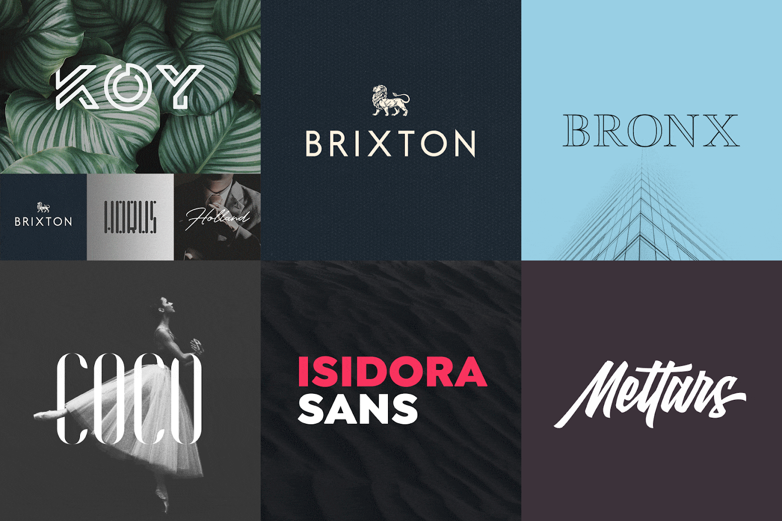
Fonts in particular come with cultural meaning and expectations baked in. Here are a few examples.
Serif fonts tend to represent tradition, respectability and discernment:

Sans Serif fonts signal modernity, objectivity and even innovation:

Modern fonts are progressive, strong and stylish:

Display fonts are friendly, expressive and amusing:

If you’re really intimidated by the idea of designing a logo for your business, don’t forget that you can always just find the perfect font, and go minimalist with text only (referred to as a ‘wordmark’ in design circles). Many brands — even some of the world’s biggest — opt for this no-nonsense route. It’s a pretty confident move, in fact.
In Daniel’s view, this is an important upfront decision to make: “Decide if your logo is just a word, or a combination of a logomark and a wordmark. The best approach is to start simple.”
It’s quite common to have both a wordmark and a logomark in your design kit.
They can live together, or separately in certain situations.
Bear in mind that it could take some time for your logo to be recognised on its own, without the brand name visible.
If you’re going the text only route for your logo design, don’t settle for the default.
“GoDaddy Studio allows you to control the spacing between letters (‘tracking’), as well as the curvature,” explains Aqeela, brand and product designer.
“Play around and see how tracking and curving makes your logo that much more unique.”
Graphics in your business logo
Should you decide you want a logo with text and imagery, the perfect graphic is the other vital ingredient for a great logo design. This will essentially be the icon of your brand.
There are a few different approaches when it comes to thinking about this:
Literal
A universally understood object associated with your industry. For example, a wave for a surf brand, or a spectacles for an optometrist.

Lateral
An icon that alludes to your story or your point of difference. For example, a sunrise representing a new dawn in your industry, or a tree to stir up associations with growth.
Narrative
A key figure, place, or object in in the story of your brand. For example, the beagle your doggy couture line is named after, or the historic homestead on your farm.
Abstract
A brand new symbol or shape that has never existed so that you can build a brand free of cultural or category baggage. In these instances, story is perhaps less important than an impactful design.
The best part about GoDaddy Studio is that you don’t have to create these illustrations from scratch or have them commissioned.
Whether it’s something simplified, or realistic, we have thousands of illustrated graphics to choose from in our library — the perfect foundation for a logo design.
Another idea is to use the first letter(s) of your brand’s name as a logo, with the full name underneath it.
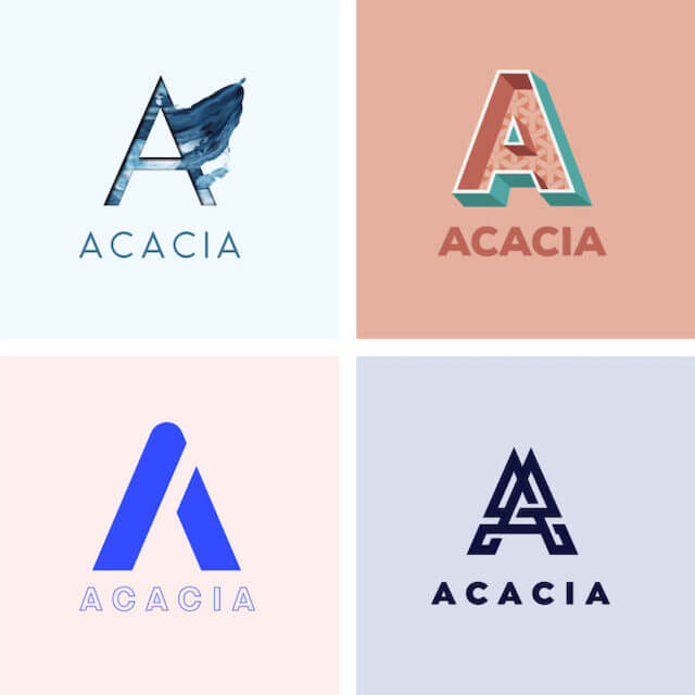
This is what the city of Melbourne did with their logo.
If you go this route, a basic font won’t cut it — you’ll want to look for something more elaborate or decorative.
And don’t worry about finding an affordable calligrapher, because we have a whole stack of ornamental alphabet graphics to choose from in GoDaddy Studio.
Shapes in your business logo
A circle is one of the most commonly used shapes for a business logo, with the wordmark or logomark often appearing within the circle.
Aside from being perfectly balanced, it’s a great device for creating a boundary for your logo. This can make it much easier to add to a design, almost like placing a sticker.

A classic recipe for business logo design incorporates all three of these elements:
- Text: The name of your brand, and maybe a slogan or descriptor
- Graphic: The central, representational element in your design
- Shape: Something to contain your logo – perhaps a circle, a box, a sunburst, or a banner

Here’s a step-by-step tutorial on how to easily combine these into a logo design in GoDaddy Studio.
A note about contrast
Size is the other crucial aspect to consider when designing your own logo. It needs to be scalable — in other words, it must be legible and look good at any size large or small. Hopefully, it ends up on the side of a building one day … but it also needs to be visible as a thumbnail on a website, or a tiny little tag in a T-shirt.
“Contrast is something you really need to think about,” according to GoDaddy Studio’s UX designer, Aqeela V.
“Fine details, or similar colours next to each other, will be very hard for the eye to make out at small sizes.”
Size, spacing, and colour combinations all affect contrast. The smaller the difference between lines, letters or colours, the harder it is to read.
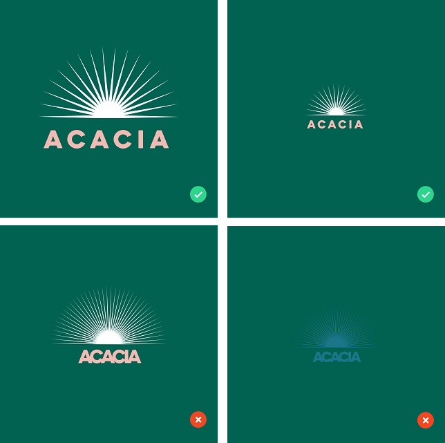
In this regard, it’s also important to export your logo design in a file format that will allow scaling, and placement.
“Always export your logo on a transparent background, as a hi-res PNG or PDF file,” Aqeela S suggests.
“This will enable you to resize it later and use it in almost any context.”
Colour in your business logo
When it comes to colour, less is always more.
“Use colour sparingly,” Daniel advises. “Only introduce colours to your logo once you’ve established it working in black and white. Make sure it works in its simplest form first.”
Almost all brands will have colour and monochrome options for their logos, and we suggest you do too.
“Only apply colour if it’s on a neutral background or it’s a complementary colour to your brand colours,” is Daniel’s advice.
A colour logo might look great on your business card, but it could blend in and disappear on a photographic image, for example.
The beauty of single colour logos
Single colour logo options are also really useful when it comes to printing things like business cards, T-shirts, or stickers, since it’ll lower the cost.
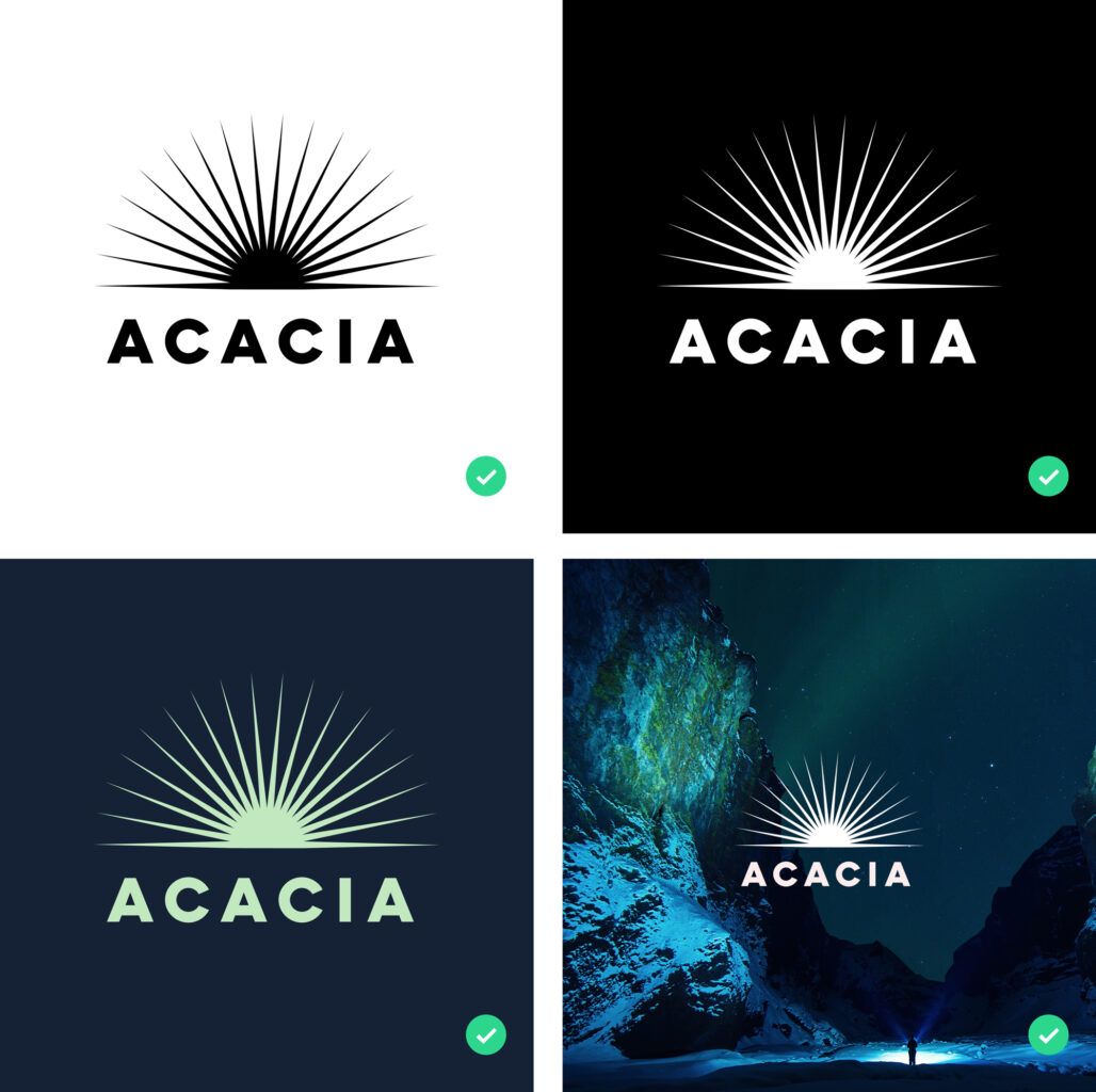
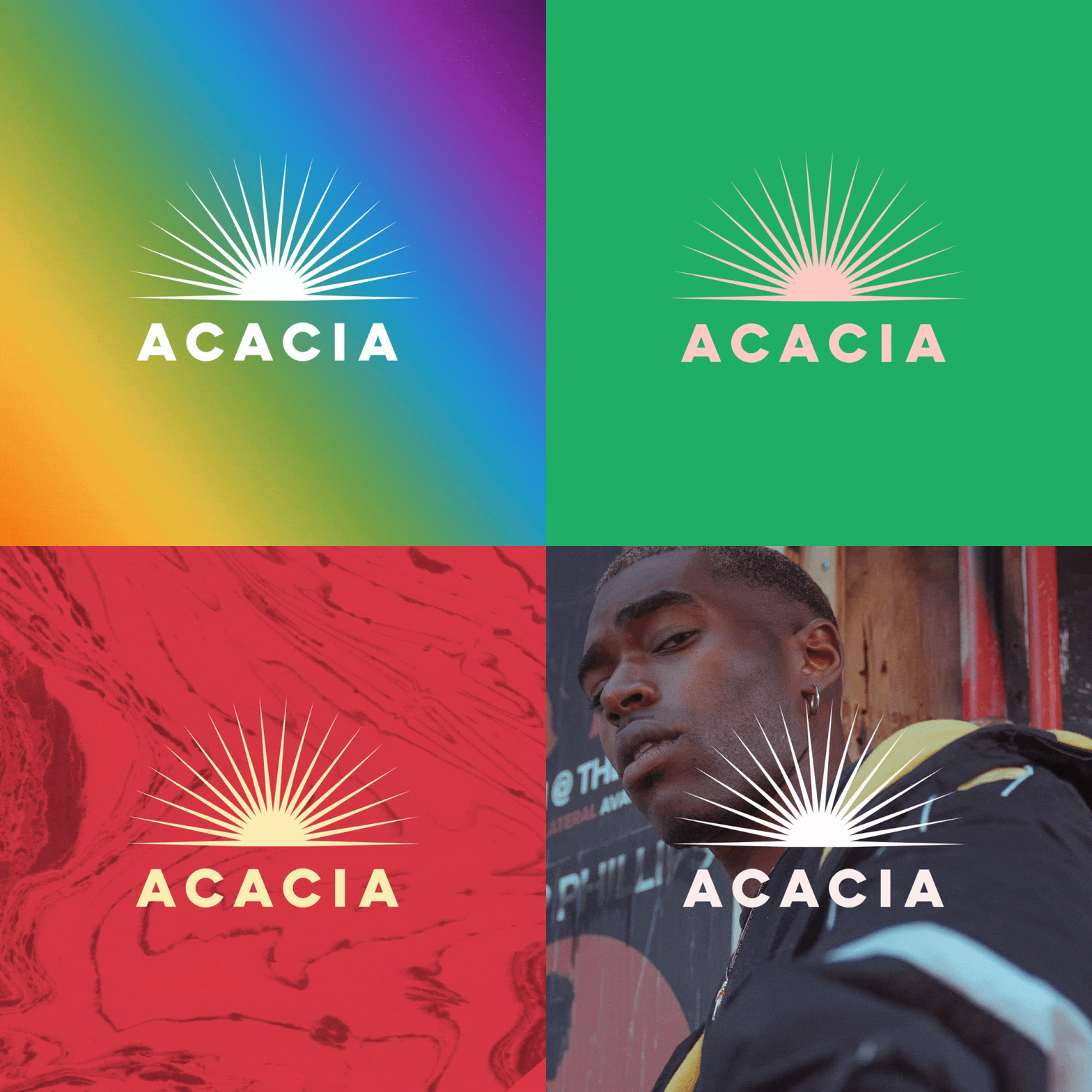
A single colour logo is also very useful for seasonal, campaign or collab applications. You can easily create unique colour variations (rainbow during Pride month, or green and gold on Australia Day), and use different graphic backgrounds to keep your brand identity fresh and dynamic.
Saving and using your small business logo
Once you’ve arrived at a design you’re happy with (including some variations) don’t forget to save them as hi-res PNG files, and then upload them to your Logos folder if you’re using the GoDaddy Studio app.
They’ll remain saved here, so you can add them to any of your designs in an instant. If you’ve used the desktop version of GoDaddy Studio, you can find any images you create in the My Projects section.
The final step in the logo design process is to see how it lives in the wild, so to speak.
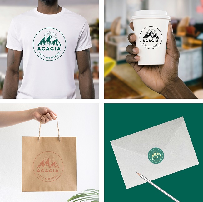
“Test your new logo on everything,” is Daniel’s advice: “Use the mockups in our Graphic collections and test your logo on everything from coffee mugs to stationery assets. A good logo is adaptable.”
Remember — creating a logo is a process. Play around, make some mistakes. Go for a walk around the block and come back to it.
You’re unlikely to get it perfectly right on the first go, so commit to ongoing refinement.
“Know that even the most experienced designers go through dozens of iterations,” is Kaeli’s final nugget of advice. “Keep going until it feels exactly right.”
Because it will. And when it does … well then, we’re just getting started.
Summing up
Creating your own small business logo can feel like a major challenge. However, with the right tool and a little planning you’ll find you’re more than capable of creating something that you’re proud of.
You’ll need to take a few decisions about your small business style and then decide how to translate that into a logo. Following the above steps on choosing fonts and graphics for a business logo will help you do just that.
Don’t forget, GoDaddy Studio comes as standard with Website Builder and is also available as a standalone product.

