To the majority of entrepreneurs and small business owners, a website ends up being more of a chore, than anything else. They build it, and leave it to take care of their daily hustle. What if your website could be an honest-to-goodness sales machine? A channel to bring you qualified leads, that takes less effort than managing a full sales team? In this article, I’ll be giving you some handy pointers on how website design can help you increase conversions and sales.
What is Conversion Rate Optimization?
Without digging into too much jargon, there’s a method where designers and marketeers crunch data, both from analytics tools and user feedback. It’s called Conversion Rate Optimization, or CRO. This technique provides insights into fine-tuning a website, and making the best possible ratio between visitors and a specific action. This can be leveraged into acquiring new customers, gathering leads, downloads, etc. Say, last month, you had 1,000 visitors to your website, and 10 requests for proposals: your conversion rate will be 1 percent.
A quick disclaimer: Keep in mind that insights from each analysis will be highly contextual (what works for one company or industry doesn’t necessarily work for another).
Website design tips to increase conversion
I’ll list a few key areas where you can get started to improve your website’s design to increase conversion. I recommend you commit not only to implementing them, but also to measuring it, and constantly improving. Think of it as a continuous process.
Here goes:
1. Place your call-to-action above-the-fold
Take a step back and consider something for a second: what is the goal of your website? Is it making a sale or acquiring a lead? With that in mind, each page of your website should have a beautiful and prominent call-to-action — be it a button or a form — right above-the-fold. That means the visitor doesn’t have to scroll down in order to see it.
Also, by adding a benefit to following your call-to-action, you have a double win! Instead of a generic “Buy Now,” try “Start My 14-Day Free Trial.” Test a few different colours. With only this slight adjustment you can heap extra conversion points.
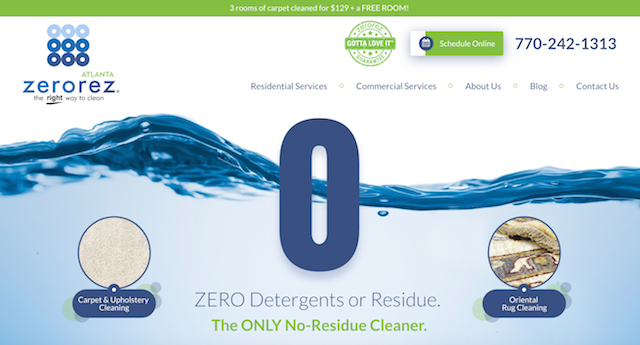
2. Pick a punchy and clear headline.
Still at the page above-the-fold: research shows that 55 percent of visitors spend fewer than 15 seconds on a website. So make sure you have a creative, bold and catchy headline. Besides, text attracts attention before graphics. To help increase conversions with design, consider bold fonts taking the stage, and paint a persuasive picture with words for your target audience.
Add social proof elements
Science backs the claim that social proof sells. Robert Cialdini’s best-selling book, Influence: The Psychology of Persuasion, lists social proof as a go-to resource for people who might be doubtful about what to do.
Buyers turn to their fellow buyers for guidance and inspiration on their purchasing decisions.
They seek out knowledge on what everyone else is doing, and allow it to influence their shopping experience. For Cialdini, “laugh tracks on comedy shows exist for this very reason.” Translating that conceptualisation into website design to increase conversions, add the following elements to your webpage:
Testimonials: People sharing how happy they are, by using your services or products. Top it off with a few choice numbers, pulled from their results. (“Lost 5 kilos in 3 weeks,” “Increased 23% in billable hours,” etc.), their picture, a few full names, and boom! You have a recipe for success, and a great starting point people can relate to it. Make it real.
Get tips for developing testimonials for an eCommerce website.
Case study: Another powerful tool for adding social proof to your website is storytelling. Think of a case study as a testimonial on steroids: you tell the customer about their background, their problem and how your company has already solved something exactly like that. Design-wise, you can distribute case studies in a multitude of formats: a report, a video, (see next point) or, simply, a section on your website.
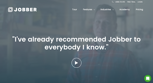
3. Show and tell with a video.
It’s been shown that videos can dramatically increase conversions. This alone seems a good enough reason to start thinking about how to add them to your website.
Some great ideas:
Behind-the-scenes: Show off the work that went into creating your product. This will increase your likeability, and bring the visitor closer to your brand.
Product tour: A quick 60 seconds on your product, and its benefits, will save the visitor's time scrolling around your page.
Case study: Pick one of your customers, and tell their story. Think of a format — such as Problem, Solution, Results — and embody that in a simple script.
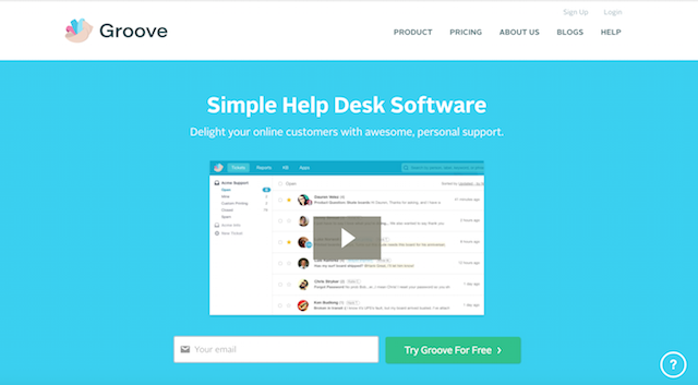
4. Show off your badges.
Adding badges as a design element can bring that extra element of trust to your website. We can organise these into three categories:
- Trust badges: Typically from review sites. Trustpilot is popular in the B2B market, while TripAdvisor and Yelp are popular for consumers.
- Security badges: Badges provided by companies like McAfee demonstrate that you have an encrypted link between your website and your visitor’s browser. These badges assure all info sent through your landing page forms is secure.
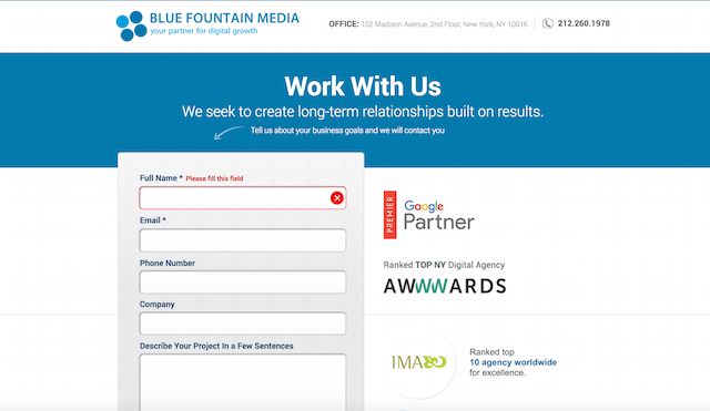
- Award badges: Highlight your best-in-class status with badges for industry-specific awards, like Awwwards for the best web designers, developers and agencies.
Summing up
Consider the points I’ve outlined above as a starting point to boosting your website’s conversions and sales. Don’t only implement them, but remember to measure and always work toward improving your performance, and you’ll have a surefire path toward increasing your lead generation, and growing your business.

