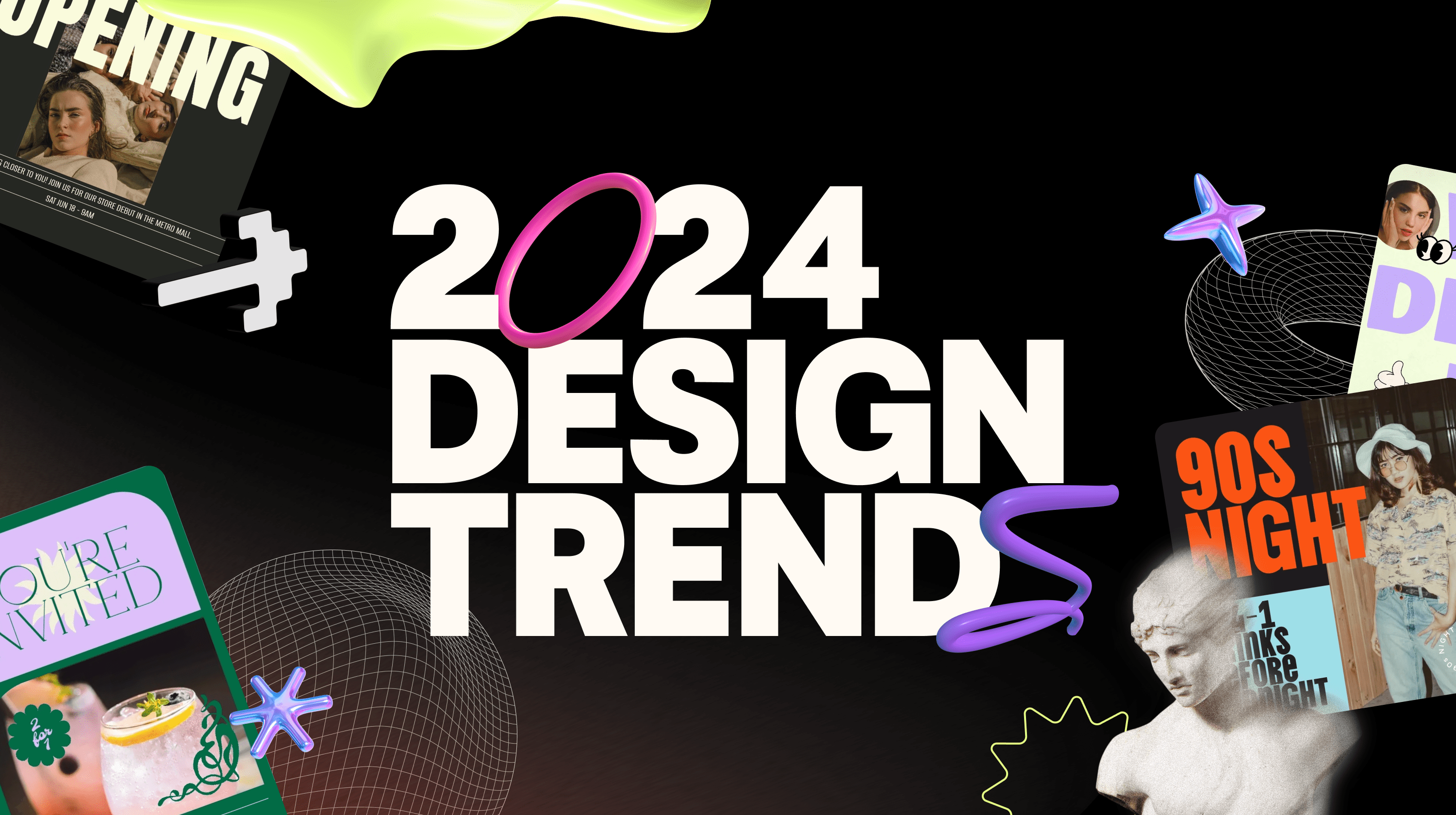
As we move deeper into the digital age, the landscape of design continues to evolve at an astonishing pace. It’s driven both by technological innovation and creative genius. This year is no different, bringing with it a fresh wave of digital design trends that are primed to redefine the way we interact with digital platforms.
In 2024, we see trends crossing opposing fields. While some designers are leaning into chaotic disorder, others crave meticulous structures and systems.
From colorful 3D elements to nostalgic throwback trends, let's take a journey into the leading digital design trends.
Related: 10 of the best freelance websites to help you start your side hustle
Digital design trends for 2024
With the dawn of each new year, we are introduced to a fresh wave of creative trends that set the tone for digital innovation, and 2024 is no different.
Our Studio team here at GoDaddy has been working hard to research and discover the trends leading the way this year. So let's dive into the results of their research and uncover the future of digital design trends for 2024.
- 90s Throwback
- Vintage Valentine
- Party Flash
- Grunge 2.0
- Swiss Gridding
- Min-Max
- Year of the Bold
- 80’s Bytes
- 3D Fun
- 3D Inflatable
- Homespun Luxury
- Bubbly Bento Box
- Vintage Vivant
- The Wes Effect
- Mod Environmentalist
- Maximalist Composition
- Abstract Characters
Prepare to be inspired!
1. 90’s Throwback
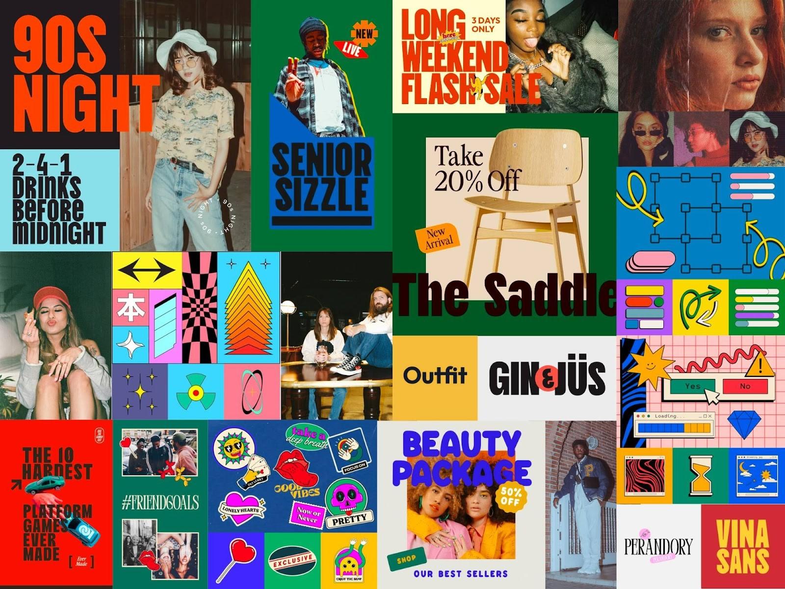
The magic of the 90’s is back, infusing its nonchalant charm into various aspects of modern life. 90’s Throwback is the elevated after-school special we can’t wait to watch unfold across industries and brands alike.
90s throwback reflects a comforting nostalgia with a contemporary twist.
In an age where authenticity drives consumers on and offline, it’s more than clear why we’re seeing this trend take us back to a decade. In the 90s many embraced bold experimentation and individuality.
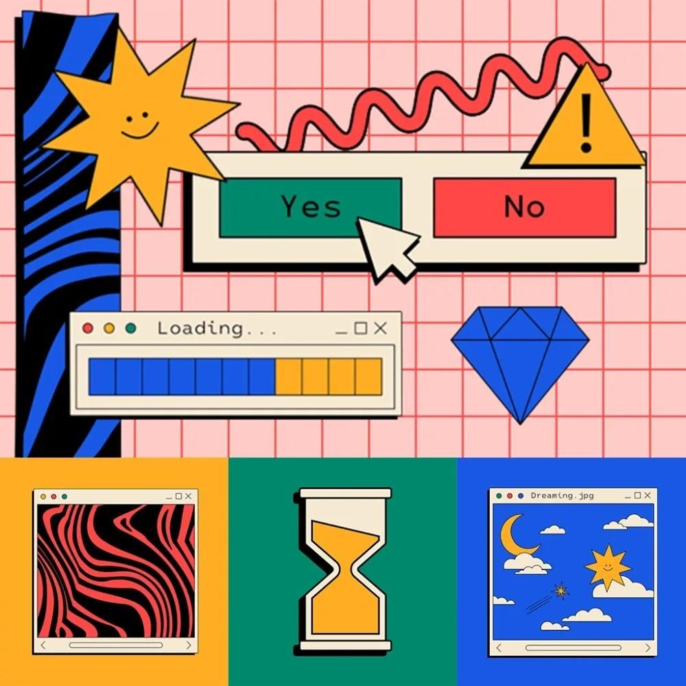
This trend harkens to a time of new opportunities, with the dawn of the digital age pushing the boundaries of what’s possible in a rebellion of form and function.
Like a slightly grainy yearbook photo, this trend takes us back with:
- Use of primary colors
- Reimagined 90s fonts
- Outlined or illustrated elements reminiscent to the stickers on your favorite class notebook
From fashion to branding, and even product design, the throwback trend is perfect for brands looking to tap into the defining and dynamic decade of the 90s.
Related: The best TLDs for web designers and developers
2. Vintage Valentine
Sugar-sweet and often hyper-feminine, Vintage Valentine indulges in the soft and elegant styles of the coquette, Rococo, and ballet-core aesthetics. At the same time, it maintains the sharp and biting edge of rebellious youth.

Think quill pen, love letter, vintage sketchbook paired with the whimsy of playing dress-up.
It’s the indulgent icing on an eloquently piped cake, the too-perfect place setting that evokes a visual sugar rush.
Designers should quite literally play in the nostalgia of frills, bows, hearts, and ribbons (in excess!). It can be achieved by using blushing color palettes, refined scripts, and hand-drawn elements, juxtaposed with the contrasting edge of flash photography. We see this trend embodying a sharp but playful design aesthetic.
Underneath this bow-topped trend is a:
- Celebration of the feminine and playful aspects
- Confrontation and subversion of the expectations of growing up
The business uses for this digital design trend starts with spaces of fashion and retail but isn’t limited to events or even food and drink design.
An exquisite pas de deux between Rococo ornamentalism and the simpler nostalgia of girlhood, this trend will have Millennials and Gen Z wrapped around its finger in 2024.
Related: How to overcome the 4 key challenges of service marketing
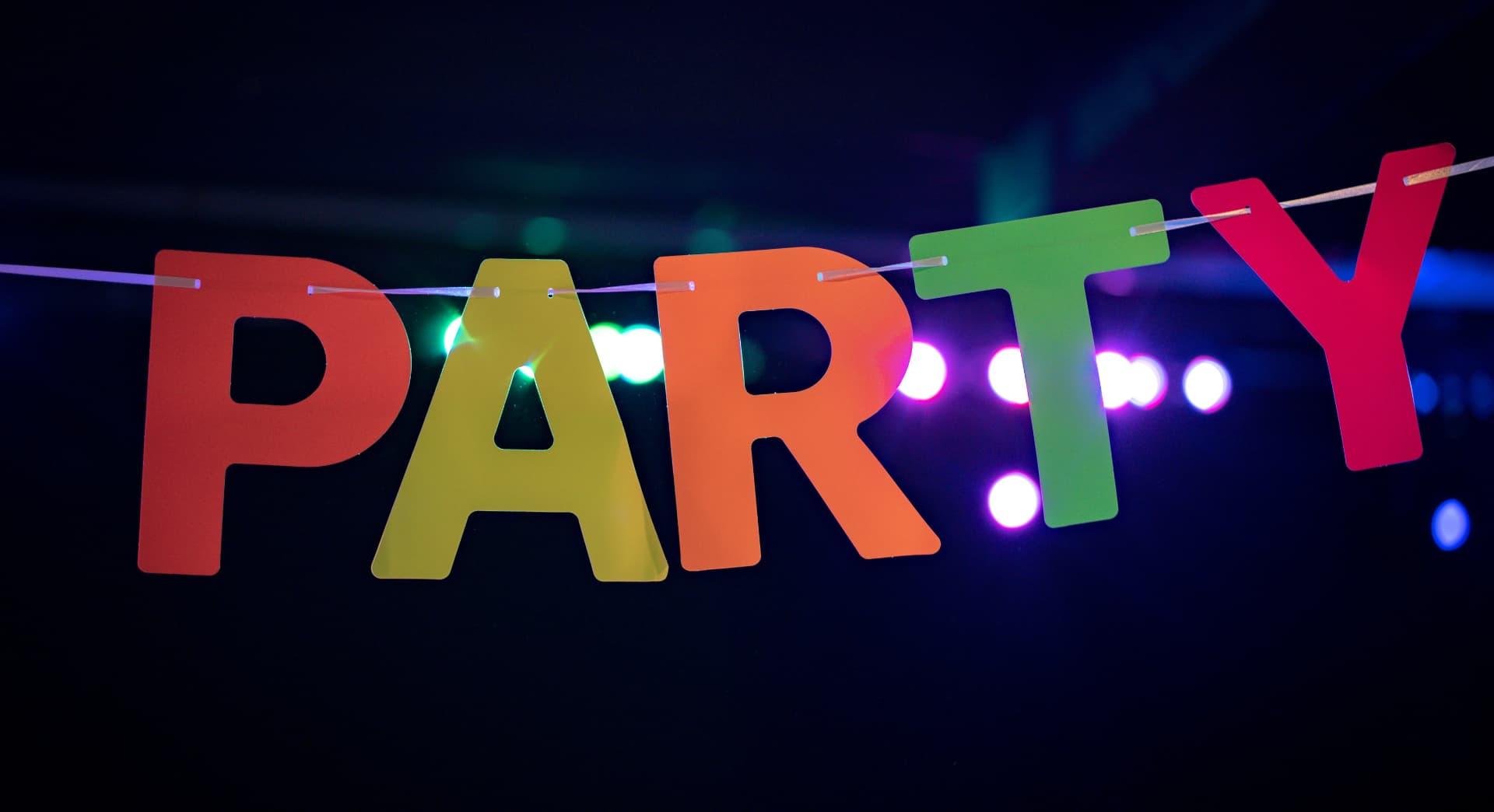
3. Party Flash
It’s a night out, it’s the buzz of a crowded room, it’s your cool best friend — this is Party Flash.
This trend thrives in the motion and nonchalance of a good time.
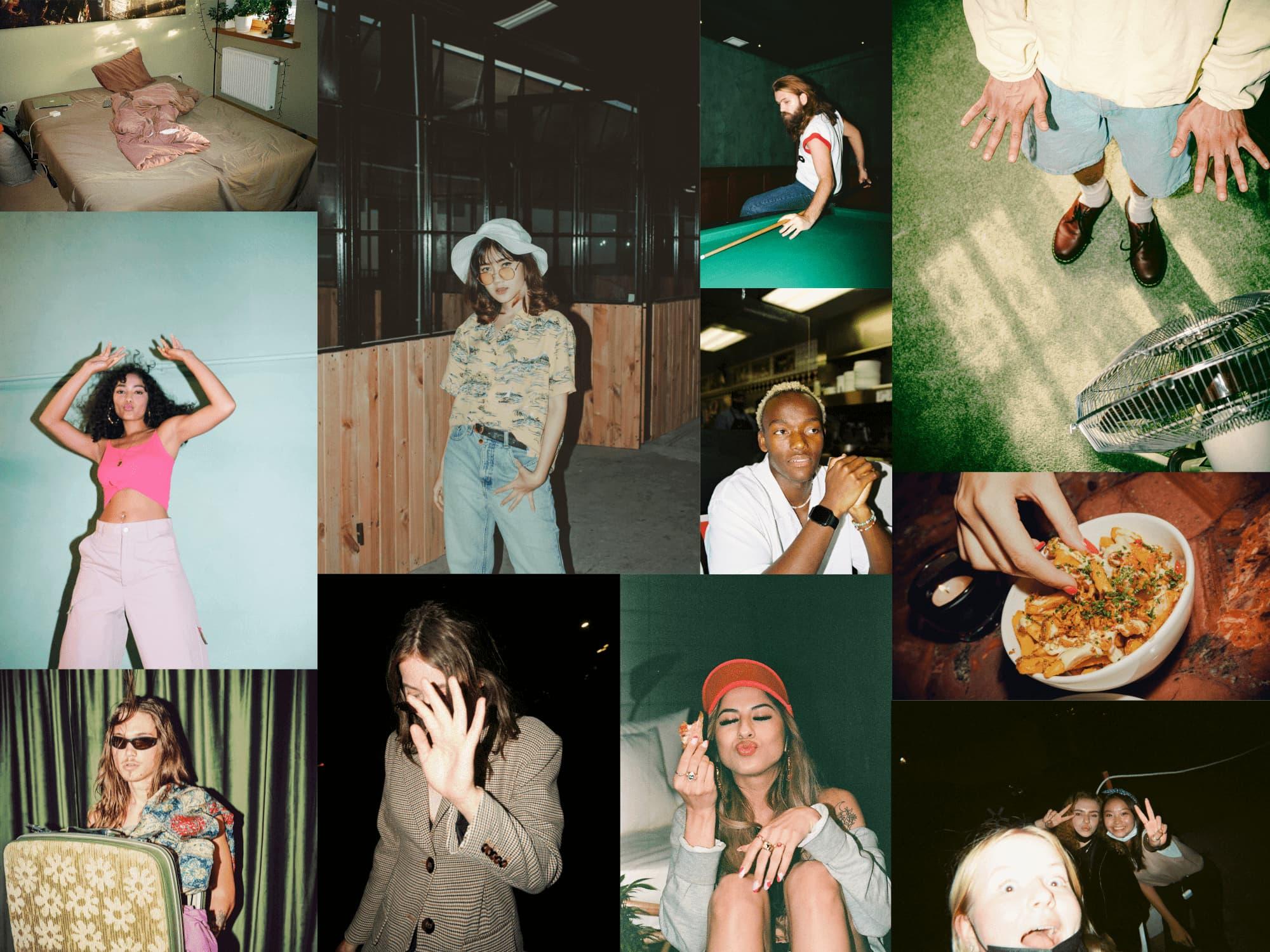
With a show-don’t-sell attitude, it leaves viewers wishing they had been on the invite list.
Where we’ve seen brands in the past rely on tidy, curated spaces and product-centric photography, Party Flash makes the most out of moody and haphazard product placement.
This trend aims to create feelings rooted in a reality a little cooler than the one you’re living in. It shies away from vibrant colors and leans into the intimate feeling of underexposed film.
Subtle grain, noise, and that dust-on-the-lens feel create an intoxicating aesthetic that portrays products as a good-time essential. Party Flash is seen across industries from retail and fashion, food and beverage, and even event spaces.
Party Flash flaunts an originality that builds trust with its behind-the-scenes aesthetic and no-filter flash. Younger generations continue to suffer from ad burnout online. In response, this trend uses an evolved method of product placement, making ads cool again.
And it’s not just used by brands trying to sell. This style of photography is also gaining popularity within wedding and event documentation as well. 2024 continues to reward authenticity across platforms and as always, we see content following suit.
4. Grunge 2.0
Rejecting the glossy, polished image of mainstream AI imagery, Grunge 2.0 is making its mark. It carries an anti-establishment ethos and a break-the-rules attitude in its use of discordant hues and gritty textures.
Grab your Docs, Grunge is back in a big way.
Odd angles and imperfect layers are just a few of the qualities that resonate with a generation seeking a departure from the shiny mainstream excess we often see online. It breaks the mold with its use of low-contrast colors paired with black-and-white photography elements.
Grunge 2.0 uses punchy, block sans serifs in contrast with gritty or hand-drawn fonts as a nod to the edgier side of the 90s trend revival.
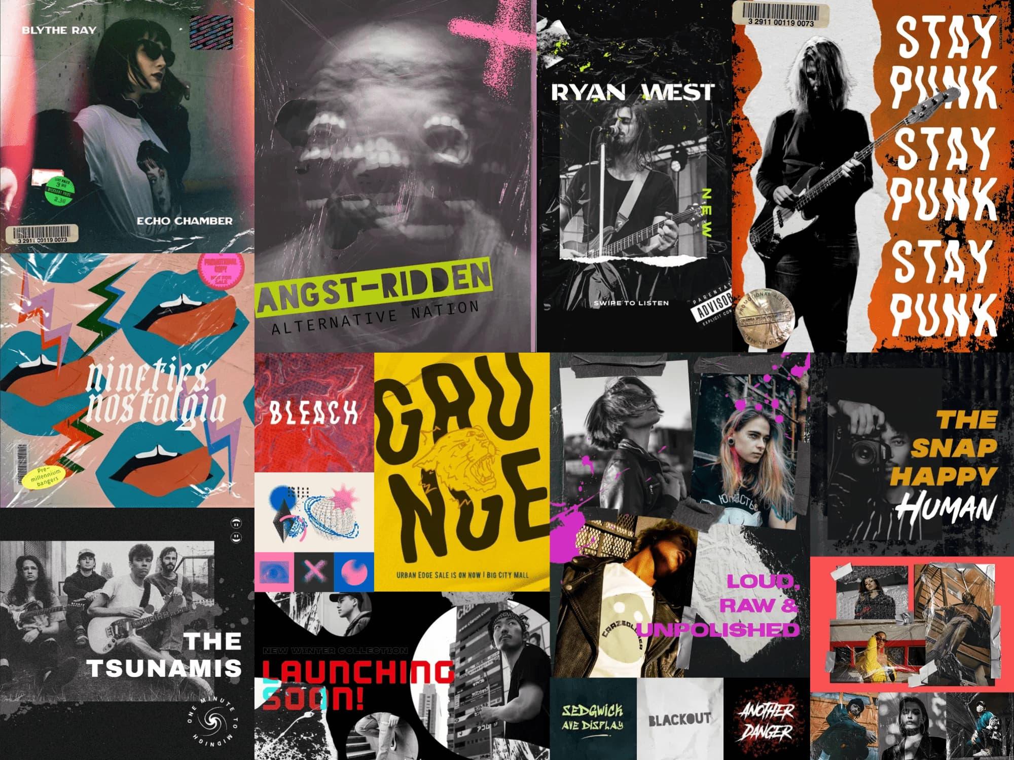
Gritty textures that resemble film grain or newsprint are lifted from analog technology.
Its poster-like layouts and hastily scribbled manifestos are a nod to the underground music scene of the 90s.
Trends usually emerge to find and create balance. As we see polished otherworldly AI-produced art splash across feeds, the natural reaction is a return to analog.
Unlike 90s Throwback, however, Grunge 2.0 takes its response to the rejection of mainstream commercial norms further. Seen used in event promotion, retail, and fashion, Grunge 2.0 is a perfect choice for brands that lean into the chaos of counterculture.
5. Swiss Gridding
Orderly and contained, Swiss Gridding is a digital design trend derived from the foundation of Swiss design.
This is a minimalist design style that favors block layouts, sans serif typefaces, and clean photographs.
Pulling influence from the 50s and 60s movement, Swiss Gridding suggests a structured approach using rows and columns to organize design.
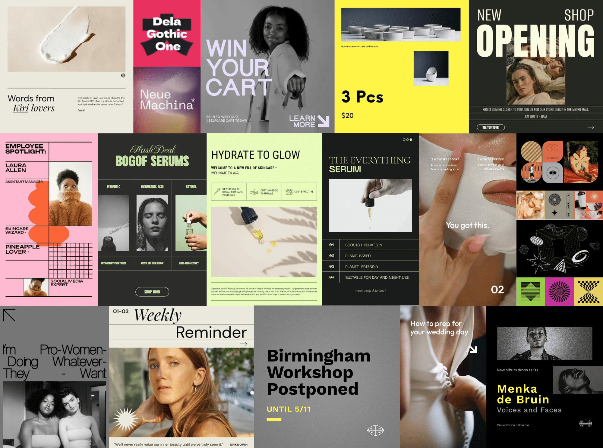
Information hierarchy is key and is often achieved by guiding the viewer through scale, color, and careful placement of elements on a grid. The modular design creates structured, organized, and visually balanced layouts that communicate information clearly.
Don’t let the use of the grid fool you, this trend often uses asymmetry to create dynamic compositions.
The use of a limited color palette — often favoring black, white, and a few accent colors — is intentional and contributes to the overall simplicity of the design. This is a restrained style that revels in breaking the rules of visual organisation.
The clarity and simplicity of Swiss Gridding invites viewers to a well-worn path or neatly organized routine. Seen across the fashion, beauty, events and travel industries, this trend calls to brands looking to fit a modern mold of luxury design.
6. Min-Max
Two sides of the same coin, Min-Max pushes the boundaries of minimalistic design. Simple yet never boring, this trend creates contrast in form and function.
Min-Max creates a crowded minimalism aesthetic that leans into the best of both worlds.
Typography is king in a trend that relies on minimal textures and design elements. Where Swiss Gridding sticks to its careful placement, Min-Max creates a haphazard hierarchy through type and bold color.
The layouts are stark but crowded in their use of unique type alignment and overlapping elements. A callback to the analog of print processing, this trend gives viewers a peek at slices of imagery as if cut through with a sharp knife.
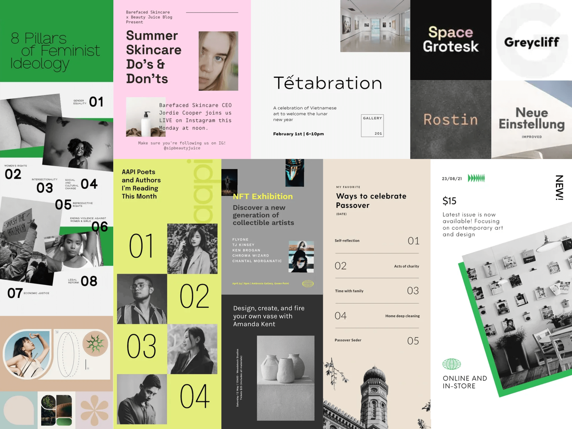
We see brands moving away from neutrals to a bolder color palette.
Min-Max can be used across industries such as retail, fashion, event and performer promotion, and even corporate business spaces.
This trend speaks to those who like the structure and simplicity of the Swiss Grid but want to push the boundaries of alignment and asymmetry. It’s a response to the sometimes-sterile feel of order and a step into the boundary-pushing 2024 aesthetic.
7. Year of the Bold
Moving away from passive hues and subtlety, Year of the Bold bounds in with captivating color and stand-out typography. It's a dynamic fusion of assertiveness and creativity, breathing life into visual landscapes.
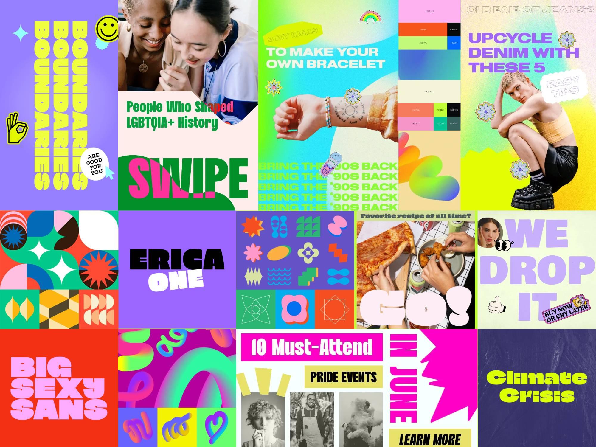
Bold typography commands immediate attention. Vivid color palettes burst forth, injecting life into every pixel and brushstroke. Meticulously rendered geometric patterns weave through designs, adding a layer of sophistication and modernity.
Year of the Bold is not just a trend — it's a declaration across industries, from fashion to technology.
In our visually saturated digital age, this trend serves as an exclamation, demanding attention in a sea of content. It represents a design ethos that is unafraid to break free from the muted norm and declare its presence with unabashed vibrancy.
8. 80’s Bytes
What happens when you combine retro nostalgia and modern design? A little trend we like to call 80s Bytes. Emphasizing innovation, futuristic ideals, and visual identities, pixels are experiencing a resurgence.
Evolving from traditional 8-bit design, 80s Bytes takes us to a place of pixelated typefaces and large-scale design elements.
This trend doesn't merely revisit the 8-bit aesthetic; it reinvents it.
Pixelated graphics, whether as intricate cutouts or oversized design elements, become the canvas for innovation and futuristic ideals. The variety of small pixels to larger-than-life pixelation creates a visual playground that captures attention and resonates with modern audiences.
Color palettes are a symphony of bright, vivid hues, breathing life into the digital tapestry of 80s Bytes. Here, nostalgia meets the future with a bold burst of creativity.
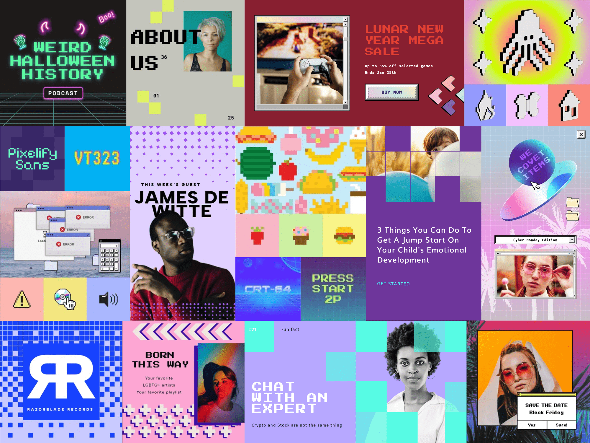
This trend is a visual testament to the cyclical nature of design, echoing the sentiment that everything old becomes new again. You don’t need a DeLorean to see how the 1980s were a pivotal era thanks to the arrival of personal computing and the birth of digital aesthetics.
80s Bytes has the nostalgic allure of retro video games and interfaces. The pixelated charm of this trend serves as a visual bridge between the past and the present. It taps into the collective memory to infuse a sense of playfulness and approachability into 21st-Century design.
This design trend can be tailored for a variety of industries — from the more obvious tech-centered spaces to beauty and retail.
9. 3D Fun
Gently rounded bright pastel corners and organic shapes that pop off the page — it’s got to be 3D Fun. Products, characters, and interesting visuals are showing up everywhere and seem to be sticking around. In contrast to the hyper-surreal images we see created by AI models, softer 3D images are on the rise.
Designs following this trend leap off the canvas with an irresistible blend of whimsy and sophistication. Picture bright pastel hues, gently rounding corners, and lively organic shapes that dance across the screen.
This trend marries playfulness with subtlety, giving 3D elements slight shadows and highlights that breathe dimension into the visual. Typography often takes center stage against solid backgrounds, allowing vibrant colors and dynamic shapes to punctuate the space.
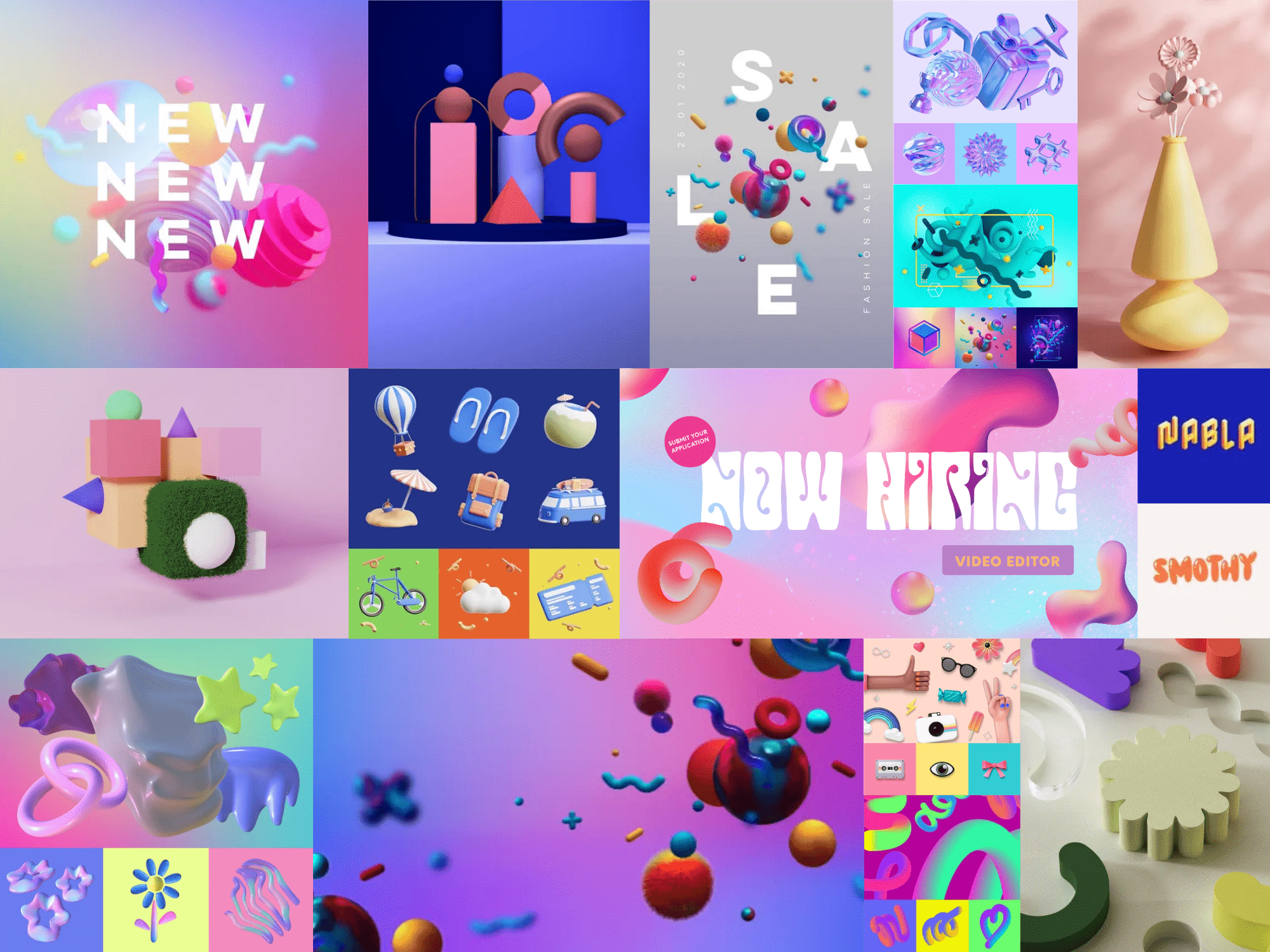
This is an ode to a softer aesthetic, where mixed dimensions tell a story that unfolds in buoyant layers.
As products, characters, and visuals embrace this trend, 3D Fun emerges as a design language that's not just a passing fascination but a playful evolution. As we navigate a world saturated with screens and virtual experiences, this trend bridges the gap between the digital and the tangible.
10. 3D Inflatable
3D Inflatable is a collision of the real world and imagination. The result? A micro trend of wobbly, balloon-like inflatable typography and design elements.
Floating off the screen, this helium-filled trend injects a mix of wonder and fantasy into visual designs.
Buoyant and whimsical, the letters and fonts defy gravity, turning them from simple characters to almost tactile experiences that dance off the screen. It thrives on the delightful contrast it introduces, often placing balloon-textured typography against a backdrop of other design elements —photography, flat type, or bold flat colors.
True to the trend's playful nature, the color palettes lean towards the bright and the colorful.

It’s a response to a world hungry for joyous escapism and longing for the tangible in our overwhelmingly digital experiences. The nostalgia it invokes is rooted in the playfulness of childhood. In a time when whimsy is welcome almost everywhere, this micro-trend is great for retail, tech, or media brands looking to leap from the screen.
11. Homespun Luxury
Homespun Luxury isn't just a design concept; it's a fusion of handcrafted charm and opulence that conjures pure visual magic.
Picture refined display serifs intertwining with bespoke details, creating a tableau of absolute sophistication. Artisanal elements not only infuse designs with warmth and authenticity but elevate the ordinary into something truly extraordinary.
It's a world where the cozy essence of home dovetails with extravagance.
Much like cutouts on a canvas, the design has a non-structured layout, capturing the essence of spontaneity.
The color palettes are a thoughtful variety of trendy hues paired with tones reminiscent of raw materials like terracotta, clay, olive, and desert sand.
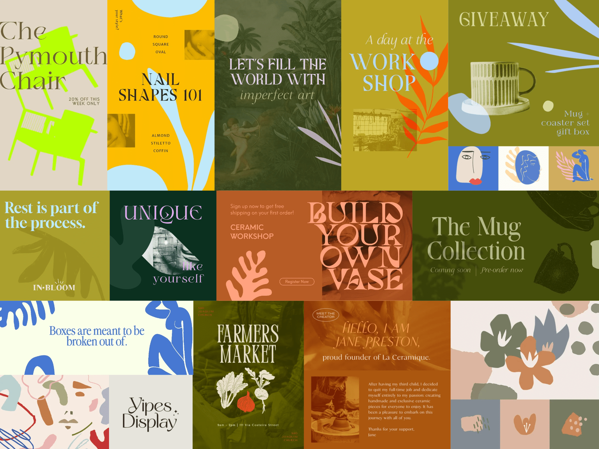
Thoughtful details like handmade logos and other illustrated elements are interwoven throughout Homespun Luxury.
In this aesthetic, there's a beautiful blend, melding the comfort of everyday life with the elegance of luxury. It invites us to embrace a lifestyle that cherishes the slow moments, echoing a ‘Living Slow’ mentality.
And it's more than just a look; it's an Ikigai philosophy — blending all these into one harmonious whole:
- What you love
- What you're good at
- What the world needs
- What pays the bills
What's particularly enchanting is how this luxury isn't confined; it's accessible to all. It celebrates the ordinary as something to seek out amidst the hustle and bustle.
12. Bubbly Bento Box
Don’t let the idea of containers and organization fool you, the rounded corners and bold coloring of this trend create a lava lamp-esque effect.
In the mesmerizing realm of Bubble Bento Box, the marriage of containers and creativity unfolds in a kaleidoscopic dance of rounded and bubble shapes.
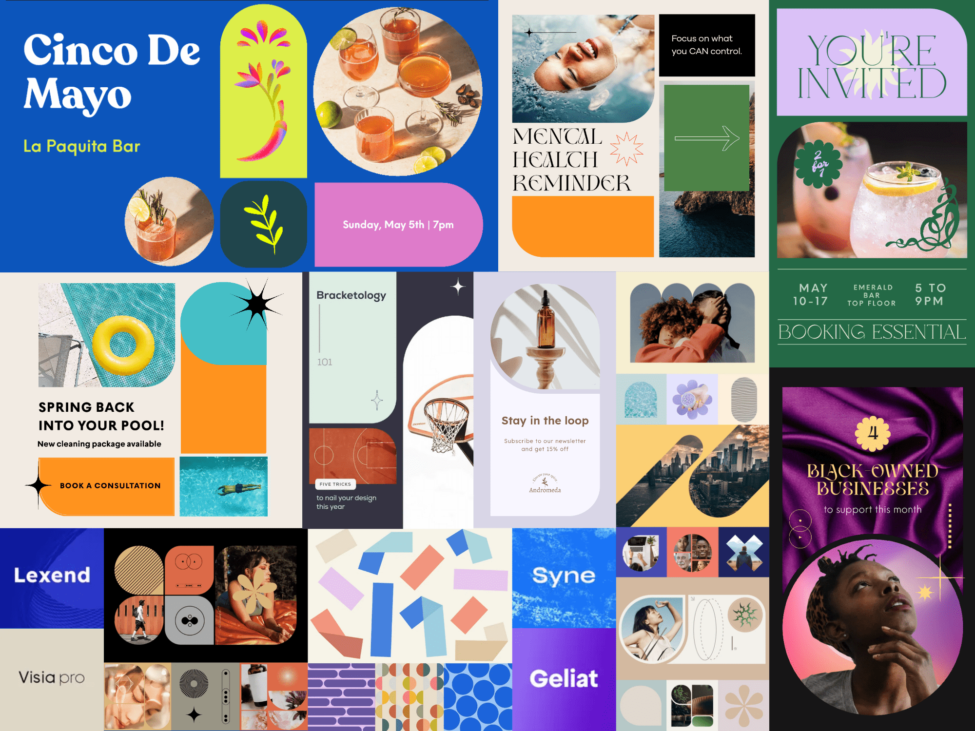
Forget the conventional expectations of organization.
Here, the design trend takes a playful departure into a world where clean edges and borderless forms reign supreme.
The color palette becomes the master conductor, dictating the tone and aesthetic with commanding influence. Darker, moody palettes intertwine effortlessly with the buoyant bubble shapes, crafting a trendier, cooler application that transcends the ordinary.
Vivid colors take center stage, inviting viewers to revel in the trend’s laid-back charm. Layouts echo the structure of a bento box, forming playful and unique arrangements that house information with an artful touch.
In our current cultural landscape, inundated with information and clamoring for individuality, the Bubble Bento Box trend is a visual rebellion.
It echoes a desire for playful and approachable aesthetics in a world that often feels structured and compartmentalized. This is not just design; it's a spectacle, where each element bubbles to life, creating a visually enchanting scene that captivates and invites exploration.
13. Vintage Vivant
An updated vision of vintage revival, this trend draws inspiration from the:
- Ornate elegance of the Victorian era
- Geometric sophistication of Art Deco
- Organic motifs of Art Nouveau
This love letter to the antique draws on intricate details, rich textures, and distinctive characteristics of bygone eras, infusing modern design with a nostalgic twist. This is Vintage Vivant.
This design trend weaves together the elegance of the Victorian era, the geometry of Art Deco, and the organic motifs synonymous with Art Nouveau.
Vintage typefaces and detailed layouts harken back to an era when craftsmanship was paramount.
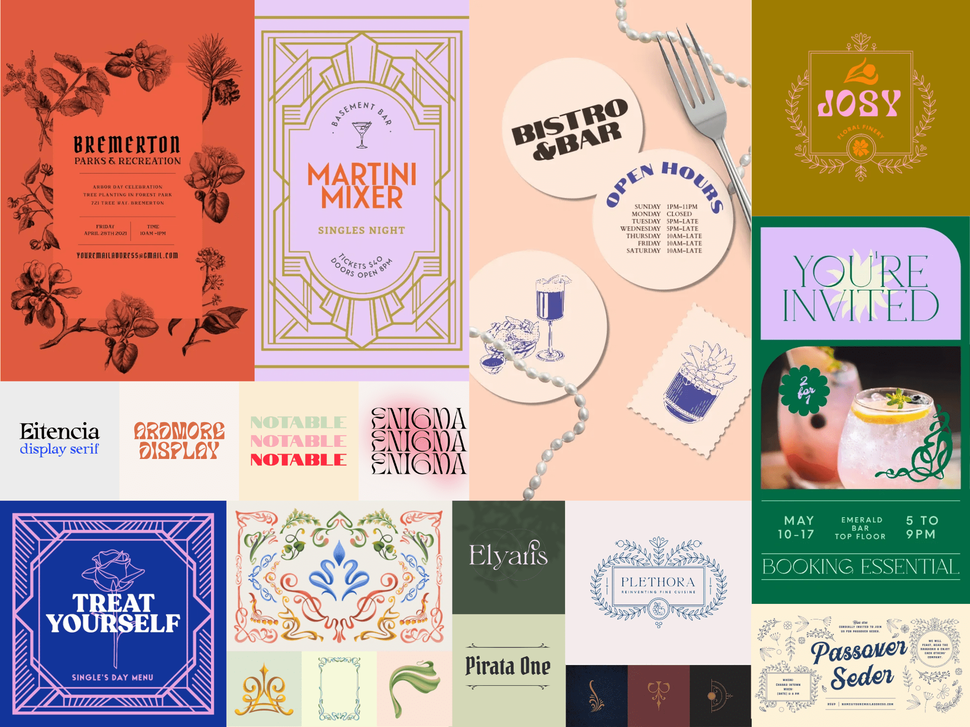
Vintage Vivant fuses vintage illustrations with nostalgic photography to strike a delicate balance between ornate charm and contemporary simplicity. This trend introduces current twists — a bolder color palette, daring shapes, and cutouts that punctuate the design with a modern vibrancy.
This trend transcends mere revival; it is a living testament to the enduring allure of vintage aesthetics. Vintage Vivant speaks to a longing for craftsmanship, storytelling, and a sense of grandeur. It allows designers to create visually captivating experiences that blend the best of the past with the innovation of the present.
14. The Wes Effect
The "Wes Effect” is named for Wes Anderson's distinct visual and stylistic trademarks. His aesthetic has transcended filmmaking, resurfacing in graphic design, interiors, and pop culture.
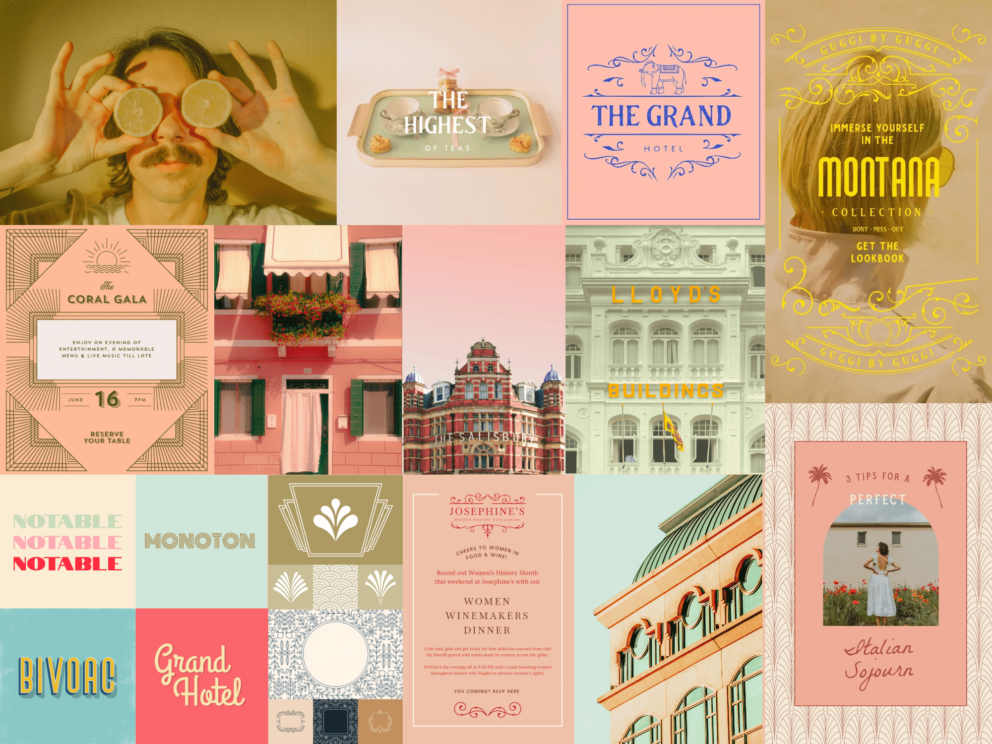
Anderson's retro-inspired aesthetic has become a pervasive influence, informing visual designs across various fields. Designers have embraced his signature quirkiness to craft fun and captivating visuals.
Curated color schemes lie at the heart of this trend, often featuring pastel hues, muted tones, and bold yet complementary color contrasts.
Symmetry plays a pivotal role as well, resulting in balanced compositions, while slight imperfections add a touch of handmade charm.
Vintage typography and retro photography treatments, along with sentimentality and humor, characterize this aesthetic. The result is artful presentations that merge whimsy with precision.
The Wes Effect has grown beyond its roots in film, now influencing AI-generated artwork designed to replicate its nostalgic charm. The director’s storytelling techniques give interest to the uninteresting and romanticize the everyday and ordinary — a much-needed perspective now.
15. Mod Environmentalist
Embracing an organic aesthetic that resonates with today’s eco-conscious consumers, the Mod Environmentalist design trend has taken root. It turns a new leaf on eco-conscious design, leaving the outdated seeded paper, recyclable cardboard, and bland palettes behind.
This trend slakes designers' thirst even as it intersects with rising concern for the climate.
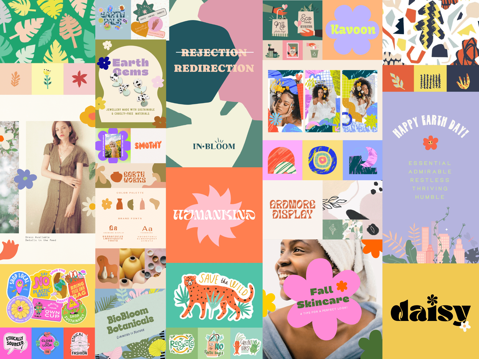
Incorporating handmade illustrations and elements from the natural world, Mod Environmentalist is the design world’s response to the growing interest in organic and sustainable products.
Bursting with bright, airy palettes, this trend draws upon nature-derived colors to create a calming, harmonious visual narrative. Distinctive illustrations are coupled with characteristic typography — often custom-made or inspired by handmade touches.
Businesses are incorporating Mod Environmentalist elements into their branding, leveraging this trend to signal environmental consciousness. This helps distinguish them in a competitive market while appealing to consumers actively seeking environmentally responsible options.
This trend would be perfect for any business that has made tangible, public commitments to reduce their environmental impact or otherwise contribute to a solution.
Related: The essential small business guide to AI
16. Maximalist Composition
Maximalist Composition may not be universally embraced, but it’s good at pulling viewers into the chaos of each design. Every composition is a unique blend of random serendipity, breaking away from conventional uniformity.
This bold and experimental style challenges viewers with its intentionally overwhelming approach.
Maximalist Composition defies the notion of white space.
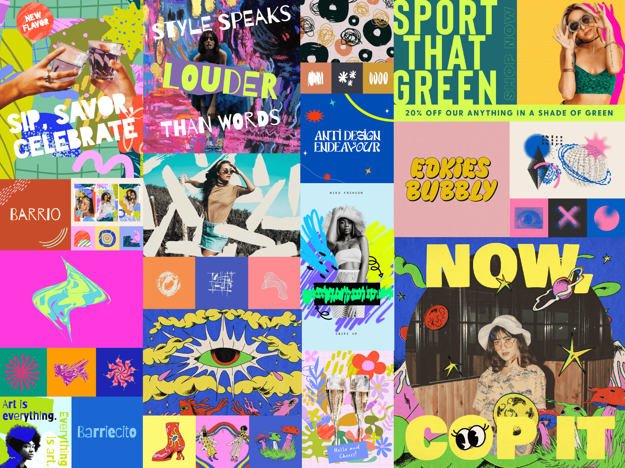
It invites viewers to break away from their routines and dive into unfamiliar narratives crafted through layers, textures, and bold fonts.
The trend takes inspiration from a variety of sources — from pop culture to digital glitch aesthetics. The result is an unpredictable and dynamic visual experience.
Vibrant neon color palettes dominate, creating an atmosphere that's intense and unexpectedly contrasted. Legibility takes a backseat in this trend, adding an element of mystery to the design and compelling deeper engagement.
While it adheres to a structured grid layout, it disrupts it deliberately, using irregular shapes and unpredictable spacing to challenge visual organization.
Needless to say, this trend turns heads.
Breaking through an endless scroll or autopilot walk to work, Maximalist Composition pushes through the noise and grabs attention. It’s perfect for brands that never shy away from center stage.
When feeds and billboards are full of the same old thing, this trend is sure to stand out.
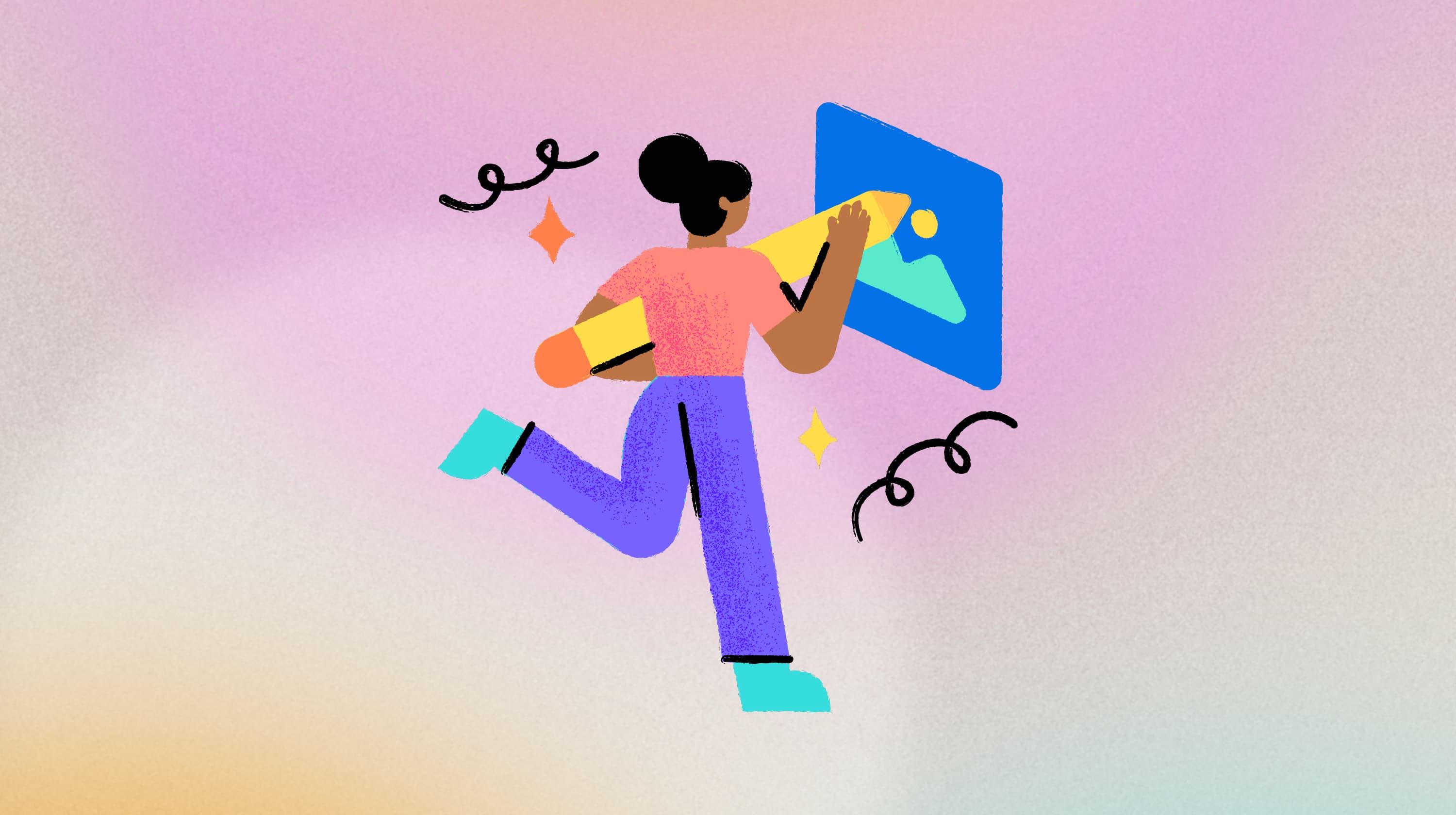
17. Abstract Characters

An evolution in mascot and brand character design, Abstract Characters shows us that what matters most about people isn’t shape, size, or hue. It’s the thoughts, feelings, and connections they make that should take center stage.
We’re excited to see brands gravitate towards abstract depictions of people as a departure from traditional human subjects.
The use of abstract mascots gives brands a versatile and engaging visual identity while creating a captivating and whimsical aesthetic.
By simplifying illustrations into outlines and flat colors without intricate details, these mascots exude a fun and intriguing vibe. They are easily recognizable and can be adapted for use across various platforms and marketing materials.
This shift allows brands to depict the human form in a more inclusive manner, avoiding specifics related to race or gender, thus fostering a sense of universality and accessibility.
The lack of specific detailing allows for a broader audience connection, as these mascots can transcend cultural or demographic barriers as well. They tend to resonate with diverse audiences on a more universal level.
Ultimately, this trend toward abstract characterization represents a conscious effort by brands to communicate:
- Inclusivity
- Approachability
- A sense of playfulness in their visual storytelling
The future is now
The digital design landscape of 2024 is vibrant, eye-catching, and inclusive. Whether you're a seasoned designer or a budding enthusiast, staying informed about these digital design trends can help to fuel your creativity and keep you at the forefront of the digital design world.
Storme Conradie (Trends Lead, Writer), Stacey Hartman, and the GoDaddy Trends Squad contributed to this post.
