Website design is always evolving, and cutting-edge trends can provide amazing inspiration for your small business website. As 2017 comes to a close, let’s take a look back at the year’s top trends and some examples of the best in website design. We hope these new and emerging website trends will spur some innovative ideas as you look to the future of your small business. It’s an exciting time to be online!
Messy minimalism
In recent years, web design has been dominated by minimalism. Clean, white backgrounds. Spare, carefully arranged content. Small, tidy text. This year, many designers shook things up with big, bold, offbeat aesthetics. Think of it as controlled chaos. The design is still thoughtfully put together, but it has a slightly reckless, uncontrolled vibe. Modular design – grid-based layouts – have maintained popularity. But, in keeping with this move away from minimal, designers have flipped the grid on its head by either shirking the orderly layout altogether, or by using it as their base but adding unexpected, rule-bending elements. Some examples of this include an increase in the use of decorative design elements, seemingly random placement of content, and text or images that bleed off the edge of the screen.
Fonts with flourish
On-trend typography isn’t shy – it’s large-scale with plenty of personality. While simple sans serif fonts like Helvetica long ruled the roost, more decorative serif fonts have gained popularity – particularly for headlines. Using an inspiring or engaging line of copy at an eye-catching size as the focal point of your homepage is a cool, current technique. Unexpected contrast is another fresh approach. For example, a huge headline in a fancy font with a small, geometric subhead. This juxtaposition creates intrigue and interest. And, even though statement fonts are trendy, clean sans serif fonts are still a solid choice for a modern look and readability.
Colours that pop
The move away from minimalism affected colour choices as well. Lots of websites opted for bold colours, patterns and gradients instead of the ubiquitous white and grey. Referencing what’s popular is a great place to start when you’re deciding on colour palette, but it shouldn’t be your only consideration.
Colour can affect viewers’ emotions and even conversion rates in a major way. Does your brand have established colours? Do you want it to? What mood would you like to convey with your website?

Photo by Erwan Hesry on Unsplash
Vintage vibes
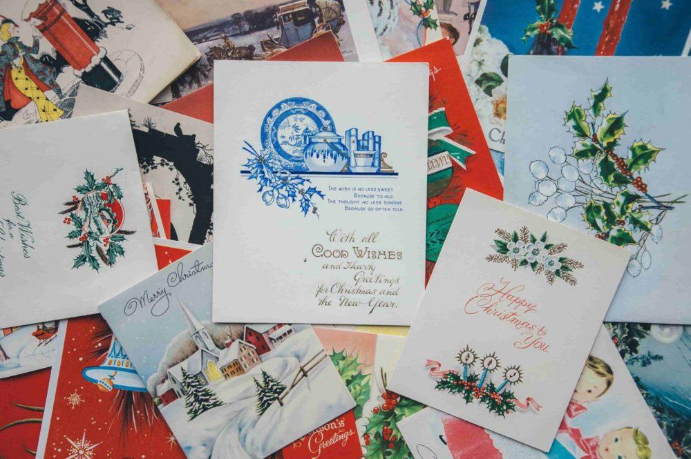
Vintage style with a modern sensibility was a big trend this past year. From colours to fonts to photo treatments, retro vibes were popping up everywhere. While some styles feel timeless, others make a more daring statement.
Look back at design trends from decades past, and see what speaks to you. Then, adapt the look for a modern audience by putting your own spin on it.
The new navigation
Classic header navigation and drop-down menus continue to be viable options, but new design solutions are emerging. The oft-used “hamburger” – three discrete lines that, when clicked, reveal the menu – is a popular choice among designers for desktop versions of websites, not just mobile. Some sites went for pop-ups instead of drop-downs, and others allowed their top navigation to creep down to the side. Skipping a formal menu altogether, you can also let visitors scroll organically to find what they need. As people use mobile devices more and more, scrolling is something we’re used to. To push the innovation even further, experiment with new ways of scrolling, like left to right.
A move toward movement
Bringing movement into your website design is sure to grab attention. Subtle animation is eye-catching, adds life to your site and has the potential to direct your visitor’s experience. Design isn’t just for looks. It can and should be used as a functional tool to achieve your business goals and increases sales. Clever design elements can guide the viewer through the ideal website experience. For example, if a button moves slightly when you hover over it, it’s like saying “click me!” in a subtle, playful way.
Full video backgrounds have been popular for some time, but thanks to advances in technology, they now load much more quickly, making them a more practical, accessible choice. Visitors are given the option to keep the sound off to avoid unwanted disruption. So, why video? It immediately immerses a visitor into the world of your brand, so they’re eager to explore more. And, if you’re interested in getting even more futuristic, keep an eye out for 360 video, which is becoming more widespread.
Takeaways
- Some of these trends are on the forefront of website design and may not seem achievable or practical for the average small business owner. That said, they’re a great source of inspiration if you’re looking to refresh your website for the new year. You may not have a 360 video on your homepage, but you could try a vibrant new colour or statement font.
- You should definitely get creative with your website design, but not at the expense of clarity and usability. Try to make your site easy and enjoyable to use, while avoiding anything confusing or disjointed.
- An innovative design can do wonders for business, but make sure that it works across all browsers and devices. With mobile usage always on the rise, a mobile-first approach is essential.
- Use common sense and always consider your brand identity when designing or updating your website. Are you a traditional law-firm with conservative clients? A rainbow gradient with a ‘70s-inspired font might not be the perfect pick...even though that sounds magical.
Get started with GoDaddy
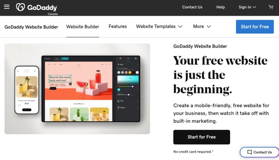
Ready to create a custom website or redesign your existing site? GoDaddy Website Builder makes it quick and easy. Best of all, our built-in tools allow you to create a completely unique and current look. Get foolproof style with expertly paired colours and fonts. Customize every element with mix-and-match content blocks. And, keep it looking professional with our Getty image library, or upload your own photos to bring your brand’s unique perspective.
