A good user experience (UX) and easy website navigation are two of the most common expectations people have when visiting a website. However, not all websites deliver on these expectations!
Your visitor's experience is directly linked to your website’s navigation.
Conversion, revenues, and bounce rates are all directly impacted by the site's navigational design and hierarchy.
A user will spend more time on your site only if your navigation is simple and interesting.
Editor's note: GoDaddy now has a hosting centre located in India, enabling faster load times and better security for customer websites. You can read more here.
What is website navigation?
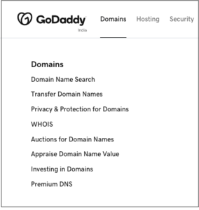
A website's navigation is a collection of user interface (UI) elements that helps the visitors find pages and content on the website.
The fundamental goal of your website's navigation is to make it as simple as possible for your visitors to find the content they’re looking for.

A strong user experience (UX) removes as many roadblocks as possible so that the visitors don't get lost figuring out how to find the content.
Did you know that your website's navigation can also help search engines locate and index the fresh content on your site?
Using links on a page helps strengthen the SEO (search engine optimisation) since it allows the search engines to learn more about a page's content and context.
Top 7 navigation tips to provide a smooth user experience
The design of your website should be such that your visitors can discover the content easily. Use these tips to improve the UX on any website.
1. Make your website mobile-responsive

Paying attention to your website’s experience for mobile users is essential.
Mobile accounts for about half of the online traffic globally.
Hence, it is imperative that you optimize your site for mobile devices and other display sizes.
When reading on a small screen, make sure the text is at least 16 pixels wide. In addition, links should be accessed by a simple touch, just as buttons are.
2. Have limited options in the menu
Some websites' home pages feature hundreds of links.
Let me tell you something: That's not good.
Limiting the number of links in your primary menu helps search engines and visitors.
Reducing the number of navigation options enhances and refines a website's ability to guide users to their intended destination.
If you want to make your site easier to use, you should use a simple menu with a few levels.
3. Add a search bar

A fantastic navigation strategy for content-heavy sites is implementing a custom search bar.
This tool can help users discover what they want easily and swiftly.
A search bar is valuable for visitors, particularly those who have less experience perusing the web.
For the position of your search bar, it is a good idea to keep it near to your menu.
Just like your navigation menu, it may remain fixed in its position as visitors scroll down your site to enable simple access to your site’s content.
4. Label the menu bar clearly
The more precise and unambiguous your labeling, the better it is for users.
Even if you don't use the same language internally, use navigation labels that make sense to users.
Avoid using phrases like "Services" or "Videos" as navigation labels. Visitors should understand where they need to click to get the information they are looking for.
Moreover, it may do well in search engine rankings.
Using the correct language in menu navigation is essential.
As a result of so much competition on the internet, often we try to be clever with our copywriting. However, this might have the unintended effect of obscuring the message.
It’s crucial to keep in mind your customers and how they may perceive and comprehend the messages.
Therefore, use the words they will understand.
5. Say no to crowded drop-down menus
A comprehensive page may be necessary if your drop-down menu selections are too complicated, unfamiliar, or vast. Drop-down menus are a pain to use, and you'll have to give up crucial information in order to fit everything in.
A crowded drop-down menu should be avoided.
Hierarchies can be created using design techniques to minimize the cluttering and overloading of information.
Pay attention to the font and make sure that each category and subcategory stands out.
The additional space surrounding each item can also be used to make the difference clear to the visitors.

6. Break your content into categories
If you have a lot of content on your website, a drop-down menu may be the best way to organize everything.
Hovering over an item on your menu will provide a drop-down menu of subcategories from which customers may choose.
Reduce the number of categories on your menu to six or seven. It will help consumers assimilate the information more quickly and get to the pages they want.
Users will benefit from this since they will be able to digest the data more quickly and get to the pages they want more quickly.
7. Keep the homepage navigation easy
What your prospective clients are searching for should be the driving force behind the headlines and content of your website.
To ensure that your message gets in front of the people searching for similar information, you must include relevant keywords in the title of your post.
Navigation elements that are too tiny or situated very close might result in inappropriate actions.
A touch target with a physical size of around 9 mm works well.
As a result, optimizing your content with the correct heading and making it stand out from the crowd may improve your search engine ranking results. The biggest benefit of using headers is that they help your site's visitors navigate the site and locate the information they're looking for more quickly.
What is the connection between website navigation and UX?
The more time people spend on your website, the more likely they are to take the desired action, such as requesting a quote or signing up for a newsletter.
For this, your website should be simple to navigate and use.

Your efforts to enhance the UX get rewarded with increased conversion rates. When visitors see a call-to-action or invitation to fill out a form, they are more likely to click on it.
The number of sales a website may produce is directly related to the quality of its UX. Getting visitors to your website is the ultimate objective of your internet marketing strategy.
To keep your visitors on your site for longer and get them to interact, you must provide an excellent user experience.
Your brand's reputation will improve if you have an excellent UX. As a result, you'll see an increase in sales over time.
Conclusion
There is no lack of sites where people can find what they are looking for. They won't bother to stay on your website if you don't have a clear website navigation menu and other easy ways of exploring your site.
Designers can't ignore the need for good website navigation while creating a website. When it comes to finding relevant information, users depend on the navigation system.
For any app or website, it should be a major focus to aid consumers in navigating.
In the end, no matter how much effort you put into creating quality content and features, none of it matters if your visitors can't discover it.
________________________________
Efficiently deliver better results
When you use the Hub from GoDaddy Pro, suddenly there’s more time in your day to focus on what matters most. Forget about juggling admin tasks. Reclaim your time and use it to make clients feel like the center of your universe.


