If you're wanting to improve the conversion rate of your landing pages, knowing what makes a strong landing page and seeing a few instances of these nuanced features in action will assist.
1. Clear goals
A top-notch landing page has many parts, and making those elements the 'best' can depend on your landing page goals.
Take, for example, the length of the form. It's simply one of many factors to consider, but best practices suggest that both short and long forms function well. The difference is whether you want to receive a large number of (possibly) lower-quality form submissions or a smaller number of higher-quality responses.
Most landing pages are built to produce a desired action.
As a result, you must ask yourself:
- What is the primary goal with the landing page?
- Who is the intended audience for the page?
The following are some of the most common goals for a landing page:
Increasing awareness
This entails collecting emails and cultivating a relationship with people who are interested in your product or service. Sharing information about your brand and products/services may lead to a loyal following.
Generating leads
This entails gathering contact information from potential customers interested in your product or service so that a member of your sales team can follow up. You can learn more about bringing likely customers to your business here.
Sales
This seeks to make purchases easier and quick by highlighting a certain product. It allows customers to add it to their cart or purchase it without ever leaving your landing page.
Defining your aim is crucial to the planning phase since it will impact the design of your landing page.
2. Simple and well-organized design

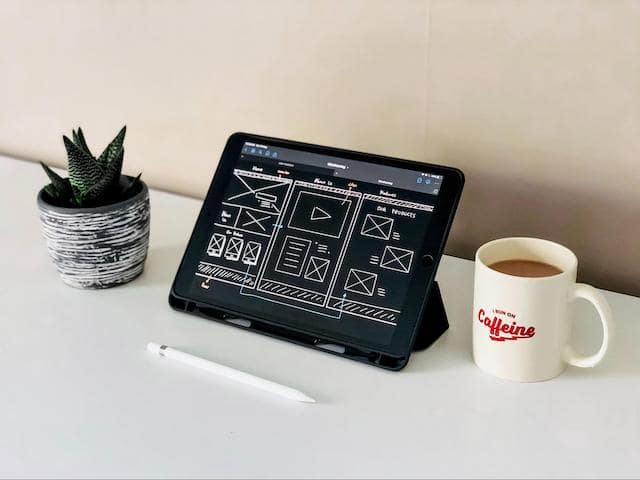
When creating your landing page, make sure there are no distracting elements and that the design is quite simple and well-organized.
Including a navigation menu allows people to simply click away without opting into your offer.
To avoid distraction, remove any navigation menus, footer links, and other links from your landing page.
- Your landing page’s appearance, feel, and overall structure will significantly impact its effectiveness and conversion rate.
- The single purpose of your landing page should be to make it as simple as possible for a visitor to take the desired action. Therefore, make sure that all parts of the page contribute to that goal, whether you want them to fill out a form, buy something, sign up for a newsletter, or download an ebook.
- Color and eye-catching graphics must work together in landing page design.
- Try various button properties — color, placement, and size to find the most successful landing page layout — to ensure an effective landing page.
Let’s say you're designing a landing page for a chef, and it must accomplish two conversion goals in a single design:
Website tour
To encourage visitors to browse through the chef’s restaurant and signature dishes, the landing page should have a:
- Straightforward title
- Succinct description
- Persistent call to action that prompts them to take the tour
Recipe search
This is why many people visit such websites in the first place.
That is how it would have all of the qualities of a good landing page design.
3. Minimalist design
Because it allows customers to learn about your service quickly, minimalist design is one of the best tactics for creating a conversion-focused landing page.
Maintain a clutter-free page with obvious, natural navigation and no distracting elements (such as pop-ups).
A good landing page contains all the information essential to persuade visitors to take the action, but nothing more.
Keep it simple and include only the essential information that will guide visitors down the funnel. Too much information can overwhelm visitors.
The information you put in the front and center should be easy to read quickly — when possible. Using bullet points to illustrate details on the landing page is a smart move.
- People scan photos faster than words in general, so including them on your landing page will benefit you. In addition, if you use a picture or photo, especially a banner or header image, it should be eye-catching and visually complement your offer.
- As a visual element, you can also include a video on your page. Videos are excellent for demonstrating complex products, such as software.
- It's advisable to use at least one graphic element regardless of the type of visual element.
- Last but not least, ensure your images are responsive on mobile devices! Mobile traffic already accounts for more than half of all online traffic, and this ratio is expected to continue to rise.
Optimizing your landing page for mobile so that it looks excellent, loads quickly, and is easy to use takes a little extra time. But you'll be glad you did it when your conversion rates skyrocket.
4. Trust signals

Buying decisions are heavily influenced by trust factors. Customer reviews, social media, and recommendations from trustworthy peers play an important role in showing you as a trusted name.
Therefore, providing positive customer quotes can help you win over potential clients.
If you don't have much social influence yet, few well-placed testimonials from current clients will suffice.
Here's how to properly incorporate them:
- Make use of real-life testimonials. Celebrities and experts are fantastic, but you don't need their endorsements (if you don’t have them). Instead, choose testimonials from people similar to your customers.
- Make sure to include images. In testimonies, pictures are the cornerstone of trust. Therefore, every highlighted testimony must be supported by a photograph of a genuine person.
- Specific testimonials are required. Generalities don't make for compelling testimony. Instead, testimonies backed by genuine numbers, facts, and particular applications are the most credible.
A few short, positive quotes with photos can help increase trust, reputation, and customer loyalty.
5. Text
Aside from the headline, the rest of the text on the page must be carefully considered.
Don’t be tempted to offer a long description of all the characteristics of a product on your landing page.
Not only is it a lot of words to read, but it also discourages visitors from taking quick action.
So instead, concentrate on the issue your audience is experiencing and how your solution will assist them in resolving it.
- To make your text easier to read, keep it short and use bullet points.
- Landing pages that are effective match the terms in their page text to the keywords and text in their PPC (pay per click) advertising. The use of the same key phrases repeatedly reassures visitors they’ve come to the right place.
- It's also critical to get people to the content they're seeking quickly. For example, if a user clicks on a PPC ad for sleeping bags, don't direct them to the camping area. Instead, show them the page that they wanted to see.
Conversions occur when you match the user's needs and expectations as closely as feasible.
6. Call-to-actions
Finally, we've arrived at the most crucial section of your landing page!
A call-to-action, or CTA, is the button that your website visitors click to take the desired action (e.g. fill out a lead-capture form, make a purchase).
- Use words that motivate and inspire your visitors to do a specific action when writing the button's copy. This frequently entails instilling a sense of urgency. A killer call-to-action criterion calls for powerful command verbs, figures, and words that elicit emotion and provide a reason for viewers to take action.
- When it comes to CTA design, the font should be easily readable, and match the rest of the page's fonts. However, it should be larger than the description text.
- Your CTA should be somewhere in the middle of what makes an impact and what reflects your brand. Contrasting colors, such as orange and green, are more actionable and result in conversions.
Example: ‘Get started today’ or ‘Click here to download.’ The CTA should be direct; avoid using question marks here.
7. Optimize for mobile
Today, customers are spending more and more time researching all types of mobile content. According to Google, more searches are done on mobile phones than on desktop computers.
Your landing page should look great on mobile devices — easy to navigate, fast to load, and superb.
However, if your landing page isn't optimized for the mobile screen, visitors will need to swipe and scroll or pinch and expand. This discourages them from finding your CTA.
But how can you make it more optimized? Well, for this, you can follow the below-mentioned tips:
- Optimize the videos on your pages to be compatible with smart devices.
- Make content scrollable instead of forcing people to click multiple pages. It can be tricky on mobile devices.
- Your images should be high quality and tightly cropped to maximize detail even when shrunk to a smaller screen.
- Try adding simple buttons on the screen so that mobile users can easily use them.
- Avoid using long paragraphs. Remember that people are often on the go when using a mobile phone. Long sections often lose them.
8. Test

Testing is the ultimate ingredient of a good landing page. Without testing, it's impossible to develop a successful landing page.
Testing and tracking results are critical for determining what your landing page does well and where it falls short.
Make sure before submitting, A/B testing is done precisely.
But why is that important?
That is because A/B testing can help you design your landing page most effectively to achieve your long-term conversion rate goals.
Regardless of your skill level, make sure you have access to analysis and A/B testing. Once the landing page is published, you'll want to monitor page views, scrolling depth, and clickthrough rates, among other things.
By A/B testing and refreshing your landing pages over time, you can ensure that you get the best results from your traffic and advertising dollars.
Some of the elements to consider when testing are:
- Color scheme
- Quantity of text
- Image size
- CTA buttons
- Video
- Design
- Target group
- Timing
Final thoughts
Landing pages are crucial to a successful digital marketing strategy. They help visitors understand why and how your business is the best solution for their needs.
Your offer may be fantastic and PPC advertisements flawlessly optimized, but without a good landing page, your results will fall short.
Start by putting each of these design suggestions into action, and you'll be well on your way to captivating your visitors and converting them into clients.
________________________________
Love wasted time? (Neither do we.)
Fumbling for login credentials, running endless updates, explaining product purchases... No thanks. We built the Hub from GoDaddy Pro to save you an average three hours per month for every client site you maintain.


