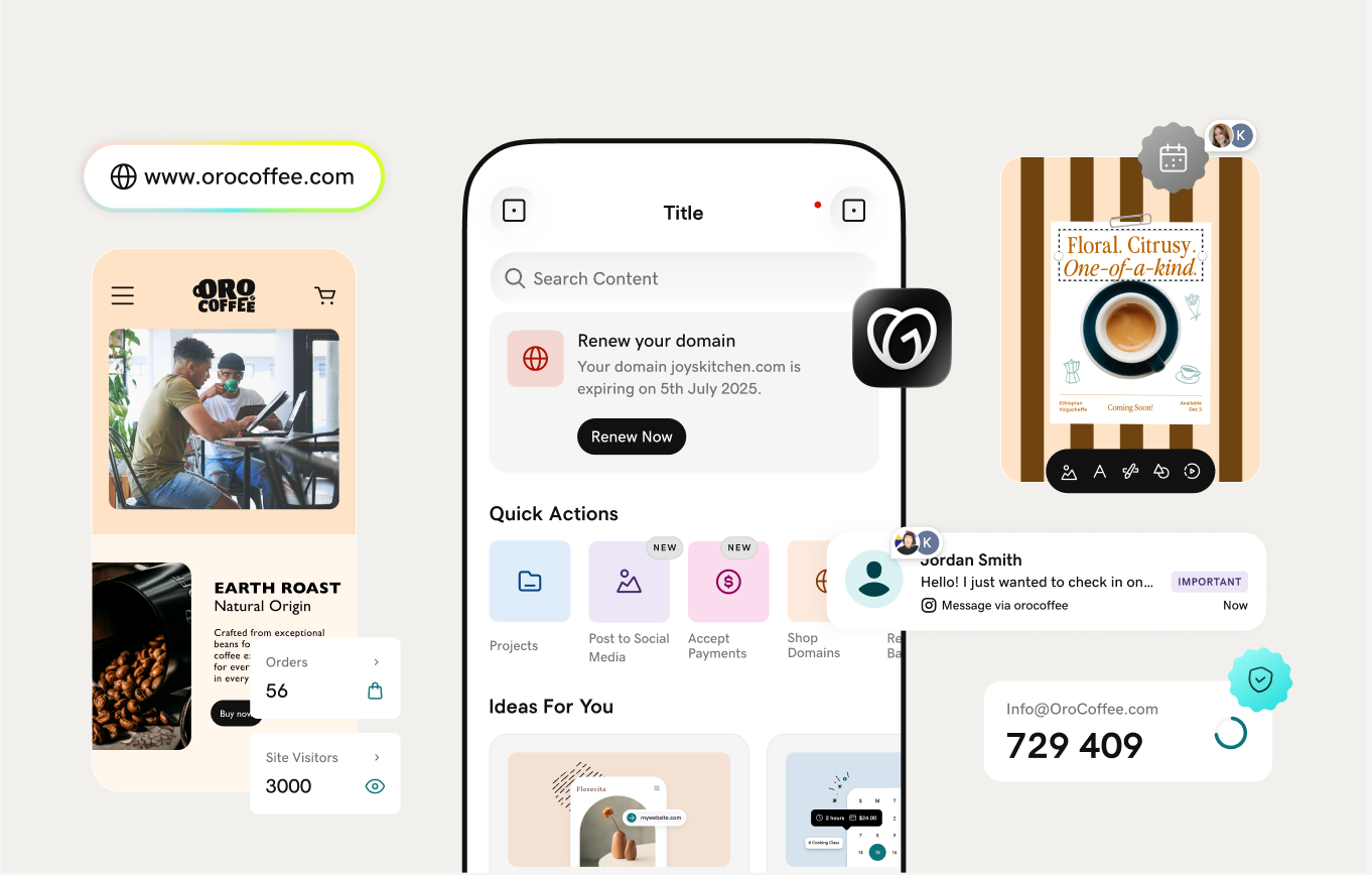
There are many elements to designing a professional website, and the website header is the first thing visitors see when they land on a website. A person takes from 17 to 50 milliseconds to form an opinion about the website. For a business, the consumers' journey starts from here. That's why website header design is key to a great and eye-catching website.
A good website header has some characteristics that make it user-friendly and interesting.
In this guide, I'll share key elements and best practices to help you build an impressive header for your next website.
Related: Best web development course for designers and developers
11 best practices to design an attention-grabbing website header
No matter what kind of business you're in or what approach you use to build your website header, these best practices help you ensure that your header design is impactful.
1. Header size
There is no exact website header size dimensions or definite answer that I can tell you. But most of the designers feel that 1024px width is appropriate. It can be up to 1920px.
These days, ensuring the effectiveness of different screen sizes is the most challenging part of website designing. Even the two screens with the same size can have different resolutions, so users can't see the same thing.
Rather than following the pixel concept, you should follow the rules of common sense to in your website header design.
A header's height should not disturb the perception of the content. Using a smaller header for informational pages and a bigger header for landing pages is a good practice.
But for voluminous headers, you can leave some space under the fold, so the user will know what is coming ahead on the page and start to scroll.
2. Visual hierarchy
It is the concept of arranging the elements according to their importance. Planning the header structure is an important task. A well-organized header always helps users to browse your website easily.
In 2006, Nielsen Norman Group introduced a theory of the F-shaped pattern of reading on the web, which is still relevant.
When a visitor lands on a new, unfamiliar website or webpage, they always start their journey from the screen's upper left corner. But if they struggle to find the information there, you need to improve your hierarchy to make your website easily accessible for your website visitors
3. Logo
No matter the niche of your business, a logo is an important marketing asset, one that shouldn’t be taken lightly. When you make a logo take careful consideration of the shapes, colors and fonts you use, make sure they’re in line with your brand and that they represent you and your business. It may seem trivial, but the wrong type of logo can change people's first impression of your website. Positioning is another thing, it also matters where you add your logo.
Most users remember a brand with a logo on the left-hand side of the website header.
But it is not the only thing that decides the position of your logo.
Make your decision according to the design layout. Also, for round-shaped logos, center placement is a good placement instead of the left-hand side.
4. Navigation
Navigation makes your website accessible. It helps users browse your website easily. Also, it helps you with your website SEO. Don't overload it with links. Only add the most important links there.
As I mentioned above, you can categorize similar pages and show them together. For that, you can use drop-down menus. It makes your navigation minimal and helps users navigate your website easily.
5. CTA
A good call-to-action encourages users to take action. The website header has limited space. That's why you should only place your most important CTA there.
For example, if you're providing SEO services, you can add a button for "Free Website Report' or "Free Consultation" to help you with lead generation for your business.
6. Fixed header
A website header stays sticky on each page of the website all the time. It remains visible even if you scroll the page to website users.
This approach provides a rich user experience to your website visitors by showing important information all the time. It provides an excellent navigation experience to website users.
Also, it can help to improve your website conversions by showing the important CTAs or links.
For example:
- E-commerce websites can make the cart visible all the time to their users.
- Services websites can make their Important CTA visible all the time.
7. Mobile header menu
Mobile is the device you can't ignore for your online business, not even while designing your website header.
There are more than seven billion mobile users worldwide. It becomes more than 90% of the population of the entire world. People who don't have or use desktops/laptops use mobile devices.
That's why you should not ignore mobile devices for your business and marketing. It must be an integral part of your strategy to increase your reach.
To start, your website must be fully responsive and optimized for mobile devices.
Having a mobile-friendly header is the first and most important part of creating a mobile-friendly website.
It is imperative to ensure that the website header is displaying correctly on the smaller screens of mobile devices. It means the header size, content, and CTAs are displayed without any issues.
With a responsive website header design, the header can adjust its size and shape according to the device.
Also, you can use a hamburger menu for mobile devices. An icon of three lines expands when we click on the icon to show the full menu vertically. A hamburger menu is a good option for site usability.
The hamburger menu can also be used for desktop websites. Many websites use it for their desktop sites.
8. Double menu
A double menu is an approach to show two rows (layers) of navigation at the top of the page. It is widely used by many designers, websites, and e-stores.
A double menu improves your website's visual hierarchy and user experience.
With this approach, you can use one menu to show your website's important navigation links and another menu for the core interaction elements like:
- Product catalog
- Offers
- Locations
- Blog categories
Website visitors get a better navigation experience to browse your website. You can use the double menu to improve your website engagement and conversions by providing the relevant navigation links or elements.
9. Consistent design
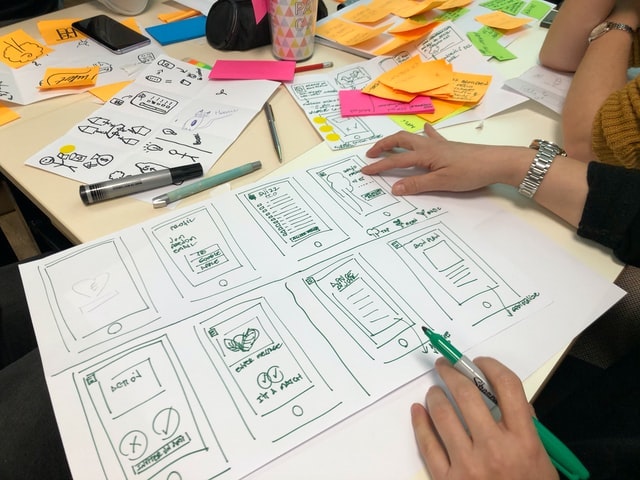
Even a well-designed and organized website header can look odd and ruin your website experience if it doesn't match the rest of the website's layout and design.
Your website header must have the proper balance between being noticeable and connected.
This means your header design shouldn't only be pronounced but also connected to the overall website design and color schemes.
For that, you should ensure that the size of your website header doesn't interrupt the content and the user experience. Also, you should use the same color schemes, fonts and imagery for your header.
10. Readable fonts
You should choose a clear and readable font for your website header. It is always advisable to use the same font family for your website or the font representing your brand identity.
Do not choose any fancy fonts that can be hard to read as they can ruin your website user experience.
Use the font-weight and style according to your website headings font-weight and style. Also, you can use it according to the website layout design. For example, it is a good approach to use bold fonts for bigger headers.
11. Clear call-to-actions
As I mentioned above, A CTA encourages users to take action and improves your website conversion rate.
CTAs are an important part of your business success. Every website uses CTAs like "call us," "Get a free report," "Add to Cart," "Sign Up" to get conversions.
You can add a CTA of "Order Now" on your website header if you're running a restaurant but for an NGO, the "Donate Now" Button will be a good CTA to show to your website visitors.
Some CTAs, like sale offers, can be used for a short duration, but others for the long term, like Contact Us.
But if you're not using a good CTA to show your visitors on your website header, then probably you're missing out on sales.
Also, it should be easily noticeable for users. You can either use a button or highlight with color for that.
You should choose a location to place your CTA where it will be more visible. For example, top right-hand side of the website header or above-the-fold for voluminous headers.
Editor's note: GoDaddy now has a hosting centre located in India, enabling faster load times and better security for customer websites. You can read more here.
What is a website header
Website header is the top section of a website page. It is a strip pinned on the top of a website that shows on every website page. It helps visitors to move around the website from page to page. In simple words, it works as a navigational tool.
But in modern designs, the whole above-the-fold space of the Homepage is considered as a header.
Also, you can use separate headers for various sections of your website. For example:
- Large header for the homepage
- Transparent header for the services pages
- Blog Header for the website's blog section
It provides a rich user experience for visitors. They can easily find pages and continue their journey to reach their end goal, like purchasing or getting information.
On the other hand, poor header navigation provides a bad user experience that makes visitors leave your website. It can even ruin the success of your website.
Website headers also have an impact on search engine optimisation (SEO) because the most important links are placed there.
What does a header include
A website header is a vital part of a website, but it has limited space. So it's your choice what elements you want to place and show there.
While choosing the elements, keep in mind that your header design must enhance the user experience.
You can list the important sections of your website like Shop, About us, Contact and others that help visitors find the information or buy something from your website.
You should plan the navigation menu links and then provide the same kind of links together.
For example, you should provide all the support-related links together. Like:
- Support
- Knowledge Base
- Chats
- Tutorials
And resource-related links together. Like:
- Resources
- Blog
- Webinars
- Videos
You can use a drop-down menu to help users find the links easily and make quick decisions.
Here are the top key elements that you can consider adding to your website header:
- Branding
- Navigation Menu
- Call-to-action
- Shopping cart
- Search bar
- Social media links
- Languages (for multilingual websites)
Final words on website header design
A header creates the first impression on website visitors. That's why you should give maximum attention to your website header design when building your website.
The above-mentioned best website header design practices and tips will help you to design a stunning header. Be sure to keep your website header up to date with the latest information and links. Best of luck!
________________________________
Love wasted time? (Neither do we.)
Fumbling for login credentials, running endless updates, explaining product purchases... No thanks. We built the Hub from GoDaddy Pro to save you an average three hours per month for every client site you maintain.
