High-value content such as e-books and downloads are, no doubt, the key to attracting, capturing, and building email lists. A list of emails that have been willingly provided by future customers is like gold to any business owner looking to grow. So how do you build a useful email list?
Long answer short, squeeze pages.
If you’ve never heard of the term before, always wanted to create one, or hope to make your existing squeeze page efficient, this guide is for you.
What is a squeeze page?
Simply put, a squeeze page is a type of web page specifically designed to collect the visitors’ email addresses.
It helps you collect email addresses by
- Presenting an offer they can’t refuse
- Highlighting social proof
- Using compelling graphics or videos
Here’s an example for you.
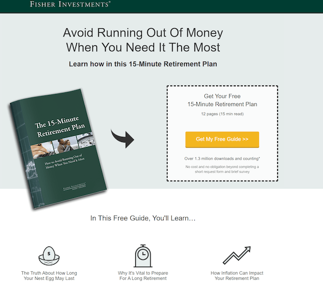
Fisher investments, a money management company, extracts email addresses by providing a free guide.
What makes this squeeze page stand out?
- First is the headline that focuses on the need of having a retirement plan.
- Second, attaching a time (15-minutes) and social proof (over 1.3 million downloads) compels the reader to take action.
- Third, the overall presentation (graphics and text) gives a preview of the bigger picture.
Now, you might be thinking, that’s just a landing page. You aren’t wrong.
Squeeze pages are, after all, landing pages themselves. So why a fancy word? We wondered too. Turns out, there are some differences.
Related: 17 top freelancing websites in India [updated]
Difference between landing pages and squeeze pages
Landing pages can have multiple goals like:
- Getting webinar enrollments
- Compelling users to take a free trial of the product
- Collecting email addresses for marketing emails
Squeeze pages, on the other hand, focus on only collecting email addresses.
Here are some finer points where squeeze pages vary from landing pages:
| Squeeze Pages | Landing Pages |
| Consist of short forms collecting the name and email address of a visitor (in most instances, only the email address) | Can contain short or long forms to collect name, email address, website URL, company name, etc. |
| Every squeeze page is a landing page | Not every landing page is necessarily a squeeze page |
| Used in the initial level of the buyer journey
| Used at multiple levels based on the information required at various stages |
| Always short and to the point to prevent users from thinking much | It can be short or long, depending on the goal of the page |
Related: 8 tips to build a landing page that converts
5 crucial elements to create an enticing squeeze page
At a time when inboxes are already full of spam, convincing people to give their email addresses is easier said than done. A squeeze page with a high click rate has these five crucial elements.
1. A benefit-driven headline
The headline of your squeeze page has to answer one important question: “What is the outcome users get by signing up?”
Your answer could look like this: “Learn how to grow your social presence by X% in the next 30 days.”
This is your benefit-driven headline. You can use this approach to target your user’s needs or challenges.
Targeting the negative can sometimes generate a better response, as in the Fisher Investments example above. After all, nobody wants to run out of money when they are no longer able to work.
Ensure your headline targets a specific issue with a hint of how you can help them.

Now that you have caught attention with an enticing headline, next comes making your reader stay with an offer they simply cannot resist.
Let’s say you interviewed certain experts and collected their world-class marketing techniques. You are presenting these tricks and hacks through an e-book. Mention the names of the experts you spoke with and how the advice will help your reader.
- Will it help increase the number of website visitors who become customers?
- Or will it help them develop an engaged audience?
The text doesn’t need to be long, but it must highlight everything that makes your offering stand out.
For instance, elaborate on the problems your course or free guide will solve. It’s a great place to target common challenges. Give them a reason to take action.
Your headline could read “Effective 10-minute marketing hacks to grow your customer base.”
Assigning a timeline to achieve the promised goal makes the benefit tangible to the user.
Related: 7 ways to craft engaging web writing
2. Hooking visuals
It isn’t easy to keep people reading through long chunks of text. But visuals capture instant attention and help them retain information for longer periods.
Let’s go back to our earlier example of the e-book with interviews with marketing experts.
Now imagine interview shots or video snippets added to the squeeze page.
Here’s an example of a squeeze page with a short video that explains the benefits of the free download in a minute or less.
The video compels users to take immediate action — who can resist a video?
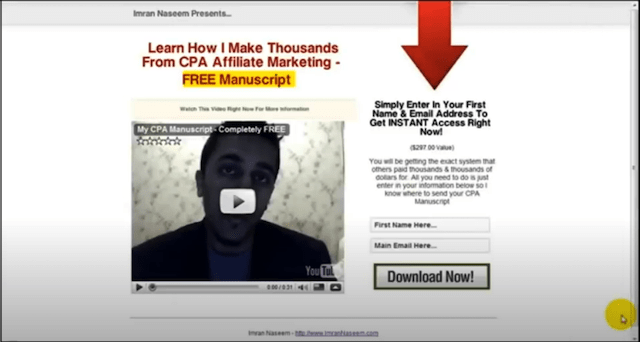
A few tips on creating a video for your squeeze page:
- Be very specific about the problem you are solving
- Use only one video and avoid distractions to retain the viewer till the end
- Create a short yet engaging story targeting the themespeople care about
- A/B test your thumbnail images to use an image that gets clicks
- Explain exactly what they get when they sign upor download
- Include text to cater to different audience segments
- Add facts, use numbers to develop credibility
Note: Video content creation, however short the video is, takes time. Commit to quality and spend the time it takes to deliver a great video.
Related: How to create an animated video
3. Compelling call-to-action (CTA)
Your CTA button is what takes the visitors to the next step.
Take time to create a good CTA that requests a clear action.
The benefit-driven approach we discussed in the earlier section can be applied here too.
Say you are hosting a personal growth webinar. What is the agenda of this particular offering? If you are trying to provide tips to make a person better, your CTA button could be “Make Me Better.”
Here are some more points to consider when creating your CTA:
Color contrast
A color contrast makes your CTA stand out visually. For example, a red CTA button may go well with a white background. Poor color combinations and low visibility can lose you potential users.
Have only one goal
The goal of a squeeze page is to collect email addresses. Don’t ask them to scroll through other offerings or give them too many choices that ultimately lead them to do nothing and leave your website.
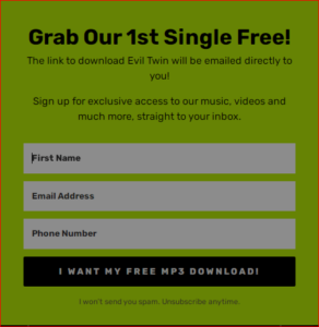
All the elements, including headlines, narrative, images, and videos, must focus on one action: capturing the email.
Use first person
Use inclusive first-person pronouns to create a sense of ownership and invite action. For example:
- Instead of “Get Your Free Report,” consider “Get My Free Report.”
- “Unlock My Free Training” instead of “Unlock The Free Training”
Take a look at how Peppercorn uses “I Want My Free MP3 Download” instead of “Get Your Free MP3 Download” to pave a smooth way to their customer’s emotions.
Drop the overused CTAs
People are used to seeing cliched options. Create a sense of excitement with your words.
Instead of CTA buttons like Sign Up, Download, Access Now, try:
- Show Me How
- I’m in!
A newsletter that shares the latest digital marketing tactics can use “Get Smarter” instead of “Subscribe.”
Start being creative with your CTA copy and note how many people clicks.
4. Irresistible offers
Be it an e-book, a whitepaper, a webinar, or a quick discount, your resource is as enticing as the value your audience derives from it.
Resource #1: Provides generic information bundled up in an e-book.
Resource #2: Based on hours-long research, interviews, etc., to collate an action-oriented e-book targeting the solutions to major challenges.
You can imagine which one attracts more clicks. When it comes to value, there are rarely shortcuts.
If you’ve done the work, don’t shy away from sharing the details of your methodology with the audience.
It adds credibility to your resource.
Experiment with lead magnets
Try different lead magnets to identify what resonates well with your audience.
- Was your click rate the highest when you offered a free e-book?
- Or was your audience more interested in receiving a quick discount with the sign-up?
Understand what your customers value to ensure you present an offer they cannot refuse.
Tips to create high-value lead magnets:
- Browse through the paid courses in your niche and explore their curriculum. If people are willing to spend on these courses, they will likely hand out their email addresses if you offer the same for free.
- Scroll through the popular forums or places of discussion in your niche. Note the major topics of discussion or challenges faced by people there. Your lead magnets must revolve around these specific areas.
5. Develop a sense of credibility through social proof
Social proof is anything that shows people that it’s safe to hand out their email addresses. Those who are new to your business will likely take action if they see the past results.
It helps back up your claims with proof.
Let’s say you are promising exceptional results in your lead magnet. Without proof, they might conclude your offer is too good to be true.
If one of your e-book users used the techniques you mentioned and achieved great results, add their testimonial to your squeeze page. If you have more than 60,000 newsletter subscribers, mention it.
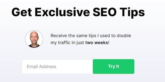
It’s not always necessary to highlight user reviews. Take a look at how Brian Dean mentions doubling his own website
traffic in two weeks. The idea here is to build trust by mentioning the results you achieved.
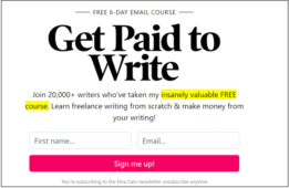
Here is another example where Elna Cain, a freelance writer, mentions the enrollment of 20,000+ students in her course.
Her target audience is beginner writers who are trying to make money off their skills.
The headline and the supporting text cleverly target the need of learning writing from scratch and making money out of it.
The right placement of every element
Imagine a squeeze page with the opt-in form that appears before the narrative and headline. Sounds messy right?
Keeping a visual hierarchy is crucial. It makes it easy for readers to quickly understand the purpose of the page.
Here is how the information on your squeeze page should follow through:
- The first element they should see is a benefit-driven headline. Sell the idea that your offer will open new doors or solve a problem for them.
- A supporting subtitle follows the main headline. The motive is to provide a little more information about your enticing offer.
- Next comes a few sentences of value-driven text focused on making users understand how it will change their life.
- The opt-in form with at most two fields — name and email address.
- A compelling CTA button with text that speaks to the reader and color contrast that highlights it.
- Videos or photos conveying the offer.
Four examples of squeeze pages you can learn from
Here are four squeeze pages that do a good job of asking for an email.
1. Lifehack
Lifehack is a thriving business built around productivity hacks and how-to guides. Here is how they convince busy people to submit their emails.
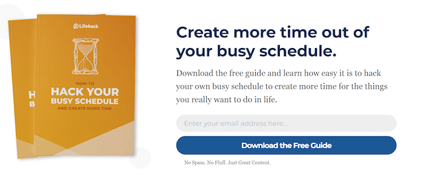
What we loved about the page:
The simple yet compelling copy is not the only area we appreciate about this squeeze page. Here are more elements the page cleverly covered:
- The headline targets the most important need of the reader — making time out of the busy schedule.
- The imagery itself incorporates a how-to headline to generate conversions.
- The CTA button emphasizes the word “Free” initiating action.
Area of improvement:
The headline is benefit-driven, yet the sentence below it doesn’t convey anything new to the users. It could have some enticing points or specific areas that the guide covers.
2. Writing Revolt
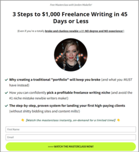
Writing Revolt helps writers start a successful freelance writing business. Here’s the squeeze page of their free masterclass:
What we loved about the page:
Apart from being visually appealing, here are the core strengths:
- The headline sells the masterclass by promising earnings of $1000 within 45 days or less.
- The sub-headline mentions the two common hurdles amateurs face: lack of degree and experience.
- The text targets the pain points or common challenges along with mentioning what the writers should do instead and how they can learn the same in the masterclass.
- Breaking the masterclass into steps targeting the right challenges initiates immediate action.
- Creating a sense of urgency for immediate action by mentioning the availability of the masterclass for a limited time.
- The CTA button entices users to take immediate action.
- Adding a face to the masterclass squeeze page helps interact better with the reader. People like knowing who they will be learning from.
Key takeaways:
Target the most common hurdles faced by your audience and attach a timeline to achieving a certain target.
3. Close
Close is a CRM (customer relationship management) software that builds an effective communication channel for sales teams. Here is a collection of useful email templates they offer.
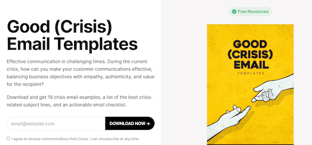
What we loved about the page:
In addition to a terrific hook — the stress that sales teams suffered during COVID-19 when the usual emails couldn’t be used — this squeeze page includes:
- A value-driven collection of resources that entices users to click.
- CTA button color that contrasts nicely with the white background.
- A narrative that cleverly targets and elaborates on the problem and the possible solutions.
Effective communication initiated with clarity.
Areas of improvement:
Here are the few areas they missed out on:
- The headline isn’t as benefit-driven as it could be.
- The picture used simply states what the headline already does. Imagery or video used on a squeeze page should present more information than what’s in the headline.
- Using a generic CTA button copy like “Download Now” isn’t a great choice.
- There could be a sub-headline targeting some numbers or social proof to catch better attention.
4. Blogging Wizard
Blogging Wizard is a digital marketing business dedicated to providing content that helps create, grow, and monetize a blog from scratch.
Here’s how the website extracts email addresses by providing multiple free resources.
What we loved about the page:
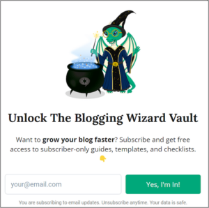
Apart from the wizard entertaining us, here is how this squeeze page offers value to the reader:
- Enticing headline that captures attention.
- The sub-headline provides clarity about what the headline initially conveyed.
- The CTA button copy is far from boring and the button color stands out.
- Provides security to visitors by mentioning their data is safe.
- Making the reader feel exclusive by mentioning “subscriber-only.”
Takeaway tip:
Everyone likes exclusive things. It helps to mention that in your content.
Area of improvement
It lacks social proof that builds credibility. Neither the headline nor the narrative uses any numbers to back up their claims of “growing the blog faster.”
Conclusion
Squeeze pages work because people are actively looking for answers to their problems. So, as a marketer, it is your job to make the resource appear as valuable as you can.
Research and incorporate your audiences’ needs to turn your page into a lead-generating machine. A/B testing your pages is crucial to identify the elements that have the best results. Last but not least, keep experimenting until you generate the best return for your squeeze page.
Remember, your audience can be hesitant to share their contact information unless they know exactly what they’re getting.
Most of the time, web pages struggle to capture the reader's attention enough to get their email. Some seem too generic and receive lukewarm interest. Over the top, click-baity headlines raise doubts.
Your best bet is to follow the lead of the examples we’ve provided here. Keep your squeeze page short and arresting to look at. Tell them exactly what they’ll get if they provide their email address. Use a single button with a CTA that tells them what to do.
________________________________
More time = happier clients
When you use the Hub by GoDaddy Pro, suddenly there’s more time in your day to focus on what matters most. Forget about juggling admin tasks. Reclaim your time and use it to make clients feel like the center of your universe.

