Email is one of the primary and most successful marketing tools available to small businesses and entrepreneurs. But what most of us struggle with, being we are not “designers,” is how to create an attractive email design. What do you need to consider and what will work best?
We want to make sure our emails are not only visually attractive but that they produce results. And, by using a template, we can ensure that our emails are consistently effective.
Why email design matters
You want to send emails that get opened and read, right? Of course you do! That's why it is so important to not only be visually stunning, but to make sure that your emails are created to provide the desired results.
Results can include an increase in subscribers who then follow through on your calls-to-action, which can lead to new customers. That's how you build your business!
The word branding is thrown around quite a bit — and for good reason. I'll reference this several times throughout this article.
Everything you do contributes to how your brand — your business — is perceived. Making the right choices and then using them consistently is how you build your brand awareness over time.
Your email design contributes to this effort.
Related: Rise above the noise — 4 ways to leverage AI in personal branding
Elements of effective email design
There are five basic elements of every great email design and we'll cover each in detail:
- Email images
- Font choices
- Colors
- Mobile design
- Using templates
Email images
The first image your subscribers will see is your banner image. The banner image is an integral part of your email design because it represents your business and the reason for your mailing. It has the power to draw your readers in, communicate your message, reinforce your brand and connect visually, as do additional images within your email.
Quality images are imperative to providing a quality professional presentation.
For images, you can hire a professional or create your own.
Image formats depend on the content of the image you are going to use. The basic guideline is to use .jpg format for photographic images and .png format for images with text or that require a transparent background.
Related: How to optimize images for the web
Do-it-yourself design
If you are not into the learning curve that is Photoshop, there are a bunch of neat web-based image creation services available where you can create stunning professional-looking images.
After trying several, I settled for GoDaddy Studio for all my graphic creation activities.
You can choose from pre-established sizes or set the size you need, choose fonts, colors, or start from a pre-built template.
You can input your specific brand colors and fonts so that you can apply them consistently across everything that you create. This level of repetition is important to building your business's visual recognition over time.
If you want to create your email banner using GoDaddy Studio, you can upload a photo of your storefront and customize that or choose from the available images and templates. You can also resize your images to cross-promote your email blasts on social media.
Related: How to find your brand’s story and share it with the world with GoDaddy Studio
Hiring a designer
There are times when investing in professionals who can do a better job than we can ourselves is just smart business.
If you feel you have hit a creative block, finding a graphic designer you can trust is worth the cost.
Just be sure that when working with a designer, you provide as much detail as possible for what you want them to create for you. Provide color codes, logo files, preferred font styles, and share the tone or personality you are trying to relay.
Email image size
The primary banner image size should be determined based on the devices your market uses most. Over time, as you look at your statistics, you can determine which specific platform to target.
Whether it’s desktop or mobile, you want to make sure that your display resizes to be viewed on both platforms.
The general rule of thumb right now is 640 pixels wide (for desktop) that scales down to and 320 pixels on mobile. Consider a height of 90 to 150 pixels for your primary banner image. While you can go larger, be sure to run tests to ensure that you like the resulting display.
Always start out with an image size larger than what you need. You can always scale down an image and crop to a smaller size and not lose quality. However, if you increase the size of any image larger than the original, it will look blurry and not provide a good impression.
If you are purchasing images, you rarely need to purchase an image larger than 1500 pixels in width. The larger the image, the higher the cost, so no need to pay for more than what you need.
Include relevant images throughout your email to keep readers interested.
Including additional images peppered throughout your mailing helps to keep readers visually interested.
Choose images that relate to the topics you are discussing. For all images within your content you want to be consistent and create them all to be the same size.
Next, once you have your images created, you'll want to compress them so that they load quickly with the smallest possible file size.
When we are talking about image size, physical and file size, both matter. Check out compressor.io for these efforts.
One last thing when it comes to images. Just in case your readers have images disabled, always be sure to include the ALT description. This is also a great way to make sure your images are understood by those with disabilities.
Related: Best image sizes for email newsletters
Best fonts for email design
Before your readers actually read your email, they see it. Maybe even feel it.
Choosing the best fonts for your email is an important step in your email marketing efforts.
Your choice of fonts will help to back up your brand and set the tone. Whimsical, serious, fun, educational? There are fonts that will fit pretty much any theme or personality.
Choose those that are in line with your business's overall image. Then continue to use those regularly to continue to build your brand awareness.
Start with web-safe fonts
Web-safe fonts are those that are typically loaded on most devices.
Did you know that Windows, MacOS and Androids all have different font sets? This means that if a user doesn't have the fancy-schmancy font that you selected on their system, their default font will be loaded.
You've just lost control of your email's look and feel. If you want to use fancy fonts, integrate them into images.
Avoid whimsical, script or decorative typefaces within your actual email content
These types of fonts tend to work best for logos and your banner image.
You want to use fonts that are uncluttered and easy to read. Fonts like Arial, Verdana, Calibri and Times New Roman will work well for the content portions of your email.
Limit your email to one or two fonts that match the style of your brand
Serif fonts (those with lines at the ends of the letters) or sans-serif fonts can both work. Serif fonts, reminiscent of newspapers and typewritten letters, tend to feel more serious and scholarly.
Try pairing a serif font for your headings with a sans-serif font for your body text (or vice versa)
You'll want to make sure that the two fonts complement each other visually.
Use font sizes that are large enough
Start with 16 pixels. With so many people on mobile devices, the digital design world is moving toward a larger type.
Stick with left alignment for most of your text
That is, unless there’s a compelling design reason to use justified or centered text.
Choosing your colors
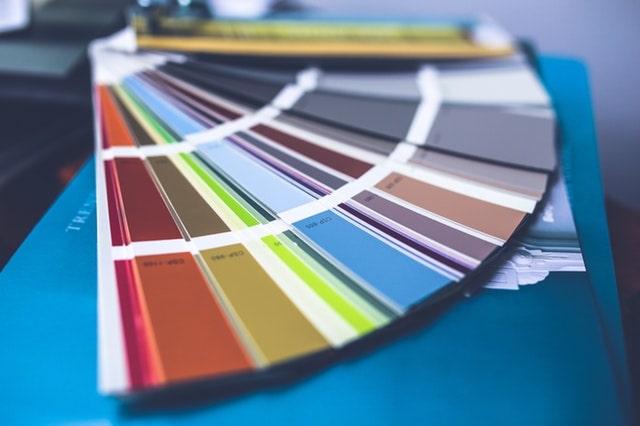
Colors are critical when designing your emails. Different elements of your emails need different colors (CTA buttons for example) and different colors convey different feelings.
I use several sites to create color palettes depending on the project: Coolors.co and Paletton.com.
Did you know color psychology and color association is a tool that you have at your disposal when it comes to your marketing efforts?
Color can have different associations across cultures, so it’s best to research your target audience when you look at your subscriber statistics.
Here are example colors and the associated meaning and emotions that are considered by marketers when creating presentations.
- Red: Power, energy, importance, intensity, danger
- Orange: Balance, warmth, vitality, enthusiasm
- Blue: Trustworthiness, order, security, loyalty
- Green: Environment, health, generosity, vigor
- Yellow: Optimism, idealism, joy, caution
- Pink: Feminine, caring, compassion, self-confidence
- Black: Power, sophistication, elegance, wealth
- Purple: Royalty, nobility, wisdom, transformation
These color descriptions are just examples of some of the positive meanings behind colors.
While there are no hard and fast meanings behind any color, developing your own palette based on what your business stands for and the culture you are creating is important. Then, translate that color scheme into your email design.
Color popularity
Contrary to the blue/pink stereotype of gender color association, blue is the favorite color for both men (57%) and women (35%). Blue is also a favorite with businesses like banks, as it suggests trust and security.
Can you see how you can use colors to your advantage?
Whatever color you decide to use, less is more.
Using your primary color in your banner and headings will help to create the impression you want. We don't want to overwhelm your readers with everything being in a different color.
The colors you use in your emails can help increase your brand recognition significantly, so it’s best to do some quick testing and then stick with that color scheme. This is because your color choices will become powerfully associated with you and your brand.
Related: How to choose brand colors and use them on your website
How to use color for a call-to-action in your emails
If you want readers to click a specific link in your newsletter, try making the call-to-action link red or orange. Being red intimates urgency — it is more likely to be clicked on than a blue link or button.
Red is the most powerful color in the color spectrum, and it might even elicit a physical response.
It can increase the heart rate and possibly cause a short-lived increase in clicking speed and action. This is why you'll see red being used for terms or actions that require attention.
Balance is very important though. Simple design always works best and provides a more trustworthy and professional appearance when compared to overly large, bright or flashing elements.
Mobile email design

More emails are now opened on mobile devices than desktop computers. And, if an email displays incorrectly on a mobile device, it most likely will be deleted within seconds.
With these stats in mind, you can see how it’s important to consider your mobile email design.
Creating emails optimized for mobile is a task you simply cannot avoid.
Fail to tackle mobile email design and you’re leaving money on the table, and potentially antagonizing list members to boot.
Picture this scene — it’s late in the afternoon, you’ve spent two hours polishing copy for your monthly newsletter blast, and a considerable amount of time making sure it looks spiffy on your shiny 34-inch curved monitor.
The innovative three-column layout you’ve gone for enables you to really highlight your many CTAs, and you’re confident this email design is going to hit it out of the park. You hit “send.”
Then the bad news trickles in. Open rates are down, but not disastrously so. Engagement rates, however, are in the cellar.
Worse still, you’re getting frustrated emails from your list about “tiny text.” Not only have you failed to engage your audience, you’ve inadvertently antagonized them.
What just happened?
Welcome to your first taste of failing to optimize your email campaigns for mobile.
Emails that are not optimized not only risk being deleted, they might also cause subscribers to unsubscribe instead of just delete. Why continue to get an email that is difficult to read or too busy?
To avoid this happening to you, let’s walk through a four-step mobile email design process so you get it right the first time.
Step 1: Mobile optimization is mandatory
Let’s get one thing out of the way right up front: You have to put out mobile-optimized content when it comes to newsletters. These days, nearly fifty percent of emails are opened on mobile.
Thus, mobile-optimized email content can lead to higher conversions.
That's why you send newsletters in the first place.
Step 2: Simplify, simplify, simplify
You've heard of the KISS principle (Keep It Simple, Stupid), right?
Refining your concept of what prioritized content actually is for your campaigns is part of the planning process.
Keeping it simple helps you to cater to the tiny screens (and short attention spans) of your subscribers.
Ruthlessly edit. You want to cut your copy down to the bone and get straight down to business. Every word counts.
Hone your CTAs. Each campaign should focus almost exclusively on your primary call-to-action that you want the reader to complete.
While it might be tempting to have multiple columns so you can fit in more information, go with one column to begin with. A multi-column layout can be a recipe for disaster on mobile devices. Embracing the constraints of a single-column layout forces you to keep your message on point and succinct.
Yes, there are two-column formats out there (and that you can build with your own with custom HTML), but with more people reading emails on cell phones, this two-column layout doesn’t make for easy reading.
Stick to one column to keep your message clear and keep you on message as you compose.
What about “below the fold” content? Below the fold is the content that users have to scroll to view.
Unlike a website, there is so little real estate in an email that you will never be able to fit everything above the fold. When it comes to your newsletters, it is your job to keep readers interested and scrolling for more.
Step 3: Stick to mobile-first defaults
We’ve set the stage for a successful mobile email with some sensible upfront work — now it’s time to get into the weeds a bit.
Start with an eye-catching mobile-ready template (more on that later).
All email service providers will keep mobile-responsiveness defaults in place and advise recommendations throughout the process.
Make sure you are paying attention to the following mobile-first defaults that will give you the highest possible chance of delighting readers while displaying smoothly across devices:
- Fonts: Use web-safe fonts with a minimum size of 16 pixels for body text.
- Text links: Avoid having links nestled together where they can be hard to click on and target.
- Formatting: Too much text looks like too much to read. Your subscribers will most likely be scanning so you want to use short paragraphs and lists where appropriate. This helps to keep things easy on the eye.
- Buttons: CTA buttons also need to be easily clickable. Aim for a minimum size of 44 x 44 pixels.
- Graphics: Don't include images for the sake of having imagery. Choose graphics with one prominent point of interest, and use them when they compliment your content or backup your CTA.
Related: Email marketing tips to captivate customers and drive sales
Step 4: Test, then test again (and again)
Testing is necessary and should be ongoing.
With every addition or modification that you make you want to run a test to see how your changes display.
You also want to preview and test all your campaigns and even split test if possible to see which produces the results you are looking for.
Your email provider provides the ability to both preview your campaign against common user configurations and also send test campaigns to specified recipients. This is where you create lists of specific subscribers based on certain details or demographics.
What works with some folks might not be as effective for others. Being able to make these determinations only serves to make your mailings more targeted.
Take advantage of ongoing reporting and split-testing data.
Once you have an overall setup that you are happy with, you can then get into split-testing elements such as headlines and calls to action.
One thing is clear — you want to constantly be reviewing campaign metrics and looking for nuggets to build upon.
While some of this might seem a bit dauntingly technical, your provider most likely offers the tools to take care of most of the grunt work for you, so use them.
Using email templates (themes)

No need to code from scratch.
Templates are a great way to get your structure and design in place for future mailings and you just customize to your liking.
Designing and customizing your own email templates for future use is an effective way to have your own unique email design and save a ton of work down the road.
General guidelines when creating and customizing your email templates (themes):
Create a color scheme
The first step for email theme design is to establish a color scheme as we talked about earlier. You can use colors from your logo and your website. It’s a simple design choice to use your website’s background color as an email newsletter color, heading colors from your site as headings in your email newsletter, etc. This will make sense to your readers. Branding!
Choose a banner image
Start your email design with your banner image. To match colors precisely, use hexadecimal color codes. Using graphic software, you can sample colors using the color picker tool.
Choose the rest of your colors
From your color palette, choose your secondary color to use for section titles and links.
Make it easy to read
Keep it readable. Make sure that the color behind your text is white or a light color. Set your outer background to a neutral color from your palette to allow your content to remain the focus.
You can use a strong dark color as a border. A dark border will highlight the space that your readers’ eyes should focus on. Readability is always the rule, so when in doubt, leave it out. (Cliche, but it works!)
Experiment with colors
Try experimenting with heading colors using variations from your website. If you don't want to be overly colorful, go with blacks and grays, because these work with lots of other colors. The font color of body text should be the traditional black or dark gray.
A word about creating email content
While design and visuals are important, content that is properly created and formatted is just as critical to achieving ROI.
Writing is a skill you can improve over time.
The more you write, the better you are at creating messages that will resonate with your target audience. And, how you structure that content will encourage subscribers to keep reading.
Hemingway is the perfect tool to make your message clear and catchy. The site automatically tells you how readable your message is and gives you tips to improve your sentences.
Write scan-friendly text, break up your paragraphs and use colors to attract readers to CTAs.
We all scan — you've probably caught yourself scanning instead of reading every word in every email you receive. Count on your subscribers doing the same. As you are creating your content, keep in mind:
- Depending on how much content you have, use section headings and subheadings.
- Avoid long strings of text. Try breaking things up with an interesting image or two.
- Keep your sentences to 20 to 25 words and your paragraphs to three to four sentences.
- Use color to draw readers toward your important links and CTAs.
Related: How to write an email that people will read
Email design mistakes to avoid

Say you have all of the above in place and are ready to go. The best looking email will not produce if the email contains errors and mistakes or the content and verbiage doesn't talk to (not at) the person opening the email.
Here are the email design mistakes that I see on a regular basis.
Not spell checking
Don't trust your spell checker alone. Misspellings that spell other words that are not inline with your message might not be caught by your spellchecker.
Broken links
When you run your tests, click on every link in your email to make sure that they go to the desired destination.
Generic subject field
Make sure your subject field is a clear and concise description of what lies within. Short and sweet. Refrain from over-hyping or using typical words you see in spam that lands in your inbox.
Incorrect “From” field
For mass mailings, having a recognizable email address is important.
Having an email address that is specific to handling email replies is also recommended. You want to have the ability for folks to email you if they want to.
Noreply@ doesn't encourage contacts.
Using an email address that produces bounce-backs because that email address is not monitored does not create a customer-centric experience.
Clashing colors
Make sure that your colors match and that they do not conflict with being able to read your text or see your links.
A very well-known hosting company I work with has a list of links at the bottom of each email newsletter. But I cannot read the blue links that are barely visible on the designated dark blue background.
Missing Images
Use an absolute path to your image (https://yourdomain.com/image.jpg) versus relative paths (/image.jpg) to avoid broken image icons.
Short codes/customization
We've all received emails that display a short-code (%FNAME%) in lieu of our name. This gives the perception that we lack attention to detail or that we are not tech savvy.
To avoid these errors, test and then test again before doing your final send.
It is common during the ongoing writing and testing process to miss errors. After a while you might not even notice those errors that are right in front of you.
Starting with a fresh look the next day can help to recognize any errors that you might have overlooked.
Reading your email out loud is also an effective way of catching any errors in your content as well as ensuring you are relaying the desired tone.
Recap: Email design basics
There are a lot of details to remember when designing an email. Here’s a recap of what we just went over:
- Choose your banner wisely, plan your layout and elements, and run tests.
- Choose images that speak to the content and back up your brand — all in optimized sizes.
- Use fonts that will work across platforms and that are easy to read.
- Be cognizant of the meaning of colors and how they fit to your brand. Use color to draw readers toward your important links and calls to action.
- Test your emails on various platforms for best results. Remember the KISS acronym for mobile.
- Create email templates and track which work best and provide the optimal results.
- Check spelling and check your links.
Now that you have all the variables needed to create your own beautiful email designs, you are well on your way to building your subscriber list and enforcing a solid reputation for your business.
Disclaimer: All trademark rights belong to their respective owners. Third-party trademarks are used here for demonstrative and educational purposes only, use does not represent affiliation or endorsement.
This article includes content originally published on the GoDaddy blog by the following authors: Dean Levitt, Emma Wilhelm, Kate Chittenden, Macdara Bracken and Tom Ewer.
