Key takeaways
- A combination mark logo is a strategic design that merges a symbol or icon with text, providing businesses with a versatile branding tool that can communicate their identity through both visual and textual elements.
- Successful combination logos are designed with careful consideration of layout, typography, scalability, and brand personality, ensuring they can work effectively across various mediums and potentially evolve over time.
- The benefits of a combination mark logo include enhanced brand recognition, flexibility in usage (such as using the symbol or text separately), and the ability to tell a brand's story through creative visual storytelling.
Let’s talk about combination mark logos, or combination logos, shall we? What are they, and why should we use them?
On a recent thrift store shopping excursion, I stumbled across the book The Power of Logos: How to Create Effective Company Logos by William Haig and Laurel Harper. The timing of finding this 1997 gem couldn’t have been sweeter, considering I was just beginning my research for this post you’re reading now.
Interestingly, the book states that logos “began to emerge as the heart of the corporate identity program in the 1950s.”
Even though they have been around for centuries, it’s only been in the last 70 years or so that logos have become as synonymous with a brand as its name alone.
What I found particularly fascinating is that many of the elements of logo design in the book are still used today — nearly three decades later. And combination mark logos, well, they give businesses another way to communicate nonverbally what they do while branding themselves simultaneously.
As Haig and Harper say, “The logo is one of business’ most ‘outspoken’ nonverbal cues,” helping audiences understand a brand better.
If you’ve ever wondered about combination mark logos and how they could help you brand your business, or if you just want to geek out on design with me, keep reading.
Disclaimer: All known trademarks contained herein are the property of their respective owners and their inclusion does not represent any affiliation, endorsement, or sponsorship.
Related: How to make a business logo
What is a combination mark logo?
A combination mark logo is exactly what it sounds like — a perfect marriage between a symbol or icon and your business name.
When you use a combination logo, you get the best of both worlds in logo design: an eye-catching visual element paired with clear text that tells people exactly who you are.
For example, when you see the golden arches next to "McDonald's," you're looking at classic combination logos in action.
Key components of a combination mark logo
What makes up a combination mark logo? A combination logo has two essential elements that work together to create a unified brand identity: the Symbol and the Text Component.
The Symbol (or Icon)
- Can be pictorial (like Apple's apple)
- Abstract (like Nike's swoosh)
- Geometric shapes
- Illustrated elements
- Monograms or emblems
The Text Component (Logotype)
- Company or brand name
- Specific typography/font choice
- Can be customized lettering
- May include a tagline or establishment date
The magic happens in how these elements interact. They can be arranged in three main ways:
Side by side/horizontal (like Microsoft's windows and text), stacked (like Adidas' trefoil/mountain above the name), or integrated (like Burger King's text between the buns).
Benefits of integrating typographic and illustrative elements in logo design
Why should you use a combination logo? A combination logo can help set your brand apart in a world cluttered with countless business identities. It's not just a logo — it's a powerful one-two punch that makes your brand work smarter, not harder.
Things get really exciting when text and symbols join forces.
Your audience might forget a name, but they'll remember that striking symbol.
How many of us can forget the iconic arrow pointing from A to Z on the Amazon logo or the “apple” for, well, the Apple brand?
Maybe the symbol seems familiar, but it's your distinctive text that clicks in their mind.
Even when we don’t see the brand name accompanying the logo’s symbol, we instantly recognize the brand. That’s the power of a combination mark logo! You’ve just given people two ways to connect with your brand.
And here's where it gets really fun: these logos are incredibly flexible. Let’s say you need a tiny social media icon. You can just use the symbol.
Or, if you’re creating business cards, the full logo works beautifully.
Making a billboard? You've got both elements at your disposal, just like a Swiss Army knife.
Let's talk about storytelling for a quick sec.
Your text tells the world exactly who you are, while your symbol shows what you're about.
Take FedEx — its name is crystal clear, but that hidden arrow between the 'E' and the 'X'? It brilliantly suggests movement and delivery without saying a word. Therein lies the brilliance of a combination mark logo at work.
Ideas and examples of combination logo marks
We’ve already mentioned a few of them, but let’s actually take a closer look at some of the most popular combination logos that brands are using today. We’ll break these down alphabetically, and share which type they are most closely associated with: horizontal, stacked, and integrated.
A quick reminder of what sets each type of combination logo apart:
- Horizontal combination marks: Symbol and text placed side by side, creating a balanced, linear design.
- Stacked combination marks: Symbol and text arranged vertically, one above the other.
- Integrated combination marks: Symbol and text woven together into a single unified design element.
1. Adidas
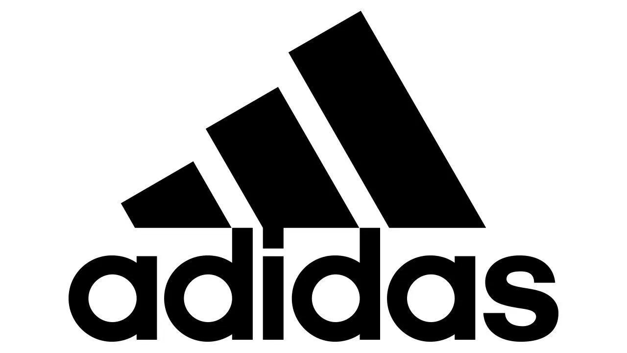
- Graphic element: Three stripes forming mountain/trefoil
- Typography: Bold sans-serif of the word “Adidas”
- Text position: Below the symbol
- Logo type: Stacked
- What makes it great: In 1991, the three stripes forming the mountain we know today were created, making for the perfect balance between distinctive symbol and text that works at any scale
2. Adobe
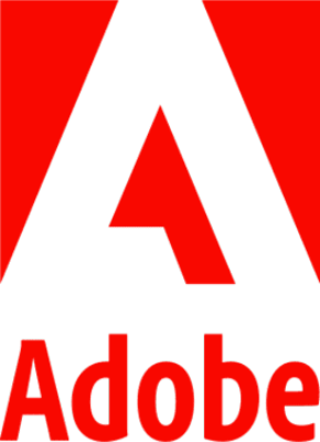
- Graphic element: Stylized 'A' in geometric shape
- Typography: Clean sans-serif of the word “Adobe”
- Text position: Below the symbol
- Logo type: Stacked, though sometimes it appears horizontal with the “A” next to the word Adobe
- What makes it great: Simple, corporate design that scales well across product lines
3. Amazon

- Graphic element: Curved arrow from 'a' to 'z'
- Typography: Custom sans-serif with the word “Amazon”
- Text position: Arrow integrates under the text
- Logo type: Horizontal
- What makes it great: Smile/arrow cleverly suggests the company sells everything from A to Z with customer satisfaction
4. American Express
- Graphic element: Centurion head portrait frame
- Typography: Custom sans serif font of the words “American Express”
- Text position: Centered
- Logo type: Integrated
- What makes it great: Projects strength and heritage while maintaining modern appeal
5. Apple

- Graphic element: Bitten apple silhouette
- Typography: Initially used Motter Tektura (1976-1984), and then Apple Garamond (1984-2003), and finally Myriad (2003-present) when text is used
- Text position: Originally to the right of the apple symbol, but now the company primarily uses the symbol alone
- Logo type: Horizontal when the symbol appears next to the text.
- What makes it great: It’s evolved with the times. It was first created in 1977 (rainbow apple by Rob Janoff) and revised in 1998 (monochrome version).
6. Audi
- Graphic element: Four interlocking rings
- Typography: Modern sans-serif of the word “Audi”
- Text position: Right of rings
- Logo type: Stacked
- What makes it great: Clean, premium feel with perfect geometric balance
7. BMW
- Graphic element: Circular emblem with blue and white quadrants
- Typography: Bold sans-serif with the letters “B,” “M,” and “W”
- Text position: Above circular emblem
- Logo type: Integrated
- What makes it great: Strong geometric design representing Bavarian colors, perfect balance
8. Burger King
- Graphic element: Two bun halves encasing text
- Typography: Bold, custom rounded sans-serif of the words “Burger King”
- Text position: Integrated between stylized buns
- Logo type: Integrated
- What makes it great: Text and symbol form a literal burger, telling the brand story in a single unified design
9. CBS
- Graphic element: Eye symbol
- Typography: Custom serif letters of “C,” “B,” and “S”
- Text position: Letters to the left of the eye shape
- Logo type: Horizontal
- What makes it great: Iconic "eye" represents both broadcasting and viewing
10. DHL
- Graphic element: Yellow and red slanted stripes
- Typography: Bold sans-serif of “D,” “H,” and “L”
- Text position: Left of or on stripes
- Logo type: Horizontal
- What makes it great: Dynamic design suggests speed and movement essential to shipping
11. Dropbox
- Graphic element: Open box made of geometric shapes
- Typography: Modern sans-serif of the word “Dropbox”
- Text position: Below the symbol
- Logo type: Stacked, but sometimes appears horizontal as well
- What makes it great: Simple, memorable design that works well for digital applications
12. FedEx
- Graphic element: Hidden arrow in negative space between 'E' and 'X'
- Typography: Bold Futura with modified spacing of the word “FedEx”
- Text position: Arrow integrated within letter spacing
- Logo type: Integrated
- What makes it great: Clever use of negative space tells the story of forward movement and delivery
13. IBM
- Graphic element: Eight horizontal stripes running through the letters, suggesting speed, efficiency, and electronic data movement
- Typography: Custom block letters constructed from and with the stripes; font based on City Medium of the letters “I,” “B,” and “M”
- Text position: The text and stripes are inseparable — they form one unified design
- Logo type: Integrated
- What makes it great: The horizontal stripes create movement and a technological feel while maintaining incredible legibility.
14. Lacoste
- Graphic element: Green crocodile
- Typography: Bold sans-serif of the word “Lacoste” when text is present
- Text position: Below crocodile
- Logo type: Stacked, though typically you’ll see just the symbol these days
- What makes it great: One of the first designer logos to use an animal mascot, pioneering fashion branding
15. LinkedIn

- Graphic element: 'in' square emblem
- Typography: Custom sans-serif
- Text position: The word 'in' is in the middle of the square
- Logo type: Horizontal when used with the word “Linked,” otherwise it’s considered integrated
- What makes it great: Professional yet approachable, works well across digital platforms
16. Microsoft
- Graphic element: Four-square window symbol
- Typography: Modern sans-serif (Segoe UI) of the word “Microsoft”
- Text position: Right of symbol
- Logo type: Horizontal, but again, the text isn’t always present anymore as the symbol stands alone
- What makes it great: Clean, modern design representing both windows and multiple products
17. Red Bull
- Graphic element: Two charging red bulls
- Typography: Bold sans-serif of the words “Red” and “Bull”
- Text position: Below bulls
- Logo type: Stacked
- What makes it great: Aggressive symbol perfectly matches brand energy positioning
18. Shell

- Graphic element: Red and yellow shell
- Typography: Bold sans-serif of the word “Shell”
- Text position: Below or to the right of the shell shape (though, from 1948 to 1961, the word appeared within the graphic)
- Logo type: Integrated (though argument can be made for horizontal when the text appears to the right of the shell, and stacked when it appears below the shell)
- What makes it great: The symbol and text can work together or independently, showing the evolution of the combination mark
19. Spotify

- Graphic element: Three curved lines suggesting sound waves
- Typography: Custom rounded sans-serif of the word “Spotify”
- Text position: To the right of the symbol
- Logo type: Typically stacked, though it has appeared horizontal as well, with the text to the right of the symbol
- What makes it great: The symbol works perfectly as an app icon, while the full logo maintains brand recognition
20. TikTok
- Graphic element: Music note design styled to suggest movement with neon blue and magenta shadow effects
- Typography: Custom heavy sans-serif in black, featuring slightly rounded corners matching the note design
- Text position: Right of music note symbol, but sometimes below the musical symbol
- Logo type: You might occasionally see the logo in stacked format, but its primary and most recognized configuration is horizontal, with the note to the left of the text.
- What makes it great: Embodies the platform's music and video fusion through the note design while the shadow effect suggests the glitch/distortion effects popular on the platform; works equally well when the symbol is used alone for app icon
21. Toyota
- Graphic element: Three overlapping ellipses: two forming a 'T' shape and a third encircling them. The vertical and horizontal ellipses represent the heart of the customer and the heart of the company merging, while the outer ring represents global expansion and technological advancement
- Typography: Custom sans-serif of the word “Toyota” in a strong, authoritative style
- Text position: Below the ellipses in stacked version; sometimes placed to the right in horizontal applications
- Logo type: Stacked (though it sometimes appears horizontal)
- What makes it great: The overlapping ellipses create depth and dimension while forming a hidden 'T'.
How to design a successful combination logo
My hope is that the examples above inspired you to come up with a combination logo for yourself. But, what makes for a successful combination mark?
To balance text and symbols perfectly requires careful planning
It also requires thoughtful execution, as well as attention to both artistic principles and practical applications. With this in mind, let's explore the essential steps to design that will effectively represent your brand for years to come.
Strategic foundation
Before jumping into design, you should lay the groundwork for your combination logo by deeply understanding your brand's core values and personality.
Research your industry and competitors thoroughly to ensure your design will stand out while still meeting audience expectations.
Consider where and how your logo will primarily be used, whether it's mainly digital, print, signage, or a mix of all three. This foundation will guide every design decision that follows.
Layout approach
Your next major decision is choosing between three primary layout styles:
- Horizontal layouts offer a professional, traditional feel that works well in standard applications.
- Stacked formats provide space efficiency and are particularly effective for social media and square formats.
- Then again, integrated designs, where text and symbol merge, can create unique, memorable logos but require careful balance and skilled execution.
Also, consider how your logo would look if you created stacked and horizontal versions of it. For example, sometimes we see the Adobe logo with the “A” next to the word instead of above it. Both make for a compelling layout.
Design fundamentals
Typography plays a crucial role in your combination logo's success. It’s a good idea to select fonts that authentically reflect your brand's personality while ensuring they remain readable at any size.
You could consider whether custom lettering might better serve your needs, but limit yourself to one or two fonts maximum to maintain clarity.
For your symbol, embrace simplicity and scalability. It should be meaningful to your brand while working effectively in black and white or in color.
You may also want to look for opportunities to use negative space creatively, but never at the expense of clarity.
Technical considerations
Many articles I researched indicated that it’s best to always create your combination mark logo in vector format to ensure perfect scalability. Then, test it extensively at multiple sizes and in monotone to ensure versatility.
Pay special attention to legibility across all mediums, and allow for adequate breathing space around the logo. These technical details might seem minor, but they're crucial for professional execution.
Balance and proportion
Your goal should be to achieve perfect harmony between your text and symbol elements.
Maintain a clear visual hierarchy while ensuring that neither element overpowers the other.
Many successful logos use golden ratio principles to create pleasing proportions— consider how these might enhance your design.
Versatility checks
Your logo needs to perform flawlessly across all applications. Test it on everything — from tiny social media icons to large signage, across various backgrounds, and in different color scenarios.
Pay special attention to how it appears on business cards, mobile devices, and in black and white. Each context presents unique challenges your design must overcome.
Future-proofing
Think long-term when designing your combination mark logo. Avoid trendy elements that might quickly date your design, and consider whether your text and symbol could work independently as your brand recognition grows.
Plan for potential brand evolution and create variations for different uses. A truly successful combination logo should feel as relevant in 10 years as it does today.
What should I avoid when designing a combination mark logo?
Yes, you want your combination mark to be perfect. But, here’s the thing — there is no perfect logo design.
Even Adidas has changed its logo multiple times, so don’t feel like you’re stuck with it forever. That said, there are a few things you might want to avoid. Let’s talk about what they are and why they’re important.
Trend-chasing
Sure, that trendy gradient or that ultra-thin font might look cutting-edge right now, but remember how we all feel looking at photos of what we wore in the ‘90s?
Trends fade, but your logo needs to stand the test of time. Instead of following the latest design fad, focus on timeless elements that reflect your brand's core values.
Playing design Tetris
Cramming too many elements into your logo is like trying to tell your life story in an elevator ride — it just doesn't work. When you find yourself adding "just one more thing," take a step back. The most memorable combination logos, like FedEx or Mastercard, succeed because of their simplicity, not in spite of it.
Font frenzy
Using too many fonts in your logo is like wearing plaids with polka dots — it's just too much. Stick to one, maybe two, font families max. Remember how clean and professional the Nike logo looks with its simple typography? That's what we're aiming for.
The scalability slip-up
If your logo loses its magic when it's shrunk down to favicon size, you might have a problem. Those intricate details might look amazing on your computer screen, but they'll turn into a blob on a business card. That’s why it’s so important to test your design at both thumbnail and billboard sizes — it needs to work everywhere.
Color chaos
While it might be tempting to use every color in the rainbow (we're looking at you, original Apple logo), remember that your logo needs to work in black and white, too. Start in monochrome and add color thoughtfully, not as a crutch to make a weak design more interesting. Try to use effective logo color combinations that can elevate your design but relevant for your industry to boost brand recognition.
The identity crisis
Your logo shouldn't try to be all things to all people. If you're a luxury brand, don't use playful bubble letters. If you're a children's toy company, maybe skip the serious corporate look. Stay true to your brand's personality — authenticity is key.
The "me too" trap
Yes, Nike's logo is iconic. No, that doesn't mean your sports company needs a “swoosh” logo, too. Study your competitors' logos not to copy them, but to ensure you stand out. Your combination logo should be as unique as your brand.
The best combination logos feel effortless. However, that simplicity comes from careful consideration and avoiding these common pitfalls. Want to see what I mean?
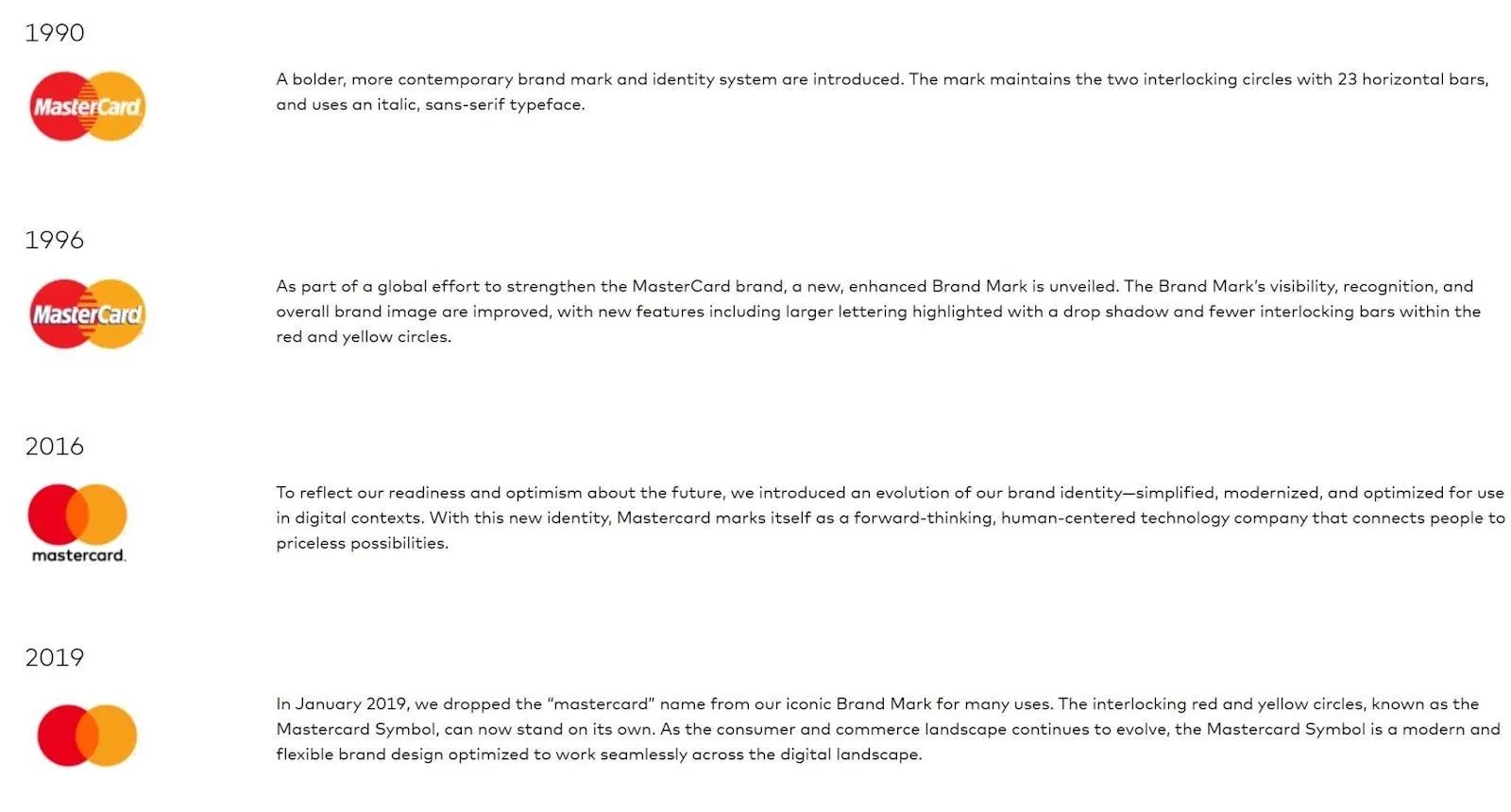
Just look at how Mastercard simplified its logo over the years. Their logo redesign process involved getting rid of unnecessary elements until it achieved its current clean design.
Think of these combination logo guidelines as your design guardrails — they're not there to restrict your creativity. Instead, they are there to help you channel it in the most effective direction.
After all, your logo will be the face of your brand for years to come. Make sure it's one you'll be proud to show off!
FAQs about combination mark logos
To close things out, let's explore some of the most frequently asked questions about combination mark logos, with clear, practical answers to help you on your design journey.
How do I combine fonts in a logo?
Keep it simple — stick to a maximum of two fonts that create clear contrast (like pairing a bold sans-serif with a lighter serif). Think of it like a good marriage — the fonts you choose for your logo should complement each other, not compete for attention. Look at how FedEx uses a single font but creates interest through color variation instead.
How do I choose the right typography for my logo?
Match your font to your brand personality. A law firm probably shouldn't use bouncy script fonts, just like a children's brand might want to avoid rigid serifs. Test your choices by asking, "If this font was a person, would it represent my brand well?"
How can I ensure my combination logo is versatile across different media?
Start simple and test extensively. Your logo should be recognizable, whether it's on a tiny app icon or a giant billboard.
Create variations (horizontal, stacked, symbol-only) for different spaces, but maintain consistent elements across all versions. Think about how Adidas can use its full logo or just the trefoil, while always staying recognizable.
What role does color play in a combination mark logo?
Color is like seasoning — it should enhance your logo, not make or break it. Design in black and white first to ensure your logo works at its core, and then add color strategically to reinforce your brand message. Remember, your logo should still work in monochrome for faxes, embroidery, or simple printing.
Can typography be a logo?
Absolutely! Just look at Coca-Cola or Google — they're primarily typographic but remain incredibly distinctive. The key is using typography creatively to create a unique visual identity, whether through custom letterforms or clever modifications to existing fonts.
What are the pros and cons of combination logos?
Pros: Maximum versatility, strong brand recognition, works at any scale, and elements can be used separately as your brand grows.
Cons: Can be complex to design, might be challenging to maintain consistency, and can require more space than simpler logo types. It’s like a Swiss Army knife — more versatile but requires more thought to use effectively.
Why is a combination mark logo important?
Combination logos (a.k.a. combination marks) give you the best of both worlds — instant recognition through symbols and clear identification through text. Similar to having a belt and suspenders, you get double the brand security, so you don’t get caught with your pants on the ground! As your business grows, the symbol can potentially stand alone (think Nike's swoosh or Apple's apple).
What is the difference between a logo and an icon in typography?
A logo is your complete brand identifier (like Microsoft's full logo), while an icon is a symbolic element that can stand alone (like Microsoft's window symbol). Think of your logo as your full name and your icon as your signature — both identify you but serve different purposes.

