This article originally published on Media Temple's blog.
If 2020 has proved anything, it’s that we work in a world of constant disruption. Whether it comes from a new technology or a worldwide pandemic, Heraclitus was right: “Change is the only constant.”
So, how do we maintain some semblance of order when we’re forced to continuously evolve?
For UX, Creative, and even wider business teams, establishing brand-specific design principles can go a long way. By crafting experiences based on these foundational guidelines, you ensure that even the most agile, experimental ideas stay rooted in your brand and why users embrace it.
What are design principles?
Design principles are foundational ideas for building experiences, guiding everything a design team creates. They sit toward the top of your “design thinking” or “design system” activities, and capture big broad concepts, often represented with a single word or short phrase.
They’re largely removed from trends and style. They’re the reasons your brand might choose a particular button shape, logo treatment, or bit of microcopy – not the specifics of those patterns themselves.
Like any conceptual framework, design principles come in many shapes and sizes. It’s up to you to decide what will be the right structure for your brand.
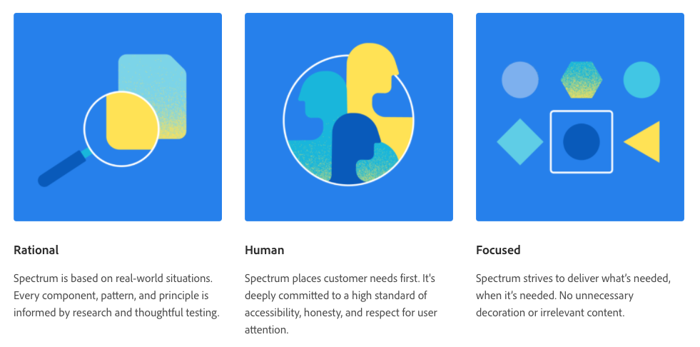
In Adobe’s Spectrum design system, three top-level principles – “Rational,” “Human,” “Focused” – are supported by four more more action-oriented concepts – “for all platforms,” “for everyone,” “evolving and transparent,” “built by a community.”
On the other side of the coin, there’s the design guidelines for Google Cardboard, which are more descriptive and focused specifically on the virtual-reality space – “avoiding simulator sickness,” “establishing familiarity.”
In both cases, you can see how these principles influence everything the design group creates.
Why are unique design principles important?
Naturally, design principles operate at a widely applicable and foundational level. Because of that, it can seem like there’s really no point in developing a set that’s tailored to your brand.
Pretty much every set of design principles has some principle about clarity, about consistency, about user empathy. A lot comes out in the details, though. How much your brand emphasizes a particular concept and even the tone of descriptions will form the unique personality of your design work.
Let’s compare two brands whose design ethos you likely have a strong sense of: Apple and Firefox. Both establish design principles about giving users control.
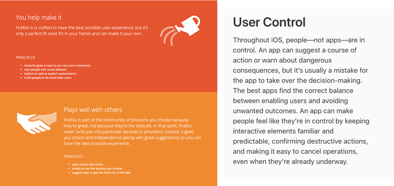
At least two of Firefox’s design principles are dedicated to giving users control over the experience. The wording establishes expansive agency for the user, too: “make it your own,” “invite people to be more than users,” “gives you choice and independence.”
Apple’s Human Interface Guidelines in no way discount the idea of user control. It’s still a primary design principle. However, Apple’s principle strives for a balance instead of the unfettered freedom and authority Firefox grants its users. “The best apps find the correct balance between enabling users and avoiding unwanted outcomes.” And consider this phrase: “make people feel like they’re in control.” (The emphasis is mine.)
Imagine a Freaky Friday-esque swap of principles. What would Firefox look like following Apple’s specific design principles or vice versa? Probably not what each looks and feels like today.
Even though a brand’s design principles will undoubtedly share core concepts, the mix’s particularities influence the flavor and form of the brand’s design. So, it’s essential to create design principles that line up with your brand’s unique cocktail.
How do you create design principles?
When we looked to establish a defined set of design principles at Media Temple, we surveyed our existing experiences.
Across a roomful of whiteboards, we hung up comprehensive examples of our user experiences, brand guidelines, plus feedback and survey information. Then, we discussed it all. What worked, what didn’t, why? All this ensured our principles would be firmly grounded in our customers’ reality.
After this analysis, each team member jotted down phrases on sticky notes. These phrases represented the strengths and pitfalls of the experiences. e.g. “Great patterns should be repeated”, “Formal tech speak feels intimidating”. Like many UX exercises, we then grouped, voted, refined, and prioritized these phrases.
Through this process, we narrowed our boards down to a set of eight clustered concepts, standing distinctly from each other while representing the breadth of what we’d discovered in our analysis.
With the high-level work done, we then transformed the team consensus into a guiding document. One useful touch: Scripting questions to ask ourselves when we assess designs against the principles.
Example: Media Temple’s Design Principles
Remove, reduce, refactor.
Our greatest value to customers is making complicated tasks easier and quicker. Favor simplicity and edit rigorously.
- Have we made this as simple as it can be?
Invent the wheel and roll with it.
An ideal solution can be used to solve more than the immediate problem. Strive for building versatile solutions and applying them across various situations.
- How can this be utilized in the future?
- How can we use existing tools to solve this problem?
Value the ecosystem.
Consistency provides benefits for both users and designers. Consider how your solution affects the big picture, and how the big picture affects your choice of solution.
- How have we accounted for the impact this might have elsewhere?
- Does this conflict with what we’ve shown users in other experiences?
Keep the path honest and clear.
Users should have a clear expectation of what they are being guided to, and where they end up should match that expectation. Avoid twists and tricks.
- Is this really how this works?
- Where might the user be confused by this experience?
Make the info useful.
Whether it’s a bold marketing claim or a simple error message, information should move users forward. Make sure everything has a reason for being and can be acted on.
- Will this be helpful to users?
- Why are we including this information?
Design for designers, develop for developers.
Creators are both our direct clients and validators for our business-side clients. The more that our experiences reflect what they care about, the more they’ll care about our experiences.
- Would a designer/developer appreciate how this is built?
Listen, watch, learn.
Ultimately, everything we do serves our users, so our users should be our number one resource. Observe their interactions and make sure they influence your decisions.
- Does this solve a problem users have?
- How do our users respond to similar experiences?
Evoke an emotional response.
In the words of Don Norman, “We need to design things to convey whatever personality and emotions are desired.” In what you create, reflect how you want a person to respond.
- How does this experience make a user feel?
Efficiently deliver better results
When you use The Hub from GoDaddy Pro, suddenly there’s more time in your day to focus on what matters most. Forget about juggling admin tasks. Reclaim your time and use it to make clients feel like the center of your universe.
