Sidebars can be a useful way to display extra information on your website. Anything you want to appear prominently or on multiple pages should typically go in a sidebar. But with their limited horizontal width, sidebars can also present some interesting space and formatting challenges.
Beware of ‘feature creep’
Have you ever visited a website and immediately thought, “I have NO idea what is going on here?!” Some developers decide to pack so many features and gadgets into a website — often from overuse of sidebars — that it can be difficult to even focus on the information.
Try to drill down to the most essential and critical data you want to include in your sidebar first. Add additional features to your sidebars sparingly and thoughtfully, or the chaotic Feature Creeper might just sneak up on you.
Another area where the dastardly Feature Creeper can attack is with the use of plugins.
Plugins are, of course, a very useful (and even necessary) tool in any WordPress website. There are thousands of plugins created specifically to add features and widgets to sidebars. But overuse them (especially ones that aren’t written cleanly) and you might see a drastic drop in your site loading speed. Google and other major search engines include page load speed as one of the factors in determining website rank, so increased load time should be avoided.
Expanding the number of plugins in use also increases your chances of a plugin/plugin or plugin/theme conflict. And if you’ve ever tried to troubleshoot issues on a site, you know how much fun tracking that down can be. You can alleviate some of these concerns by making some simple changes in how you use and format sidebars.
Adding images to sidebars
Let’s face it — all text all the time is boring. We’re visual creatures, and a good way to break up the monotony of a sidebar is to add images. Oddly enough, this isn’t as straightforward in WordPress and you might think. There is no “add media” button on a sidebar by default. However, you can still add photos and graphics fairly easily with a simple text widget.
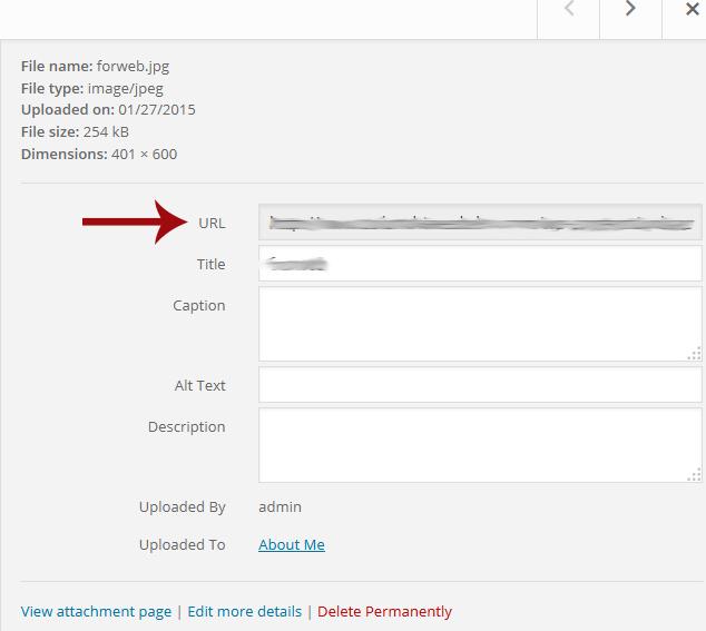
Begin by adding your image via the Media Library. Once added, click on your image (to see the details) and copy the file location from the URL box on the right.
In your Widgets section, add a standard Text widget to the sidebar where you want to feature your image. Add the following HTML code to the main body, of course replacing the URL text with the location you copied in the step above and changing the description. Be sure to also save your changes.
<img class=”sidebar_img” src=”YOUR URL HERE” alt=”YOUR IMAGE DESCRIPTION” />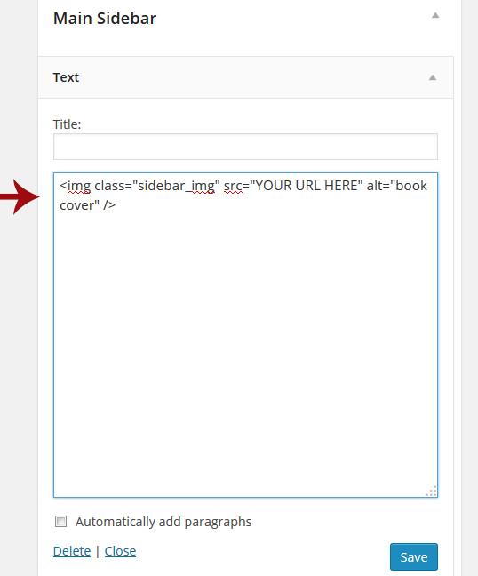
This code will allow you to easily add images without the need for a plugin or a bunch of extraneous code. The class name (class=”sidebar_img”) is optional, but is one method to adjust your sidebar images formatting easily.
Formatting images and text in sidebars
Obviously, you’ll want to ensure that images appearing in your sidebars are smaller than images shown elsewhere on the site. You might also want to change the formatting (size, color, font weight, etc) of the text in a sidebar to appear different from, say, your main H1 or H2 headlines. CSS to the rescue! In the above example where we added the image, we included a .sidebar_img class. Now, we can change just about anything we want related to those images just by modifying that class: image size, position, hover effects, you name it.
For example, you could set all sidebar images to have a maximum width so they don’t overlap the sidebar or cause strange layout issues. As long as each sidebar image you add contains the .sidebar_img class, you can avoid having to format each image separately.
A similar method is to assign the sidebar itself an ID or class name. This makes it easier to format the sidebar headings and text in addition to the images. This method could require a bit more code manipulation, but it gives you much greater control (you also don’t have to worry about forgetting to add a “class=” to one of your images this way).
Pro tip: Always make theme changes to a child theme so you don’t lose any customizations when an update is released.
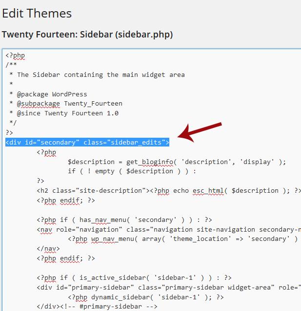
Go into the Appearance → Editor section of your theme and locate the sidebar template file (typically called something creative, like “sidebar.php”). Find the wrapper around your sidebar and take note of the ID or class name.
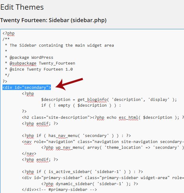
In this case (the Twenty Fourteen theme), the sidebar has an ID of “secondary”. You can now manipulate image or text within that sidebar with CSS using that ID. For example:
- #secondary img [your css here] will apply changes to all images in the sidebar
- #secondary h1 [your css], #secondary h2 [your css], etc., will format the sidebar headings
- #secondary a:hover [your css] would change the hover effect of sidebar links only
If your theme’s sidebar doesn’t have an ID or class in the code already, or if you just prefer to add your own, simply edit that wrapper and save the template (in this case, I added the class .sidebar_edits). You can now make your CSS changes to that ID/class:
Think outside the sidebar
Sidebars are useful, but keep in mind that your most important information should always be accessible. Many themes move the sidebar options to the bottom (or hide the sidebars altogether) on mobile devices. Be sure to keep this in mind when adding content to your sidebars, and be sure your visitors have another way to access the same information if necessary. Some items that used to typically be included in sidebars (social media icons or newsletter sign-up boxes, for example) can also be easily included in a header or footer.
Do you have any must-know tricks for getting the most from your sidebars? Please share with the class in the comments below.
