You may have heard that Google will be switching to a mobile-first index in the near future, but if you’re not sure what this means or how it will affect your site, don’t panic. With a little preparation, you won’t have to worry about Google turning your rankings upside down. The following information explains the basics of the update and walks you through the steps you should take to get ready.
What does mobile-first indexing mean?
Right now, Google crawls the web from a desktop user’s point of view and catalogs websites based on their desktop version. Being mobile-friendly improves a site’s SEO, but the actual content of a mobile site doesn’t affect the desktop site’s ranking in SERPs currently.
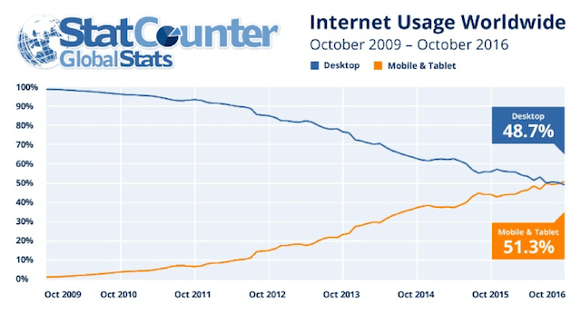
Recently, however, mobile use has started overtaking desktop use.
In May 2015, Google announced that more searches were conducted from mobile devices than from desktop computers in 10 countries around the world, including the U.S. In November 2016, StatCounter reported that more than half of worldwide internet usage was conducted on smartphones and tablets.

This shift toward mobile shows no signs of slowing down, and Google wants to make sure it’s providing a good user experience for mobile users, as well as desktop users. Switching to a mobile-first index will help them do that.
After making the switch, Google will crawl the web from a mobile point of view – that is, it will catalog and rank sites based on their mobile versions instead of their desktop versions.
What you need to know about the mobile-first index
First of all, take a deep breath. This change isn’t going to happen immediately. At SMX Advanced, Gary Illyes of Google emphasized that the change is “many quarters away” and probably won’t occur until 2018. So, while it’s important to prepare, you have plenty of time to make sure your site is ready.
Second, you probably don’t have to worry about the switch causing a big change in your rankings, especially if you prepare well. Google is aiming for a “quality-neutral” launch, and they won’t roll out the new mobile-first index until they’ve tested it thoroughly.
While it’s always best to be mobile-friendly, you won’t disappear from Google if you don’t have a mobile site by the time the change happens.
Google will continue indexing your desktop site from the perspective of a mobile user. Your site’s ranking may change, but people will still be able to find you in search results. This of course begs the question: Is there anything I need to do to prepare?
You don’t need to change anything if…
Webmasters and SEOs tend to panic whenever Google makes a big change. This time, though, there may not be any need to worry. Many sites won’t even be affected by Google’s new index. In a nutshell, this update is about improving users’ search experience on mobile. Many mobile sites are hard to access, poorly structured or light on actual content. Sites like this will probably be penalized once the new index rolls out.
On the other hand, if your mobile site provides the same quality and user experience as your desktop site, you don’t need to worry about the new mobile-first index. The easiest way to make sure you’re covered is by using responsive web design that keeps your code and content consistent across all devices.
If you already have a responsive site, you’re all set – no need to change anything.
If your mobile site is lacking compared to your desktop site, however, there are a number of ways you can improve it before Google’s update is released. Here are several things you can do to keep ranking well in a mobile-first world.
How to prepare if you’re not currently mobile-friendly
Take these steps to prep if your current website is not mobile-friendly:
Use responsive design
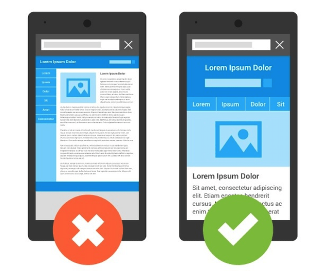
First things first: Consider switching to responsive web design ASAP. Responsive web design is useful because it keeps your site consistent, no matter what device someone is using to view it. Your HTML stays the same across all devices. The only thing that changes is your CSS, so your site looks nice on a variety of screen sizes. Below is an example of how responsive design adjusts your site’s appearance on a smartphone.

It’s also less likely to cause technical problems than other solutions, like having a separate mobile site. If you build a responsive site before the new mobile-first index launches, you probably won’t have to worry about anything else on this list.
Check your content

If you don’t think you’ll be able to make a responsive site by the time the new index launches, the next best thing you can do is to make sure your mobile content is the same as your desktop content.
Don’t scale back your content just so it fits on a smaller screen – having less content typically means having fewer keywords to rank for.
Any information visitors can find on your desktop site should be available on your mobile site, too.
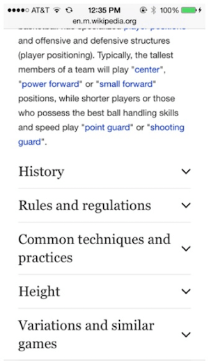
Keep in mind that, after the update, Google won’t penalize you for hiding content in expandable sections like tabs or accordions. For mobile users, these features are critical to user experience, since they keep sites organized and simple to navigate on a small screen. Just make sure your hidden content is clearly labeled and easy to find.
At right, note the example of expandable content on the mobile version of Wikipedia.
Keep technical details in mind
Once you’ve gone over your mobile site’s content, take some time to ensure your site’s architecture is sound. It should be easy for users to locate and navigate to different sections of your site. Most importantly, check that all of your internal links are working. Lots of mobile sites have problems with dead or non-functional internal links, and this doesn’t just create headaches for your visitors – it also prevents Google’s crawlers from indexing all your pages.
Then, take a look at your structured data. Structured data is important, both in terms of telling Google what your website is about and organizing your information in SERPs, but many mobile websites don’t make good use of it.
Make sure your schema markup is consistent between your desktop site and your mobile site.
Don’t use unnecessary markup, though, since that might slow your site down. If you need help updating your structured data, Google’s markup helper will guide you through the process. To go through your website pages, type in your mobile URLs.
![Mobile-First Index Structured Data]](https://www.godaddy.com/resources/wp-content/uploads/mobile-first-index-structured-data.png?size=3840x0)
Last but not least, if you haven’t done so yet, verify your mobile site on Google Search Console. This makes it so Google can find and index your mobile site instead of your desktop site.
 Run tests
To make sure that your improved mobile site works the way you expect it to, use Google’s helpful Webmaster tools to run some tests on your site.
- Check your site’s mobile-friendliness with the Mobile-Friendly Test.
- Check your structured markup for errors with the Structured Data Testing Tool.
- Use the Fetch as Google tool to look at your site through the eyes of a crawler. Make sure it can see everything you want it to see.
- Check the speed of your mobile site with Google’s PageSpeed Insights Tool.
The takeaway
Google’s new mobile-first index will change the internet, but that doesn’t mean you have to change your entire SEO strategy. Instead, start thinking like Google, and look at your site primarily from a mobile perspective. Focus on making your mobile site as informative, user-friendly and structurally sound as possible. With a little preparation, you won’t have to stress over the change, and your rankings may even improve.


