There was a “shower thought” meme circulating recently, pointing out that “accents are just mouth fonts.” All the design nerds at GoDaddy app had a good chuckle at that one. But the insight is kinda profound, from the perspective of your brand’s identity, and more specifically, your brand font.
You see, words aren’t just words in the context of design.
They serve a dual function — communicating information and telling a story. Like an accent, the way in which we receive and decode even basic information is affected by the idiosyncrasies of the voice telling it to us. And this unique tone of voice is a result of that individual’s origin story.
So now the question arises: What unique accent does your brand have, and what can this tell us about you? Your choice of brand font is really the key ingredient to shaping your brand’s voice out there in the world, in line with your story and your graphic style.
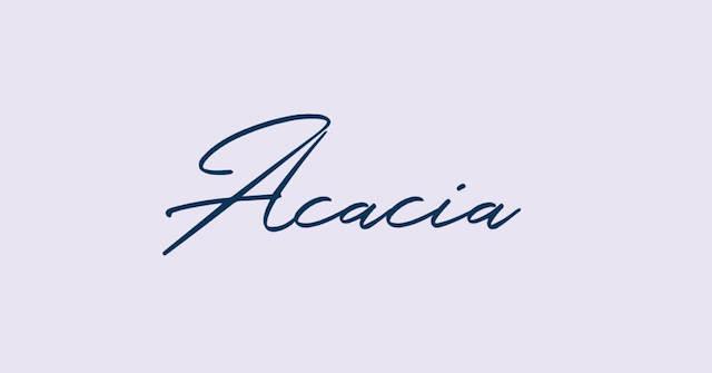
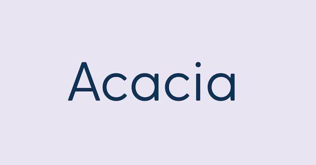
Look here, for example, at the same brand name written in three very different font styles. Each of them seems to come from a completely different world, and we know this instinctively, without any additional graphics, images, or words. We read them all slightly differently.
In this post, you’ll walk away with:
- A working knowledge of the basic principles of typography.
- Insights on how fonts can affect your brand identity and messaging.
- The ability to find, navigate, and edit fonts in GoDaddy app.
- Your own customized selection of typefaces to add to your brand board.
This information is going to make your creative decisions more tuned-in to your brand. Choosing your hero fonts upfront will also develop brand consistency, and save you loads of time in the design process down the line. We’re thinking long-term here, folks!
GoDaddy app makes the process of finding fonts and creatively editing text extremely simple and intuitive.
Once you know the basics, almost anything is possible.
The art of typography
For most of its existence, typography has been a highly specialized field for professional designers with a thing for microscopic detail.
But with the advent of personal computers and word processors, the average person has been presented with a universe of typographic possibilities for the first time. And these options just keep expanding as the field of typography keeps growing.
Today, most devices come pre-programmed with hundreds of font styles.
It’s an ever-evolving art form, and in as much as there are some unshakable rules we’ll look at in this chapter, typography — like all forms of art — is subject to the tide of trends.
We’ve been seeing a surge in the popularity of Delicate Serifs, Supersized Type, and Didones.
The point to take from this is that — whether we realize it or not — we’re all incredibly finely tuned to the subtleties of typography. In fact, we’re subconsciously snobbish to the extent that a poorly chosen font (Papyrus or Comic Sans anybody?) might rightfully raise a red flag and strongly affect our decision to engage with a brand at all.

Let’s start with some basics and fine-tune as we go along.
Typography 101
It’s important to get some terminology straight at the outset because typography design has its own secret language to describe structure and spacing.
Once you start looking closer at the nuances, you’ll be able to express your choices better (“I like Sanchez Bold, but think it needs some tracking and an option with heavier serifs.”)
First off, the difference between a font and a typeface is confusing. You can use them interchangeably for the most part (we’ll do exactly that in this chapter), but to be absolutely correct and gain some cred with the type geek crowd:
- A typeface is a family of fonts (Baskerville, for example).
- A font refers to any variation of this typeface (Baskerville Regular, Baskerville Bold, Baskerville Italic, and so on).
This is important to know because while some typefaces in GoDaddy app have only one default appearance, many of them will have variations in weight and style — i.e multiple fonts within a given typeface.
Anatomy of a font
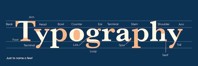
Typographers clearly personify their creations, judging by how many terms for the bits and pieces that make up letters, numbers and symbols are borrowed from the human body. You might never think of an ear, shoulder, leg, arm, or spine in quite the same way after today. The alternate definitions of beaks, bowls, tails, and spurs might also surprise you.
This diagram identifies the range of components that make up a typeface. The more you learn about typography design, the more you’ll start paying attention to how these little details differ from font to font.
Now let’s consider how we refer to the positioning of text on your canvas, and the spacing between letters, words, and paragraphs.
This diagram illustrates the relative high points and low points of a font from its baseline. The parts of a letter that rise above this are called ascenders, while the bits that dangle below the baseline are called descenders.
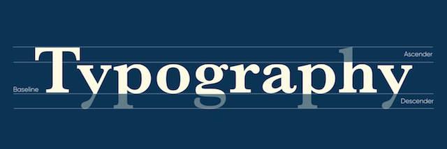
The length of ascenders and descenders in a word will influence the relative space between text above or below.
If the ascenders and descenders get too close to each other, the lines feel compressed, and the paragraph would require more effort to read.
In this case, we would need to adjust the leading: the space between lines of text.
This is an easy adjustment to make in GoDaddy app, by simply dragging the dial within the Style tab when editing fonts.
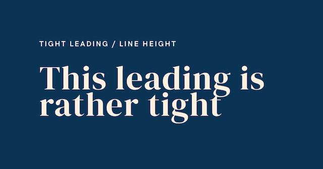
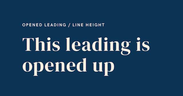
When we’re dealing with spaces between the letters themselves, we refer to tracking.
If letters are too close together, the word can be harder to read. Again, it’s a simple edit in GoDaddy app, switching to the tracking dial, and adjusting the spacing to add some breathing room, and legibility. You could play around with this as a creative flair for sure, too.
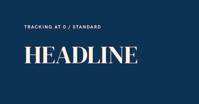
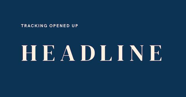
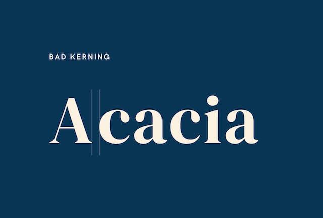
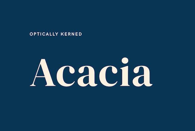
Kerning is similar, but refers more specifically to the spacing between two adjoining letters, and not the whole word.
Sometimes the word will be evenly spaced, but two particular individuals are standing a little too close for comfort. Restoring balance here requires optically adjusting the kerning — or just, you know, closing the gap a little.
Hierarchy
The final typographic lingo we’ll run through is hierarchy, and this one’s important because it’s how you’ll navigate the reader’s eye through your design.
In any design with text — an Instagram Story, a poster, a presentation — we can’t simply take it all in at a single glance.
To decode your message clearly, our eyes need to have a starting point, and then proceed in the right order — from point a to point b, c, d, and so on. Without this priority order for the information you’re relaying, your message will be confusing at best, and frustrating at worst.
The idea of hierarchy is most obviously expressed in editorial design, which has its roots in centuries-old newspaper layouts and remains the default today.
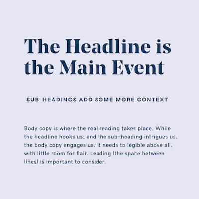
Scanning the pages of a publication, printed or digital, the first thing to grab your eye will always be the headline or title. If this piques your interest, the sub-heading might give you a little more context, and if you decide to read on, you’ll dig into the body copy.
These three levels are typically expressed in descending order of size:
This age-old idea still applies to almost all graphic design and branding.
Think about a concert poster, whether it’s on a street pole or your social feed. You’ll only glance at it for a moment.
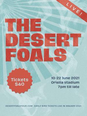
In this example, there’s an order in which the designer wants us to read the information: a hierarchy from most to least essential. We’ll absorb this information sequentially, so each section ought to nudge us on to the next in a logical way:
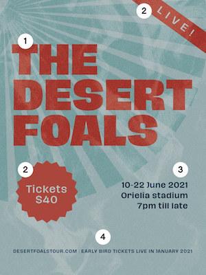
The reader moves through text all over the page, but in a coherent order:
- The Desert Foals! I love them!
- Playing live in my town? The price isn’t too steep…
- When and where is the show?
- How do I buy tickets?
This instinctual, instantaneous process simply doesn’t work in reverse, and so the key is to make sure that the most essential information is absorbed first.
There are a few ways to do this as a way to engineer your hierarchy.
Scale
Size is the most obvious one: the more real estate the word takes up on the page, the more likely we are to read it first.
Weight
Bolder, heavier typefaces will typically get noticed before thin, slender fonts, simply because of the unignorable presence they demand.
Color
All things being equal, a word expressed in a strong, vivid color will always attract the eye more than something neutral, faded, or monochrome.
It’s no different from being transfixed by a single pink flower on a green and brown tree.
Position
Front and center is always a good spot to grab attention, but for more text-heavy design, remember that the (English-speaking) human brain is wired to scan from top to bottom, left to right — making the top left quadrant of the page our default starting position.
That’s enough theory for now. It’s time to use all this knowledge to make some informed decisions for your brand.
Let’s take a gander at the options.
Types of typefaces
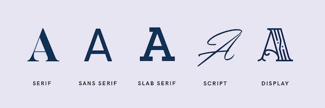
All the thousands of font styles in the world can mostly be grouped into five main groups or families.
They’re classified by their structure, but this is very closely related to the context in which we use them.
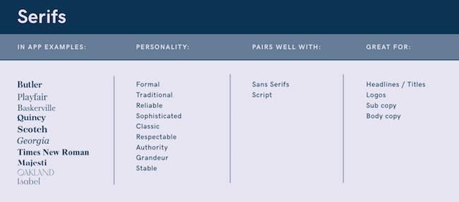
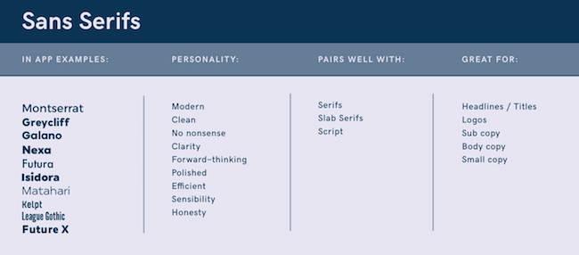
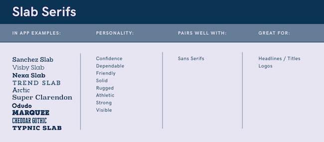
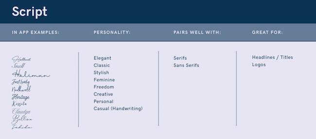
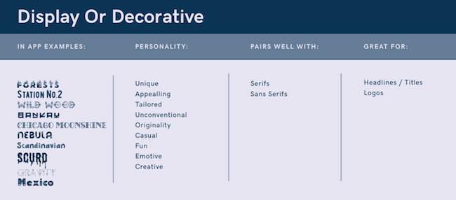
These quick reference guides include some examples of the relevant typefaces we have waiting for you to try out in GoDaddy app:
Serifs
Serifs are those tiny little extensions that stick out from the tops and tails of some letters. Whether a font has these or doesn’t, will affect its classification.
Serif fonts, as you might have guessed, do have serifs. It’s kind of their thing.
For centuries, pretty much all typefaces were Serifs, and as such, they’re associated with classicism, and tradition — traits that suggest trustworthiness, and authority.
Stylistically, they exude sophistication and grandeur. Equally at home in a headline, logo, or full page of text, elegant Serif fonts are highly practical all-rounders in your brand identity kit.
Sans serifs
Sans is the French word for “without,” so sans serifs are fonts without those little doohickies at the ends of them.
Without this added ornamentation, they appear cleaner, more geometric, and minimalist. There’s straightforwardness and simplicity inherent in this, and brands that value these ideas would gravitate to modern sans serif fonts (take a look at many tech company fonts and you won’t find serifs).
Emerging much later in typography’s history, they conjure up associations of modernity and progressive thinking. Sans serifs are supremely legible, which is why you’re able to read this paragraph so easily. They team up beautifully with their serif cousins as a font pairing: an unbeatable combo is a serif headline, with sans serif body copy.
Slab serifs
A slab is something we talk about when we refer to enormous, flat sections of stone or concrete. So, in the typography world we can imagine Slab Serifs as exactly that: fat, chunky serif fonts of significant weight.
You’d be more likely to use this for a headline rather than body copy. Their hefty presence makes them impossible to ignore. Counterbalancing a strong slab serif headline with a no-nonsense sans serif for body copy is a solid pairing.
The well-built jocks of the font family, slab serifs project strength, confidence, even athleticism — but not without a sense of playfulness. This might be why it’s the Varsity sports sweater standard.
Script
We’re clearly all in denial about the death of handwriting since there are hundreds of fonts that emulate the O.G typography: pen on paper.
There’s an inherent beauty to the unbroken, liquid dance of lines that sketch words like patterns on a page.
In GoDaddy app, it’s a heck of a lot easier than mastering fountain pen technique. Digitized though they may be, Script fonts call to mind the work of human hands. They’re expressive, free and casual, but equally capable of femininity and elegance.
Not always the easiest to read, they make better headlines and subheadings than body copy.
Display/decorative
The name says it all, right? Display typefaces, or decorative typefaces, are the big ones you’ll bring out when you really want to get noticed.
They’re for headlines and logos primarily — the main event. These typefaces are elaborate, ornate and playful, with an attention to detail that carries through to our associations with your brand.
Opting for decorative fonts in your brand kit is a considered move; they function as graphic elements, and as such ought to align with your brand’s graphic style.
Font pairing
In the last section, we mentioned that certain typefaces work well with others. We also discussed hierarchy and the idea that copy usually appears at different sizes and lengths in any design.
While you could use a single typeface for all your branding and communication, it’s far more common (and sensible) to have two or three options in your kit of font styles, to use at different positions within your hierarchy.
Sadly, not all fonts can co-exist harmoniously. Some combinations just look wrong.
They can tug in different stylistic directions, compete for dominance on the page, or just seem to exist in different worlds. Font styles that are too similar trouble the eye too, as the reader wavers between reading, and noticing subtle differences between the necks, shoulders, feet, and ears of the two slightly different typefaces.
Font pairing refers to selecting two or three fonts for your brand kit that work in harmony, despite their differences.
Beyond our general advice of choosing a combination that is neither too different nor too similar, it’s difficult to prescribe any hard rules here. Contrast is important: pair chunkier fonts with more slender ones, an expressive typeface with a straightforward option.
The options within your brand kit could also include different font variations of the same typeface: bold, italic, textured, and so on.

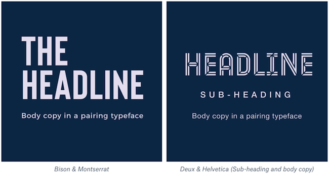
Some of the fonts we have in GoDaddy app are called duo fonts, which is basically a typeface with two very different expressions designed to work together.
Essentially, it’s a pre-selected font pairing — a two-for-one for the taking.
You’ll need to try out a few combinations to find the magic formula, which will of course hinge on your brand’s style.
As a starting point, here are some suggestions for font pairings we think work particularly well together — grouped according to our 10 graphic styles. Either use these or try subtle variations as you develop a customized combo to add to your brand board. Our free logo generator includes interesting font pairings in order to help you get the logo you really want.
Bold font pairings
Minimal font pairings
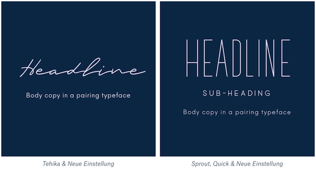
Elegant font pairings
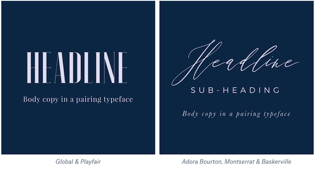
Modern font pairings
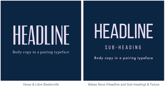
Street font pairings
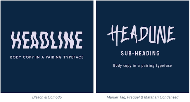
Classic font pairings
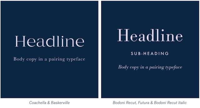
Luxury font pairings
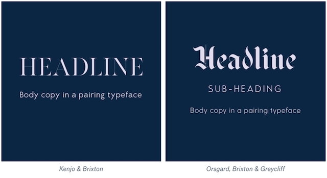
Playful font pairings
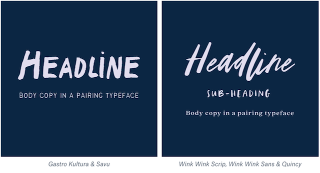
Organic font pairings
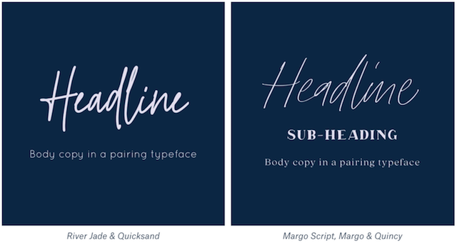
The right fonts for your brand
As we’ve emphasized before, the name of the game when it comes to creating your brand’s identity is consistency: pick them, and stick to them.
Just like your graphics, images, and colors, select font designs that complement your brand’s story and style. That said, trust your gut here. You need to be in love with your brand’s typeface more than anybody else, seeing as you’ll be using it on a daily basis.
Love at first sight is as good a reason as any to guide you.
Here’s some excellent parting advice from the king of the type geeks at GoDaddy app – our senior UX designer, Daniel, who also runs a dedicated font fanatic account @type.bot that we recommend you follow for ongoing inspiration.

Daniel suggests seven key points to consider when choosing a typeface for your brand identity:
- Make sure it's clearly readable and functional before choosing a typeface based on its looks. It needs to work across many mediums as your brand evolves over time.
- Typography styles are expressive and evoke emotions, so choose a font that is versatile and allows for different moods, depending on what content you need to create.
- Looks are important and cannot be ignored. It helps to distinguish your brand from others. It's important to think about the unique letterforms and if they hold their own character, plus if they elevate your brand and don't fall into the generic pool.
- Be consistent with the use of your primary typeface. Experiment with layout and forms and be consistent in delivery of type scale and composition, so that your audience can easily identify your brand.
- Start simple and if you need to grow and evolve your brand, start thinking of a complimentary typeface that accentuates your primary typeface and overall brand.
- There's a limit. It's best practice to keep your brand’s font family in the range of one to three fonts that work well together. A good starting point is a single font that’s versatile in its weighting and style.
- When you’re establishing a brand from scratch, a single well-chosen typeface can serve you and your brand well, before having to consider more typefaces (if at all). Start simple and build confidence through continuous creation.
Create your brand new brand with GoDaddy app today, and find the perfect fonts to stand out in style.
