Why do we need to go through the following responsive web design tutorial step-by-step when we can just use WordPress and find a theme that takes care of making our website responsive?
Why design responsive from scratch?
In my article, Top 12 free responsive portfolio WordPress themes, we had clients who were on a limited budget and wanted us to create responsive portfolio WordPress websites using a portfolio theme (not a portfolio plugin) that would showcase their hard work.
We accomplished that goal by finding free WordPress themes to do the job, but our newest client, Trudy, is on an even tighter budget and absolutely does not want us to redesign her current site on WordPress or any other content management system. Trudy quite directly told us, “I don’t need all that.”
Trudy, a piano lessons teacher, already has a static website created with HTML and CSS, and all she wants us to do is make her existing site responsive for the about 15 percent of her students who have said to her, “Ms. Trudy, it’s hard to view the class schedule on your site on my cell phone (tablet).”
Aside from her class schedule, the content on her website hardly ever changes, which is why she doesn’t want to bother with the maintenance that comes with keeping WordPress secure, but she does want to keep up with the times since she knows she has some students who go to her website and check the class schedule on their nifty tablets and fancy smartphones.
She needs her website to be responsive so it looks good on all types of devices.
Here’s the thing …
After WordPress started gaining popularity, a lot of us web designers got accustomed to the majority of our clients saying, “I want my site on WordPress!” It didn’t matter if they needed “all that” or not. They’d heard WordPress was the way to go now and grow later, so they demanded we “put” them on WordPress. So we did, and we (again, not you, just me and some other web designers) got a little rusty with the static website side of things.
That’s why I’m following with this responsive web design tutorial step-by-step for a refresher on how to make an HTML and CSS website look great on desktop computers, laptops, tablets and/or mobile phones with just one site design. If you’re also a web designer who needs to learn how to design a responsive website, then you’re reading the right guide.
Responsive web design tutorial: 5 steps
You can design a responsive website in five primary steps:
-
Understand the elements of responsive design.
-
Search for examples.
-
Define your media queries.
-
Define your breakpoints.
-
Test your choices.
Let’s get started!
1. Understand the elements of a responsive design
In Responsive web design: It’s not just a trend, Sonia Gregory writes that “responsive web design creates a system for a single site to recognize and react to the size of a user’s device.”
She goes on to say that responsive design has three elements at its foundation: a fluid grid, flexible images and text and media queries:
- A fluid grid will allow a website to appear bigger or smaller depending on the size of a visitor’s device.
- Flexible images and text will also appear bigger, smaller, not at all or be swapped out depending on a visitor’s device.
- Lastly, it is the job of media queries to make fluid grids and flexible images and text appear correctly, so let’s give media queries a bit of a breakout explanation since they do the heavy lifting in responsive web design.
But first let’s …
2. Search for examples
Now that we have a solid working definition of what responsive web design is, and before we move forward with how to design a responsive website, we should do a search for responsive web design done well.
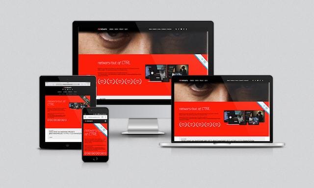
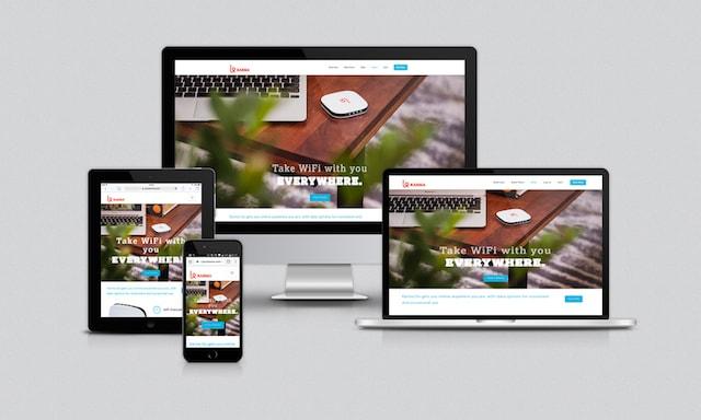
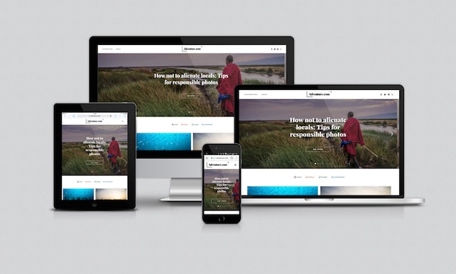
What follows is only a very small sampling, but this sample gives us a good idea of what we’re getting ourselves into with Trudy’s website.
Netwars
GoDaddy
![Responsive Web Design GoDaddy]](https://www.godaddy.com/resources/wp-content/uploads/responsive-web-design-godaddy.jpg) Adventure.com
Adventure.com
 Karma
Karma
In all four of these examples, the websites look great on different types of devices. The layouts are fluid and content reflows nicely. This is exactly what we want to happen when we redesign Trudy’s website.
And we’re going to make that happen with media queries.
3. Define your media queries
With responsive web design, the HTML of a website remains the same, but CSS media queries allow different portions of your CSS to be applied when the website is viewed on different screen sizes.
A media query looks like this:
@media (max-width: 500px;) {
/* Your CSS rules here */
}
These specific portions of your CSS, contained within media queries, only apply when certain breakpoints are encountered.
Breakpoints? Yes, I know. We’re not even halfway through this tutorial, and there’s another term we need to define. As important as media queries are, they are absolutely nothing without breakpoints!
4. Define your breakpoints
Simply put, breakpoints determine when the fluid grid of a site will change size and when content on a page will be rearranged, hidden, or swapped out. Breakpoints are often (but not always) based on common screen sizes for different devices.
In Navigating the rapids of responsive design, Stephani Worts suggests that we “start with just a few logical breakpoints,” and I agree.
We cannot design for every single screen size that exists or will exist.
The best practice is to create breakpoints for the average sizes of desktop monitors and mobile device screens. Don’t get anal retentive about S-series or 8th generations and such. My best advice is to go with what the devices have in common, not what makes them different.
So for Ms. Trudy’s redesigned and responsive website, we’re going to define the following five media queries and breakpoints:
@media (max-width: 1200px) { ... } /* for desktops */

@media (max-width: 991px) { ... } /* for laptops */

@media (min-width: 768px) and (max-width: 990px) { ... } /* for large tablets */

@media (max-width: 768px) { ... } /* for smaller tablets */

@media (max-width: 500px) { ... } /* for cellphones */
5. Test your choices
We know we can’t define media queries and breakpoints for every specific screen size, but we must make sure that the sizes we do choose actually work well within our responsive design. We’re not doing Ms. Trudy any favors by designating certain breakpoints and then not making absolutely sure that the content of her specific website reflows properly within the fluid grid we create. We can do this in two ways:
Use the browser’s developer tools
On a PC, using Google Chrome or Mozilla Firefox, you can go to a website and then either hit F12 on your keyboard or right-click and choose “Inspect” to bring up the browser’s developer tools to simulate viewing the website in different screen size modes.
F12 and the right-click methods work for Google Chrome and Mozilla Firefox on a Mac, also, but if you want to use developer tools with Safari, you have to first enable Web Inspector.
Let’s look at Ms. Trudy’s site in different sizes via the developer tools in the Google Chrome browser on the PC:
@media (max-width: 1200px) { ... } /* for desktops */
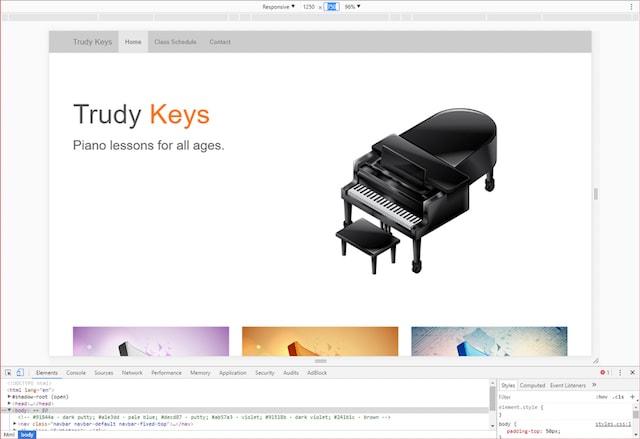
@media (max-width: 991px) { ... } /* for laptops */
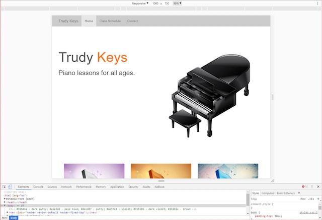
@media (min-width: 768px) and (max-width: 990px) { ... } /* for large tablets */
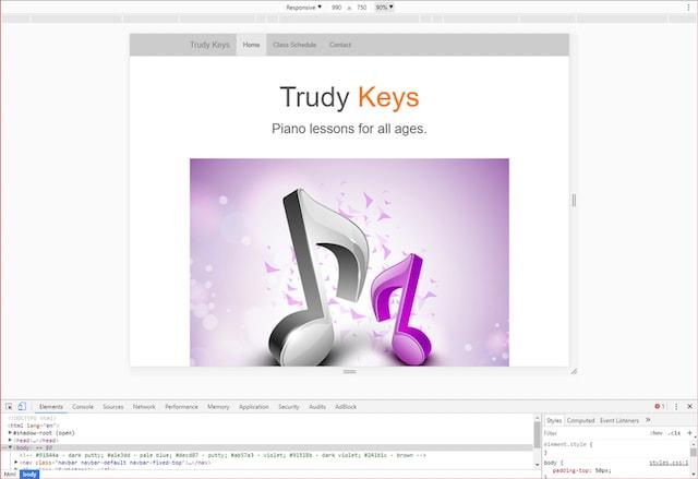
@media (max-width: 768px) { ... } /* for smaller tablets */
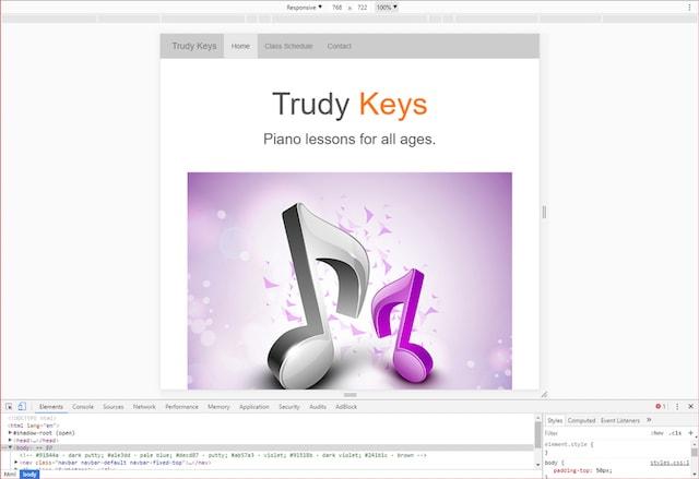
@media (max-width: 500px) { ... } /* for cellphones */
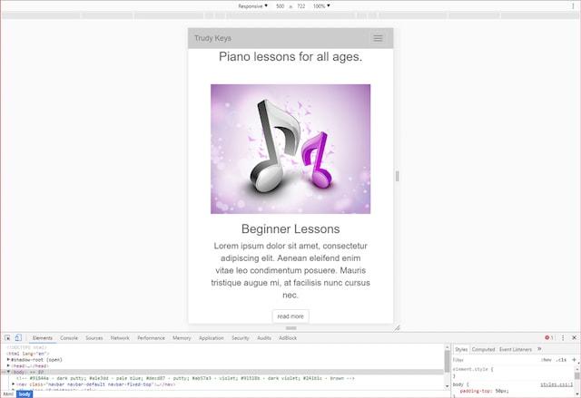
Using developer tools to view Ms. Trudy’s site doesn’t quite do it for me, though. While I’m grateful to have the option to simulate a client’s website in my browser, I actually prefer the real thing, which means…
Use actual devices
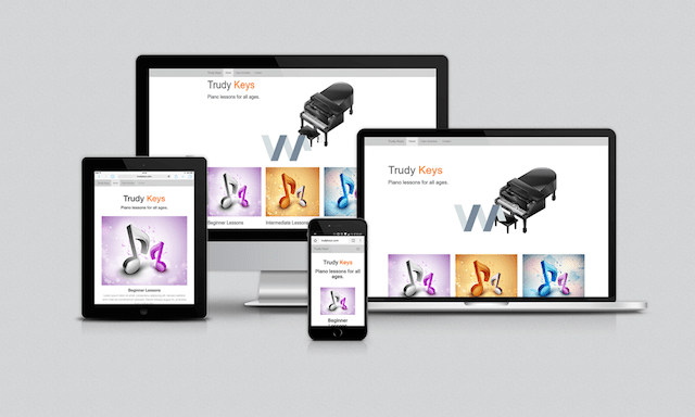
I’d say viewing the website on your actual devices is the better method for testing our clients’ websites to make sure they’re responsive because it is the devices that visitors are going to be using, and not developer tools, when viewing a website.
You get a much better indication of whether the fluid grid has enough for padding or margins or whether text and images are reflowing/resizing/hiding properly when you actually view the website on the devices site visitors use.
What about ‘mobile first?’
Nathan Reimnitz makes an interesting point in his article about whether a designer should go with the “mobile first” concept or with responsive design. He says with the “mobile first” concept, we start “from a place of limitation” because “mobile first” design dictates that we confine ourselves to smaller “real estate” and “functionality confinements.”
Keep in mind that our client is Ms. Trudy, who told us that only about 15 percent of her piano lesson students voiced any desire about wanting to see her site on their smart devices. For the most part, we can assume that the majority of Ms. Trudy’s students will be viewing her website on their laptops or desktops, so we’d do better to design with responsive in mind as opposed to starting with the “mobile first” concept.
If you’re like me and happen to be one of those people who prefer to work from a desktop, it’s easy to spot the websites that have been designed with the “mobile-first” concept. Everything is overly large when the site is viewed on a desktop monitor. I actually find this quite annoying, and I don’t think it’s that appealing, but that’s a topic for a different article.
Suffice it to say that we will be creating Ms. Trudy’s website with responsive design in mind over the “mobile-first” concept.
Conclusion: Why is responsive web design important?
So now that we have reacquainted ourselves with how to design a responsive website, we should ask ourselves why this is even important.
I mean, Ms. Trudy’s business wouldn’t suffer too horribly if only about 15 percent of her students have to do a bit of zooming, swiping and pinching. The other 85 percent are perfectly happy with Ms. Trudy’s site the way it is.
Or are they?
Instead of focusing on the 15 percent who have verbally expressed an opinion, let’s think about the folks who stopped doing business with Ms. Trudy because they had a hard time viewing her site on their mobile devices and didn’t say anything but took their business elsewhere. What about the potential new clients who found Ms. Trudy’s website through a search engine query but decided not to do business with her because her site wasn’t mobile-friendly? Or what about the potential clients who performed a search engine query on Google and never saw Ms. Trudy’s website at all?
More and more people are using smart devices to view web content.
And don’t forget Google
Millions of people want to be on the first page of Google, because it’s the most popular search engine on the planet. Our clients are going to have a tougher time getting there without a mobile-friendly website.
Back in April 2015, Google started its campaign of penalizing websites by lowering their search engine ranking if the website wasn’t mobile-friendly. This was a big deal known all over the web as Mobilegeddon. Google picked up the pace with their campaign in March 2016.
Google even created an online tool where you can give your site the Mobile-Friendly Test and then get suggestions on what you need to fix to pass it. [Just FYI: don’t assume that because you’re using WordPress and your theme claims to be responsive that you’re in the clear, but that’s another subject for another article.]
In a nutshell, mobile-friendly websites are the lay of the land. It doesn’t matter whether 15 percent or even 5 percent of website visitors are using a mobile device to view your website or your clients’ websites.
You must make all the websites you design responsive, and hopefully, this responsive web design tutorial step-by-step will help you make that happen.

