A great logo is like a superhero cape for your brand — it sets you apart from the crowd and leaves a lasting impression on your audience. It's the first thing people see and the last thing they remember.
Think of it as your brand's signature, a visual representation of everything you stand for. That’s why it’s key to invest in a logo that speaks volumes about who you are and what you do. Your brand deserves to stand out in a sea of competitors, and creating a great logo is the key to making that happen.
With that in mind, let’s take a look at what makes a logo popular, what’s trending, and then we’ll examine a few popular types of logos.
Disclaimer: Third-party logos, names, and marks are registered trademarks of their respective owners. All rights reserved.
What makes a logo popular? Logo examples
A popular logo is a simple, memorable, and unique visual representation of a brand that resonates with consumers. It becomes popular due to its ability to create instant recognition, convey the brand's identity, and stand out from competitors. These qualities make the logo easily recognizable and unforgettable in the minds of consumers.
What is the current trend for logos?
Current logo trends include wordmark, letterform, modern, and abstract schemes. Logos are becoming simpler and more versatile, allowing for easy scalability across various platforms. Companies are also opting for unique and memorable designs to stand out in a crowded market.
Exploring 11 types of logos
Brand mark logos (pictorial and symbol)
Brand mark logos, also known as pictorial and symbol logos, are visual representations of a brand that do not contain any text. These logos use images, symbols, or icons to communicate the essence of the brand to consumers. Pictorial logos are literal depictions of a brand's name or products, while symbol logos are abstract representations that convey a brand's values or personality.
Examples of brand mark logos include the Apple logo, which is a simple apple shape representing innovation and creativity, and the Nike swoosh symbol, which symbolizes speed and movement. These logos are easily recognizable and help consumers identify and connect with a brand.
Apple is an example of a brand mark logo.
Nike is an example of a brand mark logo.
Wordmark logos and logotypes
A wordmark logo, also known as a logotype, is a logo that consists solely of the company's name or initials in a stylized font. This type of logo focuses on the typography and design of the company's name to create a strong visual identity. Wordmark logos are simple, clean, and easy to read, making them effective for brand recognition.
Examples of wordmark logos include Google, FedEx, and Disney. These logos use unique typography and color choices to create a memorable and recognizable brand image. Wordmark logos are often used by companies with short and distinctive names, as well as by established brands looking to reinforce their identity in the market.
Google is an example of a wordmark logo.
Disney is an example of a wordmark logo.
Monogram and lettermark logos
Monogram logos are designs that combine two or more letters, typically the initials of a company or individual, into a single symbol. These logos are often used to create a distinctive and memorable brand identity. Examples of monogram logos include the overlapping "LV" of Louis Vuitton, and the stylized "WB" of Warner Bros.

Louis Vuitton is an example of a monogram logo.
Warner Bros. is an example of a monogram logo.
Lettermark logos, on the other hand, use a company's initials or acronym as the main element of the design. These logos are often used when a company's name is lengthy or difficult to remember. Examples of lettermarks logos include the "IBM" of International Business Machines, the "CNN" of Cable News Network, and the "NASA" of the National Aeronautics and Space Administration.
CNN is an example of a lettermark logo.
NASA is an example of a lettermark logo.
Letterform logos
Letterform logos use typography or lettering as the main visual element to represent a brand or company. These logos typically focus on the design and style of the letters themselves, rather than incorporating additional imagery or symbols. Letterform logos can be simple and clean, or elaborate and decorative, depending on the desired aesthetic.
Examples of letterform logos include the logos for brands like IBM and FedEx. IBM's logo is a simple, modern interpretation of the company's initials in a bold typeface. FedEx's logo cleverly incorporates an arrow between the "E" and "X" in its name, subtly representing the company's focus on speed and efficiency.
IBM is an example of a letterform logo.
FedEx is an example of a letterform logo.
Simple logos (minimalist)
Minimalist logos are simple, clean, and stripped-down designs that focus on essential elements to convey a brand's identity. These logos typically feature basic shapes, colors, and typography, without any unnecessary details or embellishments. The aim of minimalist logos is to create a strong visual impact with minimal elements,.
Examples of minimalist logos include Uber, Airbnb, and Spotify. These logos are straightforward, uncluttered, and instantly recognizable, making them highly effective in representing their respective brands. Minimalist logos are versatile and work well across various mediums, from digital platforms to physical products, making them a popular choice for many companies looking for a sleek and modern brand identity.
Uber is an example of a simple logo.

Spotify is an example of a simple logo.
Name logos
Name logos are a type of logo that uses the name of a company or brand as the main element of the design. These logos often incorporate unique typography, color, and graphic elements to create a distinctive and memorable visual identity.
Examples of name logos include the Coca-Cola logo, which features the company's name in a distinctive script, and the Prada logo, which uses a stylized version of the brand's name. Name logos are effective for building brand recognition and establishing a strong brand identity, as they focus on the name itself as the primary element of the design.

Coca-Cola is an example of a name logo.
Prada is an example of a name logo.
Modern logos
Modern logos are graphic symbols or icons that represent a company or brand in a contemporary and innovative way. These logos often feature clean lines, bold colors, and simple designs that are easily recognizable and memorable.
Examples of modern logos include the minimalist "F" logo for Facebook, and the stylized "M" logo for McDonald's. These logos are all distinctive and effectively convey the essence of their respective brands in a visually appealing manner. Modern logos are designed to be versatile and adaptable across various mediums, such as digital platforms, print materials, and merchandise, making them an essential element of a brand's identity and marketing strategy.
Facebook is an example of a modern logo.
McDonald’s is an example of a modern logo.
Emblem logos
Emblem logos are a type of logo design that incorporates text within a symbol or icon. The text is usually placed inside a badge or crest-like shape, creating a unified and cohesive look. Companies with a long-standing history or a sense of tradition often use these logos, as they can convey a sense of heritage and reliability.
Examples of emblem logos include Harley-Davidson and the NFL. These logos typically feature intricate details and a classic design aesthetic, making them easily recognizable and memorable. Emblem logos are versatile and can be scaled to fit various marketing materials, making them a popular choice for many businesses looking to establish a strong brand identity.
Harley-Davidson is an example of an emblem logo.
NFL is an example of an emblem logo.
Abstract logos
Abstract logos are designs that use shapes, colors, and forms to create a unique and memorable image without directly representing a specific object or concept. The Mastercard logo is a prime example, with its overlapping red and yellow circles symbolizing connectivity and partnership in a simple yet effective way.
Another example is the Olympic rings logo, which uses interlocking rings in different colors to represent unity and diversity among participating nations. Abstract logos like these rely on symbolism and creativity to convey a brand's identity or message in a more conceptual manner. They are versatile and open to interpretation, allowing for a wide range of meanings and associations that resonate with audiences on a deeper level.
Mastercard is an example of an abstract logo.
The Olympics are an example of an abstract logo.
Combination mark logos
A combination mark logo is a type of logo that combines a wordmark or lettermark with a symbol or icon to create a unique and memorable brand identity. This type of logo is versatile, as it can be used both together or separately, allowing for flexibility in branding and marketing efforts.
Examples of combination mark logos include the logos of companies like Adidas (where the wordmark is combined with the iconic three stripes), Burger King (where the wordmark is combined with an illustration of a burger), and Lacoste (where the wordmark is combined with the iconic crocodile symbol). These logos effectively communicate the brand's identity and values through the combination of text and visual elements.
Burger King is an example of a combination mark logo.
Lacoste is an example of a combination mark logo.
Fun logos
Fun logos are designs that evoke a sense of playfulness, joy, and light-heartedness. These logos often use bright colors, whimsical fonts, and creative imagery to convey a sense of fun and excitement. They are typically used by brands that want to appeal to a younger audience or convey a sense of creativity and innovation.
Examples of fun logos include those used by companies like Nickelodeon, with its playful and energetic logo featuring splattered paint. Another example is the logo for Ben and Jerry's ice cream, which uses a playful font and a colorful cow illustration to convey a sense of fun and indulgence.
Nickelodeon is an example of a fun logo.
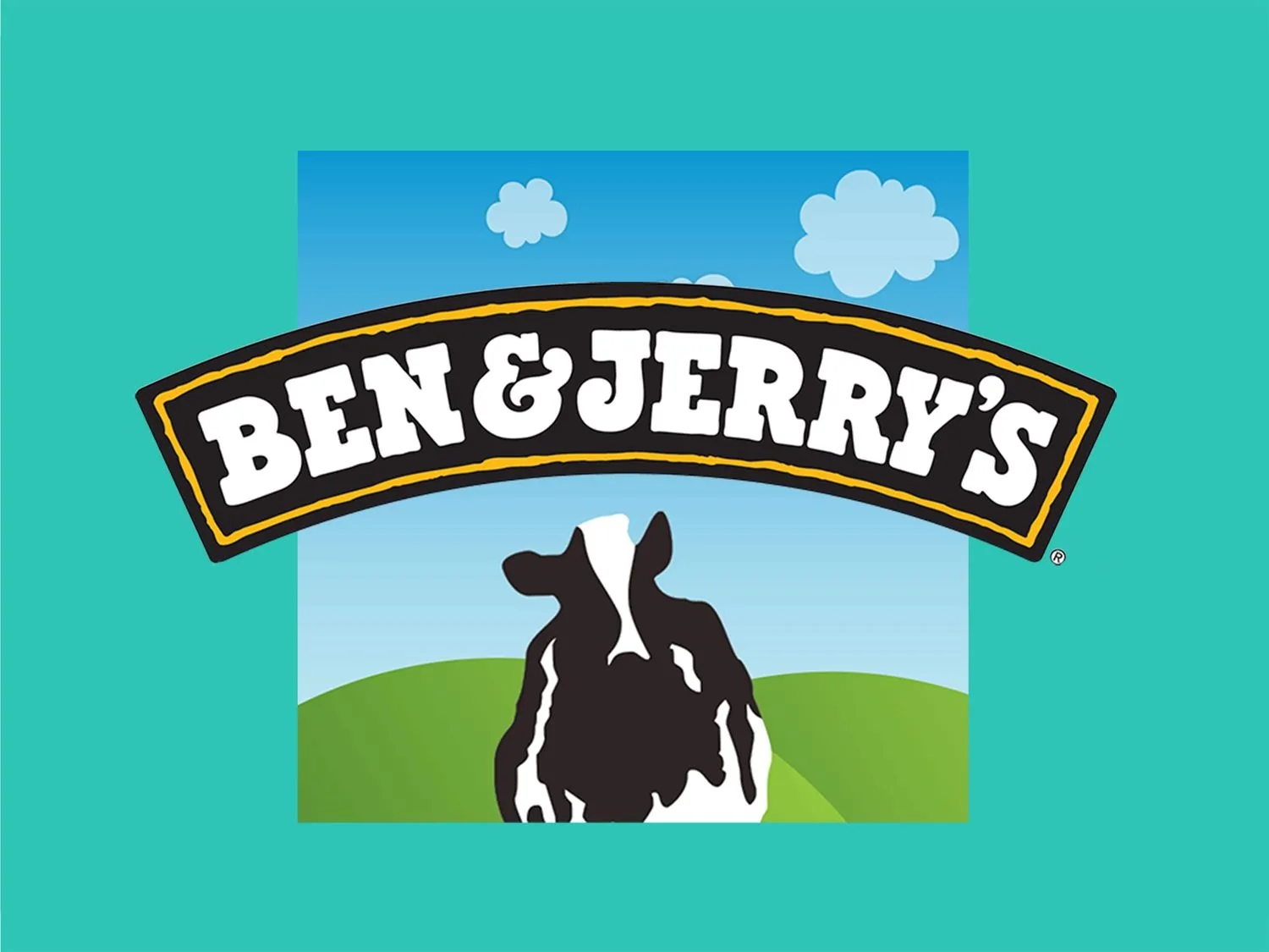
Ben and Jerry’s is an example of a fun logo.
Tips for choosing the right type of logo for your business
Choosing the right logo for your business is often a deeply personal exploration, but there are a few universal tips to help guide you:
- Keep it simple and memorable: A simple logo design is easier for customers to remember and recognize, making it more effective in creating brand recall.
- Ensure it reflects your brand identity: Your logo should convey the essence of your brand, including its values, personality, and positioning in the market.
- Consider scalability for various applications: Your logo should look good and be legible when scaled up or down for different uses, from business cards to billboards.
- Test for legibility and versatility: Make sure your logo is easily readable in different sizes and formats and works well in both color and black and white.
- Get feedback from the target audience: Gather input from your customers or focus groups to ensure your logo resonates with the people you are trying to reach.
FAQs about logo types
What is the future of logos?
The future of logos will likely focus on simplicity, versatility, and digital adaptability to effectively represent brands across various platforms and mediums.
Are logos becoming simpler?
Yes, logos are becoming simpler, more versatile, and easily recognizable across various platforms and mediums in today's digital age.
Is it okay to have two logos?
Yes, it is okay to have two logos as long as they are both relevant to the brand and effectively represent the company's identity and values.
What is the difference between traditional and modern logos?
Traditional logos are more classic and timeless in design, often featuring intricate details and symbols, while modern logos are sleek, simple, and minimalistic in style.
How do I design a great logo?
If you’re wondering how to design a great logo, research your target audience, create a unique concept, keep it simple, use appropriate colors and fonts, ensure scalability, and make sure it reflects your brand identity effectively.

