The best digital marketing strategies involve the use of multiple tools for determining what works best on a website and what has the biggest impact on the conversion rate. The types of tools used range from online polls to user testing, but heat maps are some of the most effective tools around. In this article, we’ll review heat map examples and how utilizing this data can boost your conversion potential.
What are heat maps?
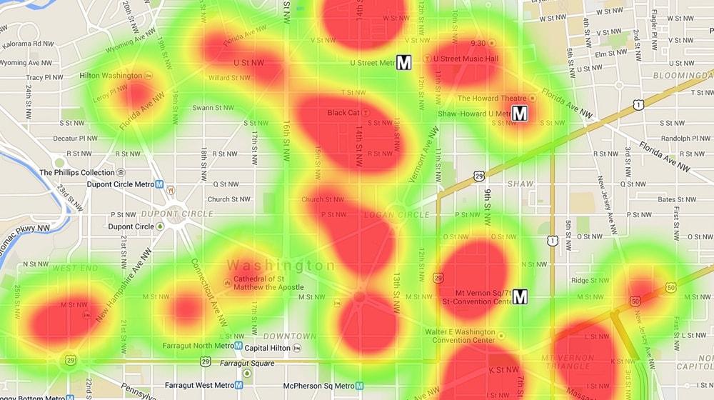
Heat maps are two-dimensional (2D) representations of data in which values are marked by colors. In terms of a website, a heat map is a visual overlay on website data that allows you to monitor how visitors interact with a web page. The color variations within a heat map represent the parts of the website that have high and low levels of activity.
Unlike quantitative analysis that only tells you which web page is underperforming, heat maps (visual analysis) tell you which element(s) on a web page need to be adjusted (and how) for maximizing conversion.
Different examples of heat maps
Heat maps are generated through the use of click-tracking software that converts the user’s cursor movement and mouse clicks into a 2D, color-coded, overlay visual.
There are two primary categories of heat maps — eye-tracking and mouse-tracking.
However, mouse tracking is more commonly used due to the lower costs involved. Here are four widely used examples of heat maps, each of which are designed for tracking different types of data.
Click-tracking heat maps
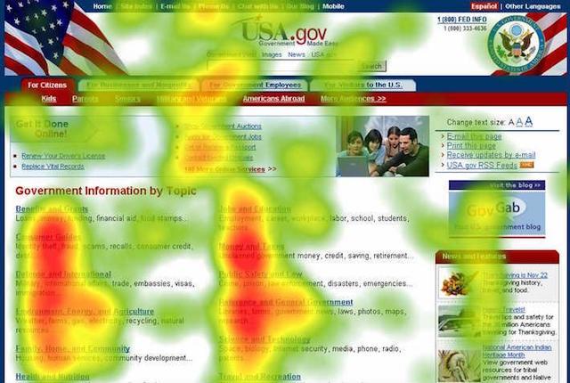
This is the most widely used heat map of them all. Click maps show where visitors on your website are clicking so you can identify and eliminate distracting links. These are most suitable for directing the visitor’s attention to calls-to-action (CTAs).
Mouse-movement heat maps
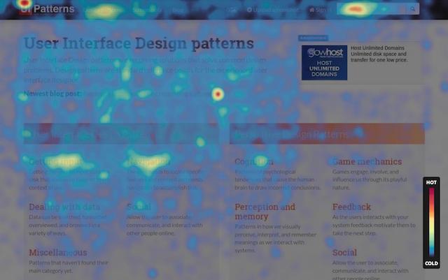
This heat map shows the pattern of how the users navigate and read a page. It highlights the areas where the users hover their mouse over the most. You can determine which parts of your website command the most attention through the use of a mouse-movement heat map.
The image above illustrates mouse-movement tracking.
Scroll-tracking heat maps
A scroll map shows the point at which visitors leave a website as they scroll through the content.
The scroll heat map provides insight about how to alter the length of your content and where to place important call-to-actions for maximizing the conversion rate of a landing page.
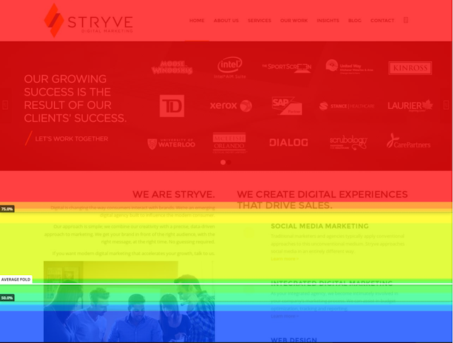
According to the Nielson Norman Group, 80 percent of visitors’ attention is focused above the fold. This means that if your CTA is located somewhere near the bottom, you need to rethink your strategy.
Eye-tracking heat maps
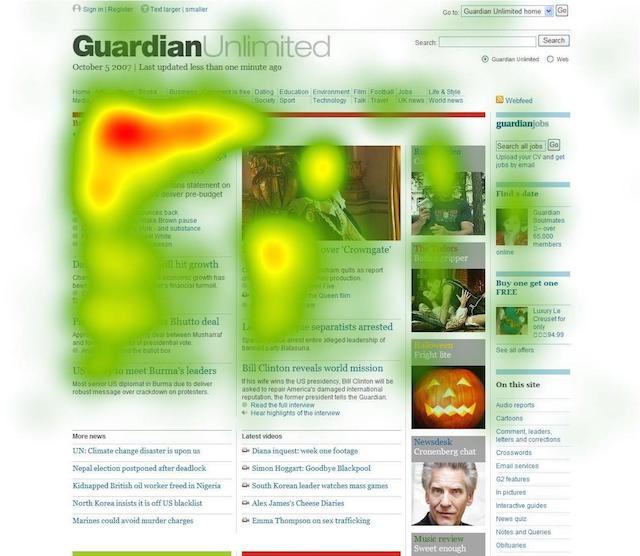
Eye-tracking heat maps make use of the entire subset of visitors’ interactions with a website to determine their eye movement.
This heat map shows exactly where a visitor is looking on your website.
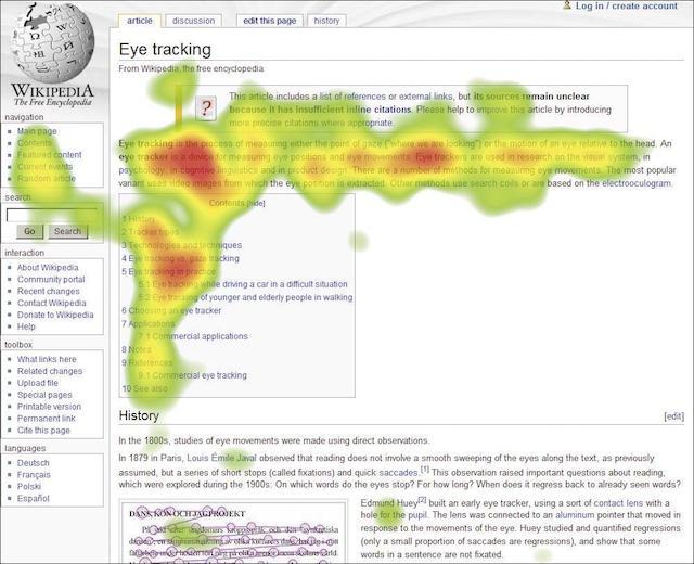
These heat maps are more complex (and more expensive) to set up because of the technology and software involved. It’s also difficult to generate eye-tracking heat maps for larger groups due to the high expense.
Why are heat maps important?
Marketers can make use of the incredible insights provided by heat maps for increasing conversion rates. Using the information that is provided by these tools, they can identify the following:
- Which elements of a website should be made clickable.
- Where should key information be placed on a page.
- What’s working on a page and what isn’t.
- If the visitors easily identify CTAs.
- If the instructions are clear enough to lead a user to sales and conversion.
- Which elements of a page are distracting and should be eliminated.
With a heat map, you don’t have to speculate how a certain graphic layout or user experience design would work for your landing page. Instead, you can easily test and tweak the design in real-time for maximizing conversion.
Studying heat maps will show you areas of your website that receive the most attention (and generate the most clicks). This way, you can validate if a particular website design is providing optimum conversion rates or not.
5 ways to use heat maps to increase conversion
-
Optimize the placement of calls-to-action.
-
Improve content and readability.
-
Streamline the page design.
-
Maximize the effectiveness of images.
-
Reduce abandoned carts.
Heat maps help marketers understand a lot about user behavior. The extensive quantitative and qualitative data provided from different heat maps can give useful insight on how to boost conversion rates. From heat maps, we obtain real-life data that tells us what users focus on and how they react to the CTA on a website.
Let’s take a look at the ways in which you can make use of heat maps for increasing the conversion rate of your website.
1. Optimize the placement of calls-to-action.
The effectiveness of a CTA is denoted by the number of users that click on it. For instance, your visitors might be clicking on an item or element on the web page that isn’t actually clickable.
A click heat map shows exactly where the users are clicking on your landing page.
A click heat map will provide you with insight on how to maximize the performance of various user-experience elements. Another good strategy is to combine A/B split testing with a click heat map for improving the placement of the CTA and the design of the CTA button for maximizing conversion rate.
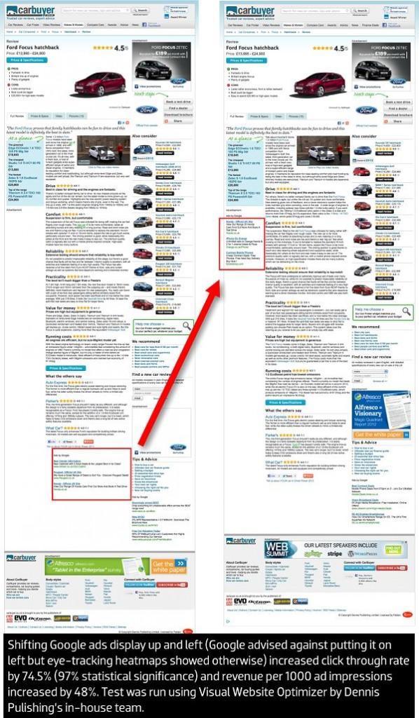
The image on the left is an example of CTA movement.
According to the case study of Dennis Publishing by VWO, visitors focus most on the left-hand column of a web page. Recognizing this, the company shifted their Google ad to the left-hand pane of a website. As a result, their click-through rate (CTR) increased by 44 percent and their revenue per 1,000 ad impressions (RPM) increased by an impressive 48 percent.
2. Improve content and readability.
Scroll-tracking heat maps give us an interesting bit of insight on whether the content on your website is being seen or ignored. While most internet users today are beyond the “above the fold” rule, it still plays an important role in website design.
According to statistics by Nielson Norman Group, the visitors on a website spend more than 80 percent of their time above the fold (i.e., without scrolling the screen) while only 20 percent of their attention is focused on content that is below the fold.
Using an eye-tracking heat map, the Nielson Norman Group also indicated that web users spend 69 percent of their time looking at content found on the left half of a web page while only 31 percent of their time is spent looking at the right half.
This means that a conventional design is likely to make websites more profitable.
These statistics illustrate that the keywords and CTAs in your content should be placed on the left-half of your web page above the fold for maximum effectiveness. You can make use of scroll-tracking and eye-tracking heat maps to determine which parts of your web page draw users’ attention.
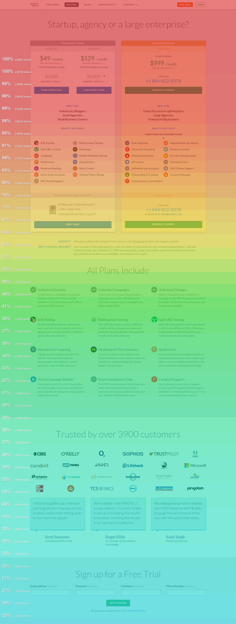
You want to make sure that the visitors on your website reach the CTA before they navigate away from your page. If the scroll-tracking heat maps of your website show that users do not scroll down to the bottom of your landing page, you should look at moving your CTA above the fold of the web page.
The image on the right is an example of scroll tracking on VWO.
3. Streamline the page design.
Elements on a web page that receive little to no attention are referred to as “dead weights.” If an element is not contributing to the user experience or conversion rate and it receives little attention from the visitors, then it needs to go.
Make use of click and mouse-tracking heat maps for identifying elements (or content) that receive little attention and provide little value to the customers.
These elements distract users from CTAs that lead to conversion.
Based on the results generated by the heat maps, look at removing elements that aren’t garnering attention and replace them with engaging content or elements to increase the chances of conversion.
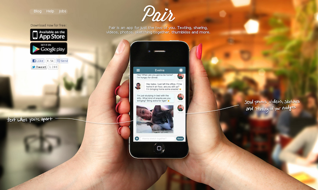
Pair, now known as Couple, had a simple landing page where the CTA asked visitors to download the app. Along with the CTA buttons, there were navigation options available for going to the Blog, Help and Job pages.

However, a click heat map showed the CTAs were receiving too little attention while other useless elements on the page were distracting for visitors. Recognizing this, the company decided to test out new designs with the help of click heat maps and A/B split testing. Through this, Pair streamlined their landing page design by removing the “Download for Free” text above the CTA buttons, resulting in a 10 percent increase in conversion rate. Moving the navigation menu from the top of the page to the bottom of the page also improved the conversion rate by 12 percent.
The image above shows Pair’s homepage with click mapping enabled.
You can make use of heat maps for identifying, removing, and replacing areas of your landing page that are hindering conversion.
From the example on Pair, we can identify three important lessons for increasing conversion:
- Clear up clutter around CTA buttons.
- Social proof is an important part of your landing page.
- Be open to testing different menu locations.
Check your heat maps and analytics — moving the menu to a different location might actually boost conversion.
4. Maximize the effectiveness of images.
The right placement of an image can divert the user’s attention towards the content and CTA buttons on a website. On the other hand, an ill-placed image can have an adverse effect on the visitor’s attention.
Remember, you don’t want the visitors to be clicking on or looking at the image the entire time.

You can make use of an eye-tracking heat map to determine whether an image is effectively placed on your website. If the image itself gets too much attention from the users, then you need to re-align it or re-locate it on your web page to divert attention to your CTA. Take the image to the left — the child’s face draws the attention of the audience (as denoted by the red coloring in the heat map).
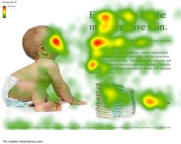
A slight modification was made, as shown in the image to the right, angling the child’s face toward the content on the web page. The results spoke volumes. Now, the majority of the user’s attention was toward the content (and subsequent CTA), which eventually increased the chances of conversion.
5. Reduce abandoned carts.
A poorly placed checkout button on the shopping cart page can be another cause of low conversion rates. For instance, if the checkout button is difficult to locate or if a promotional banner or ad is placed near the checkout button, it could lead a potential buyer away from the shopping cart.
Through the use of a mouse-tracking and click-tracking heat map, you can identify elements other than the checkout button that are receiving the user’s attention and remove them or relocate them for improved conversion.
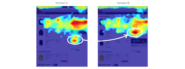
According to a case study of The North Face, a simple change of position for the checkout button can increase conversion drastically. The company observed that their shopping cart received plenty of traffic, but the checkout button was not being clicked as often.
When they analyzed this with the help of a heat map, they found that a promotional banner just above the checkout button was getting much more attention than the button itself (Version A below). When they readjusted the position of the checkout button to be above the banner (Version B below), they noticed a 21 percent increase in clicks on their shopping cart page.
You can make use of click maps to determine whether visitors are clicking on the checkout button or not. Consider these questions when determining whether or not to use a heat map:
- Were the visitors easily able to locate the checkout button?
- What were the visitors clicking on if they did not navigate to the checkout page?
- Is an element other than the checkout button receiving too much of the user’s attention? If yes, then can it be repositioned or eliminated?
In conclusion
Heat maps are a digital marketing tool that can be utilized for improving the conversion rate of your website. Instead of relying on myths and hunches, you can actually monitor the way users interact with your website through the use of the data collected from heat maps.
With the different types of heat maps available, you can gather real data about which elements on your website are getting most of the customer’s attention. With the help of this data and techniques such as A/B split testing, you can optimize your website design for achieving excellent conversion.
