It’s easy to choose the colours for your website when you already have a brand. Just grab your brand colours and have at it! But if you’re a new business creating your brand colours from scratch, there are a few things you should do to ensure success.
You will want to tackle this in two steps:
- Figure out what colours you need for your brand.
- Apply your colours to your website.
How many brand colours do you need?
The general rule of thumb is five brand colours, but I’ve seen many sites that just have one main colour. That’s the colour they use in their logo, buttons and maybe as an accent inside photos or on overlays.
Then the site background is white and text is black. I use this technique on my own site. It’s simple to design and create but can feel limiting.
If you have time, choosing five colours is smart because it gives you more flexibility in all future design work.
Here is a screenshot from colourmind.io showing the five colour types they recommend:
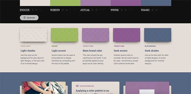
Photo: Colourmind
Typical brand colour breakdown
The Colourmind brand colour guidelines are a great start, but in my experience working with large corporations, the breakdown is more like below.
Main brand colour
This is usually featured prominently in your logo. In fact, your entire logo might be this colour.
Secondary brand colour (dark accent and/or light accent)
This can be in a smaller placement on your logo. It can also be used as an accent colour on your website — in the borders, text, links, etc.
Tertiary brand colours
Optional. Sometimes brands want to have a lot of fun colours to choose from so they choose extras. These are added sparingly, to bring extra life to their pages.
Dark colour (text)
Your main text colour. Typically black or dark grey, but also could be blue, brown, etc.
Light colour (background)
This is often the colour of the website itself, or lightly shaded sections as you scroll down a long page. Typically white or a neutral shade of grey/tan.
How to choose brand colours
There are two possible approaches to take when starting a brand colour exercise.
Approach 1: Use your intuition to choose colours for your brand
If you’re a free-spirited, instinctive sort of person, you might want to use your intuition to choose your brand colours. Take a look around your home for inspiration. Do you have a favourite colour that you use again and again in your decor? What colour are your rugs, throw pillows and curtains? What does your bedding look like? Are your wood furnishings dark mahogany or farmhouse white?
Take a turn through your closet — do you see any colours making an appearance again and again in your wardrobe? Are your favourite shirts red? Is every scarf purple?
What fashions inspire you? You’ll likely be able to narrow the list of appropriate brand colours by doing this exercise.
Approach 2: Research trends to inform your brand colours
You can also look to current fashions and trends for inspiration. If you love Pottery Barn, look through the latest catalogue and see what colours make an appearance. Maybe you love the beach cottage designs filled with coral, aqua and sand. Or you love the deep reds and rich browns and golds in the traditional English bedroom setup.
You can also head to a bookstore to see what’s trending in home decor books and magazines. Or visit a mall to see what colours the stores are using. You can even go to your local home improvement store and check out the paint swatches.
Rather research from home? You’re in luck! Just search “colour trends,” “colour schemes” or “colour palettes” on Pinterest or Google. And don’t forget to see what your competitors’ brand colours are. Maybe you want something similar … or wildly opposite!
You can combine these approaches if you want
Personally, I like to start with my instinctive colour choices, combined with Pinterest browsing. Then I refine my choices on Photoshop mockups of my website, and finally, I test for accessibility.
Sometimes I get all the way to the website and realize I need to tweak the colours a tiny shade more before it’s right. That’s what works for me. Do what works best for you!
Tools for choosing brand colours
There are some wonderful free tools and applications online that can help you with your colour exploration journey.
Colour pickers
Remember when I mentioned above about finding colours on competitors’ sites? If you find a website with a colour you love and aren’t sure how to save it, it’s actually really easy. Just use a special tool like this ColourPick Eyedropper. It’s an add-on for Chrome that allows you to select colour values from web pages by clicking on them with a little eyedropper tool. It couldn’t be easier!
Colour palette generators
Another wonderful tool to help you choose brand colours are colour palette generators. These applications help you sample colours from existing designs, cycle through ideas and home in on your perfect colours.
Here are 3 popular online colour palette tools that can help you get started:
Coolors.co is an online app that allows you to hit the spacebar on your keyboard to cycle through randomly suggested palettes. You can also choose brand colours from a photo, save a single colour you see and generate more colours to go with it, and save/export your final choices when you’re done.
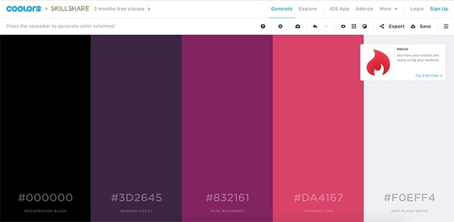
Photo: Coolors
Canva/colour-palette is a simple website application where you can upload a photo and it automatically generates five colours that match. Then you can just jot down the hex codes for the colours you like. It’s fast and easy. You can even move from there right into the Canva application and start creating graphics and documents with your new palette.
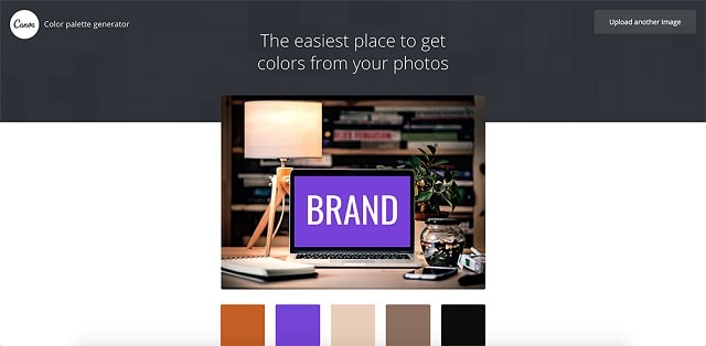
Photo: Canva
Colourmind.io describes itself as “a colour scheme generator that uses deep learning. It can learn colour styles from photographs, movies, and popular art.”
It’s a little more full featured, with daily inspiration colour palettes and educational content around colour and how to apply it to pages and design.
Like the other two choices, Colourmind also can choose colours from a photo. So make sure you save photos that inspire you as these will give you a great jumping-off point when using colour palette generators like these.
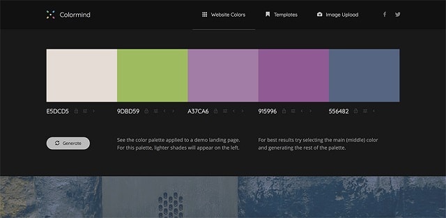
Photo: Colourmind
Test for colour blindness
When you have narrowed your colour choices to some finalists and are ready to take them online, be sure to test your page for colour blindness issues before launching.
You’d be surprised what colours will be unreadable to some visitors.
Not everyone has perfect 20/20 vision. Usability is key to being able to serve more people, better! Visit Web Design Guidelines for Colour Blind Audience for best practices on how to design for accessibility.
Document your brand colours
Once you’ve gone to all the work of deciding what colours fit your brand, it’s important not to lose that information. Spend some time creating a brand guide to house these and other important brand details like fonts, logos and copy voice.
How to apply brand colours to your website
You’ve picked out the perfect set of colours, and now you need to decide where they should go on your website. Here are some common areas where your new colours will go, along with my recommendations on which colours are most appropriate for each. If you're using GoDaddy's Website Builder, it should be easy to implement these changes.
Purchase button
What it is: A purchase button leads to a place your reader can actually make a purchase, such as o a cart page or payment form. The wording is typically “Buy Now.”
Colour: Use your primary brand colour or secondary colour that is easy to see and stands out well on the page. So it can be dark on a light page. Or very bright.
You don’t want this kind of button to ever be overlooked, so be bold.
Orange, magenta or bright blue are good options.
Informational button
What it is: An informational button is one that takes you to a page with additional information on a topic. So instead of leading directly to a cart where the customer can buy your product, it might lead to a landing page where they can learn more about it. The wording is typically “Learn More.”
Colour: You can use your primary colour here as well, or use a secondary colour — maybe a green or bright blue. Many sites will use a solid colour for their main purchase buttons and for the secondary “informational” button, they’ll use a white button with a black outline. This still looks visible but not as prominent as the solid button. You can also simply use a text link for all your “learn more” calls-to-action and leave the button shapes only for the most important income generating actions.
Links
What it is: Links inside paragraphs or blocks of text are called “inline links.” You can also have links in a headline.
Colour: Most web pages by default have a bright blue colour for all these kinds of links and you have to make a deliberate effort to change that to a different colour. Your secondary or tertiary colours will work well as link colours and go a long way toward solidifying your brand on your website.
Headline text
What it is: This is self-explanatory. It’s the text headlines or <h1> or <h2> or <h3> tags on your website.
Colour: Your darker greys and blacks work great but sometimes it looks nice if you change your headlines to another colour. Just make sure NOT to use your link colour on headlines or your visitors won’t know what’s clickable and what isn’t.
Graphics and pictures
What it is: Icons, graphics and photos.
Colour: You can colourize your icons with any of your brand colours. You can also add colour to boxes that have text overlays, or to photos.
Hint: look for photos of people wearing clothing that matches your brand colours, or apply a colour overlay on top of your images for a clean and branded look.
Now it’s your turn
So what do you think? Will you use five brand colours or keep it simpler? Are you intuitive or more of a scientific, research-based person? It’s OK to mix the two.
Just grab a notebook and jot down your thoughts as you dig into this process. Then after you’ve documented all your new colour favourites, you can start applying them to your website.
Be sure to follow your new plan for all the pages on your site. If you stay consistent, you’ll have a beautifully branded, professional looking website in no time!
