How much time do you spend thinking about your website homepage? How much time do you think your potential customers spend looking at your website homepage?
If someone is thinking about becoming a customer of yours, then the chances are they'll spend at least some time checking out your homepage.
Why? Because a website's homepage is where people expect to get an overview of who you are and what you do.
They'll use this information to help decide if your product/service meets their needs, and if they can trust you to deliver what you're promising.
So if your homepage doesn't let people know who you are, what you do, and that you can be trusted then you could be missing out on customers.
Here are the crucial elements that every website should have.
Your business name
Seems obvious, right? And to be fair no one is really going to forget to include their business name on their homepage.
Where people tend to go wrong with including their business name on their homepage is with positioning and size.
It can be tempting to think that your business's name is the most important element of your homepage - after all you want to be memorable.
But making your business name prominent on your homepage takes up valuable space that could be used for more important things, things that will actually encourage people to become your customer.
So make sure your business name is there, but keep it simple, smallish and out of the way. The top left corner is a popular choice.
Information about your business
Anyone visiting your homepage should be able to understand what your business does with just a glance.
It's absolutely crucial that you include information about what your business does above the fold on your homepage. (Above the fold means people don't have to scroll down to find it.)
This information may come in the form of a call to action (more on which later), a slogan, or something else.
What's important is that you communicate your purpose quickly and simply.
You can then go into more detail about who you are and what you do further down your homepage.
An easy-to-understand navigation
Potential customers might navigate to your homepage to learn more about your business, while existing customers will use it as a logical starting point when revisiting your site.
By providing an easy-to-understand navigation you'll help the former group discover more about what you have to offer, and help the latter group complete whatever task it is they're trying to achieve during that particular visit.
The bare minimum is a navigation bar at the top of your homepage, and you'll probably want to include navigational links in your homepage footer too. The header and footer should appear on every page of your site, so people can always quickly and easily find navigational links.
You can learn more about creating a good navigation bar here.
An image related to your business
This is another feature that seems obvious, but which a lot of people get wrong.
When choosing images for your homepage, be sure to avoid stock photos as these are easily detected and can feel unauthentic.
Instead, aim for images of your products if you sell a physical product. (The Amazon homepage is dominated by product images.)
If you sell digital products, or offer a service it can be harder to select strong imagery to use on your homepage.
Some ideas include:
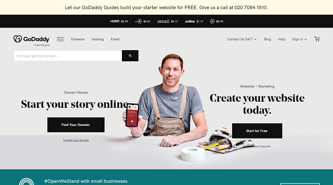
- Images of your customers (This is what you'll find on the GoDaddy homepage)
- Images of your team
- An image of your product in use (If you offer a digital product)
A next step
If someone is taking the time to read your homepage, that's good. But it's not your ultimate aim.
Clearly your ultimate aim is to get people to become a customer, and to for your homepage to help with that it needs to feature a clear next step for visitors to take.
This is likely to take the form of a call to action of some kind.
For example, on the GoDaddy homepage we have two main calls to action - one inviting people to search for a domain name and another inviting them to start a free trial of our Website Builder product.
On the homepage, you can see their call to action is a free trial of their SEO tool.
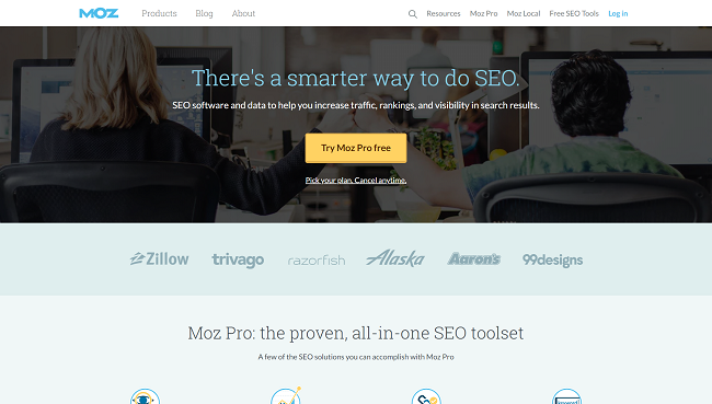
Calls to action are a crucial part of any website, and perhaps the most crucial part of your homepage. You can learn more about creating good calls to action in this guide.
Social proof
Want to convince new customers that you're the right business for them? What better way to do it than have your existing happy customers explain why you're so great?
Reviews and testimonials are a powerful tool in any business's marketing toolkit, and your homepage is just one place you should be including them.
This example from social media tool Buzzsumo shows homepage testimonials in action.
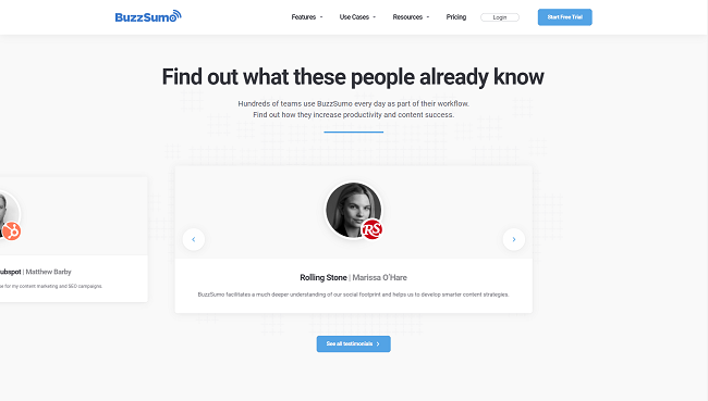
You can learn more about using reviews and testimonials in this guide.
More content to explore
Not everyone who visits your homepage will be ready to buy right away, so it makes sense to offer them more content to explore.
This could include things like blog posts, how-to-guides and videos of your product in action (or if you're selling a service, video testimonials.)
You should also consider offering people the chance to sign up to an email newsletter, and you can even offer "gated content" which people can access in exchange for signing up to your newsletter.
An email newsletter allows you to stay in touch with potential customers, and gives you more opportunities to grab their attention (and business).
You can learn more about starting an email newsletter in this guide. (You'll need a tool like Email Marketing from GoDaddy to do so.) Also make sure that the way you gather and use email addresses complies with GDPR rules.
Summing up
Your homepage is a vital part of your website, make sure that people visiting it can easily see the kind of information they're looking for. If they can't, they probably won't hang around to hunt it down.

